4 Ways to Use White Space Creatively in Web Design

White space is a critical component of everything we design. While there’s a very functional role that white space has to play, we can use it in creative ways as well.
White space in web design refers to the empty or negative space within a UI.
Some white space is micro, like the small bits of padding we add around words or lines of text to improve readability and organize content. White space can also be macro, occupying large swaths of the interface to enhance focus, establish balance, guide users and so on.
But what if we get a bit more creative with white space?
In this post, we’ll explore some unique and effective ways that white space gets used in UX design. From shadow play to disrupting the geometric grid, there are various ways to shake up your designs and pique user interest with white space.
Unique and Effective Ways to Use White Space
Looking for inspiration for your next project? Here are some white space design tactics that other designers have tried out (and that work really well):
Add Asymmetrical Carousels
Let’s say you have numerous products you want to promote on your homepage. You could create a section that highlights the top three or four as Ring does here under “Featured Deals”:
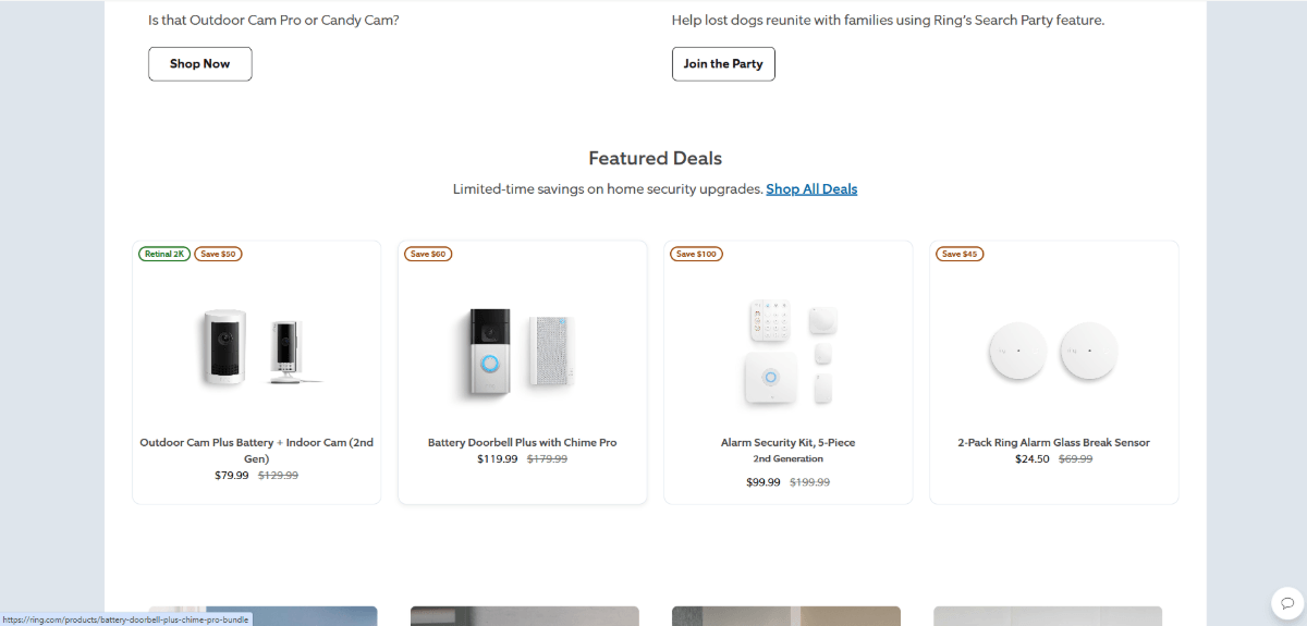
If you want to show off more products in this space, though, you have to consider whether you:
- Should shrink up each block to fit more products in the row?
- Or keep the blocks relatively spacious and add more rows beneath?
The first option is OK, but the small size of your product blocks could subconsciously signal to visitors that they’re not as important to look at as the larger sections on the page. The second option is also OK, but you run the risk of fatiguing your visitors by lengthening the page.
An alternative option is to put these products into a slider and carousel. My recommendation is to place them into an asymmetrical carousel that looks like this one for Google Nest:
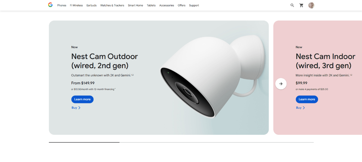
Visitors are used to seeing content contained within symmetrical blocks and surrounded by symmetrical white space. When you disrupt the grid like this, it’s going to cause them to notice.
Add to that the interactivity of a scrolling carousel, and they’re likely to do more than notice. They’re going to stop and try to find out what’s sitting beyond the visibility of the section.
This asymmetrical carousel structure—where the left side has the typical white space beside it and the other has content that reaches to the screen’s edge—can be used for other content, too. For instance, the World Wildlife Fund uses a carousel on the homepage to promote blog posts:
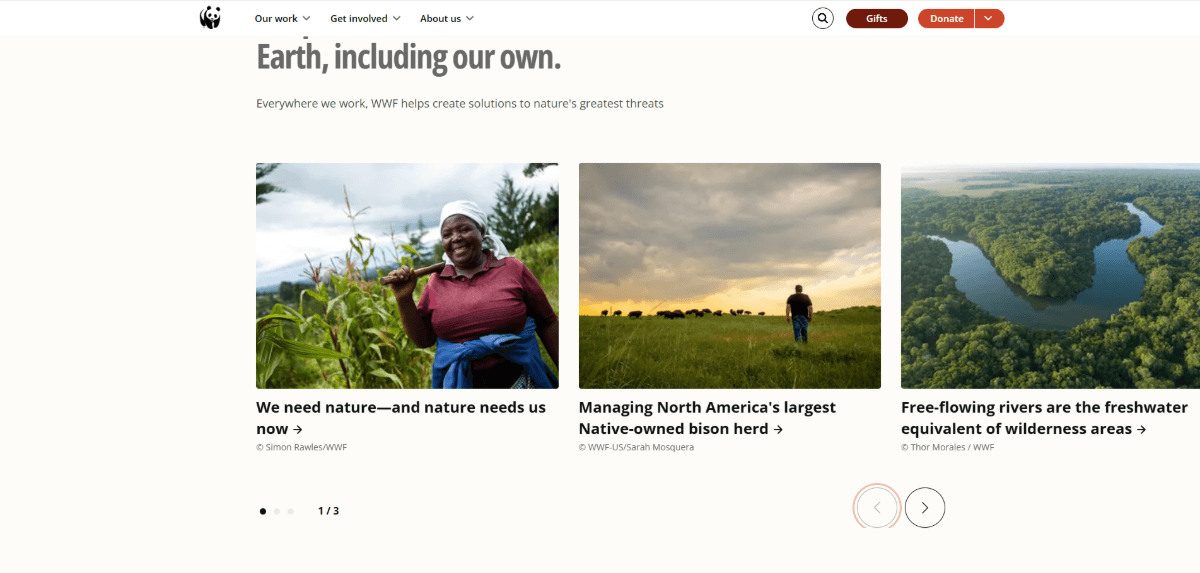
This one isn’t as disruptive as the Nest example as none of the content blocks are cut off and hiding beyond the scroll. However, the lopsided design of the carousel and navigation below it still effectively signal to visitors that there’s something to stop and interact with here.
Work with Shadows
White space isn’t always white. It doesn’t always have to be solid or geometric either.
I think one of the unfortunate side effects of drag-and-drop block builder technology is that the web is now full of websites that look blocky. Each section ends with a clean horizontal line before the next one begins. Even white space assumes a very solid and geometric appearance.
There’s nothing wrong with this kind of web design. It makes for a clean and well-organized interface. However, some brands could benefit from blurring the boundaries between content and giving their designs a more natural feel.
One way to do this is by using shadow to create your white spaces.
Here’s an example from the Thievery Corporation homepage:
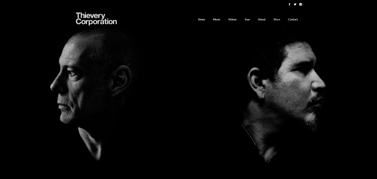
Here we see the faces of Rob Garza and Eric Hilton, the musical duo behind Thievery Corporation. Between and all around their turned faces is white (black) space. But it’s not a solid black block separating them. It’s a shadowy darkness which bleeds a little bit onto each. This shadowy white space also flows down the rest of the page.
It’s an alluring effect and feels more natural than if the designer had placed their portraits side-by-side with a black line or block to separate them.
Another example of shadowy white space is found on the Library page of Gilt Bar Chicago:
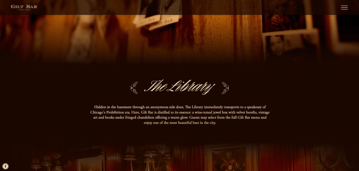
At the top of this page is a video background that shows off the Library space. The section below it doesn’t feel much like a section, but more like a shadowy corner or nook where we learn a bit more about the Library.
There are no solid lines that divide the hero section from “The Library” section. Nor are there defined lines between “The Library” section and the subsequent one. This gives the homepage a more realistic vibe, as if information is quickly being revealed in a dark corner of a room before we explore the rest.
While these two examples demonstrate how this effect can be accomplished with black/shadowy sections, it can also be done using white/lightness as well.
Use Fullscreen Popups
It’s been 10 years since Google announced it would penalize mobile websites that used obtrusive popups. At the time, I believe they had good reason for passing such guidelines.
When marketers and designers discover a new effective trend or technique, too many people often rush to hop on the bandwagon. This is how we’ve ended up with a web full of lookalike sites and functionality time and time again.
Around this time in 2015, it was the popup that was everywhere—and it had become quite intrusive to the mobile user experience.
Now that we’ve moved past that era and designers and developers have become more mindful and intentional about using popups, I think it’s something worth playing around with design-wise. Just so long as it doesn’t disrupt the user experience too much, that is.
Let’s take the example of the age verification popups we see on websites for alcohol brands and breweries like Wicked Barley:
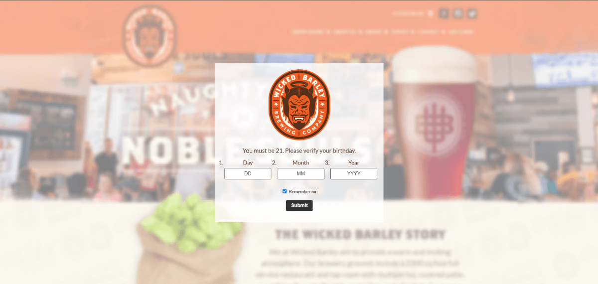
When you first enter, the website becomes blurred and this age verification popup appears. Users are only able to bypass it by entering a valid birthday (over 21 years of age). So, this means the website remains a blurry teaser in the background until this process is complete.
An alternative approach to designing this experience is to take the user out of the website entirely and to move them to a fullscreen interstitial. Compare the above design to this one on the Reuben’s Brews website:
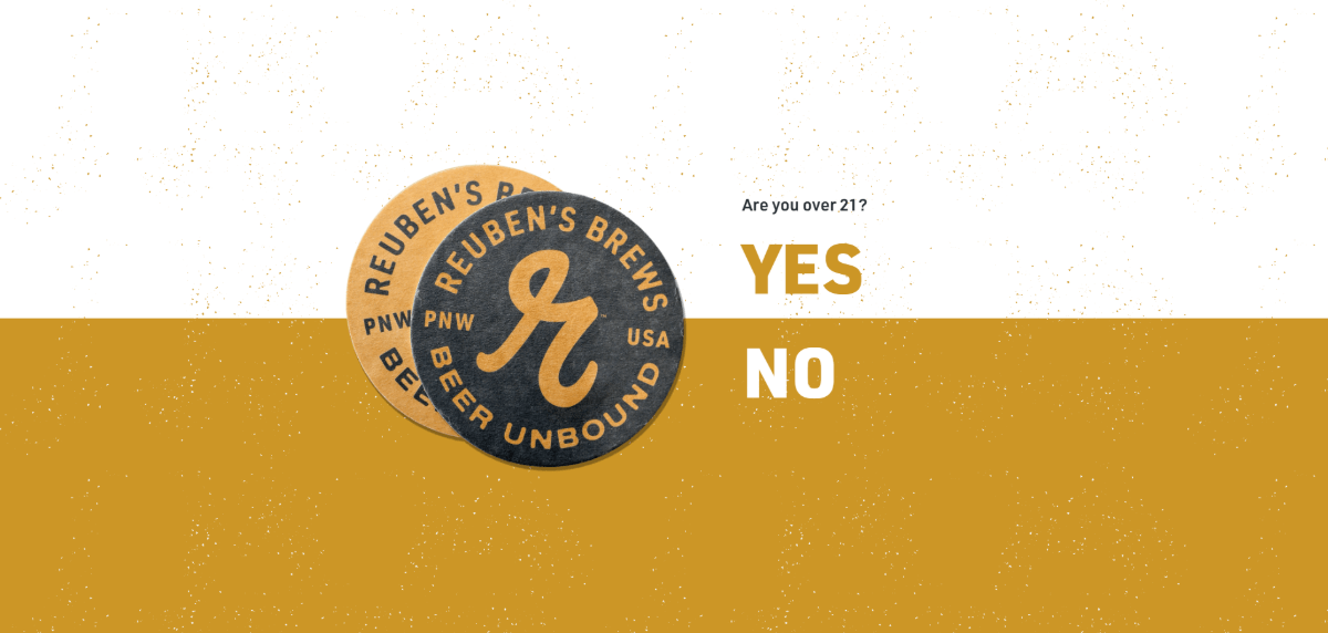
This screen doesn’t feel as distracting or overwhelmed (even if the content was blurred). The website is hidden behind the age verification interstitial. And although there’s very little content on this page, the white space doesn’t feel like wasted space. In fact, it makes things feel simpler and easier. Visitors can focus on the question instead of trying to sneak a peek at what lies ahead.
This fullscreen popup isn’t just effective for age verification screens. You can also use it for other kinds of popups, like Material Kitchen has done:
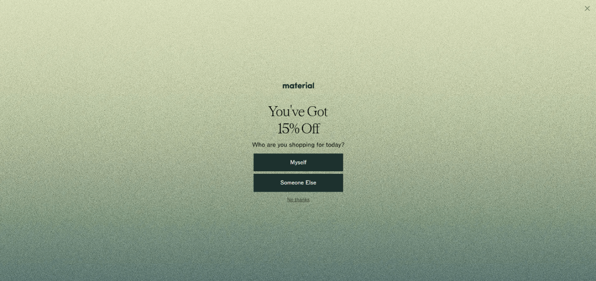
About 10 seconds after a visitor enters the Material Kitchen website, this fullscreen popup appears, letting visitors know they’ve received 15% off their purchase.
There are a number of reasons why this may be more effective than smaller popups that appear over content.
For starters, it fully interrupts the user experience. This was one of the reasons why Google had sought to penalize interstitials a decade ago (on mobile, specifically). But considering how overstimulated people are, this might be a good way to hit pause on all the distractions and get them to focus on one important offer right now.
Also, like the age verification modals, this one uses expansive white space to fill the screen entirely. This way, users are required to take action. Do they claim the discount? Do they pass on it? Or do they ignore the message entirely and click “X” in the top-right corner?
Some users may be so accustomed to smaller popups appearing that they naturally dismiss them without a second thought (i.e., popup blindness). By disrupting their expectations and designing yours in this way, you might be able to get more people to consider whether the offer is actually worthwhile.
It’s also worth noting the similarities in how these interstitial examples are designed. The content takes up very minimal space in the center of the screen. The white space surrounding it isn’t solid and plain though. In both cases, there’s a texturization that amplifies the look of it.
So, this is something to think about when designing yours. The textured and colorful look makes the popups seem more attention-worthy than if they had been designed with a solid color and white space.
Fill White Space Through Animation
Typically, white space is a permanent fixture within the UI. It doesn’t go anywhere. It just acts as a buffer for our content. But what if we could do something else with it?
I saw two examples of this white space animation in action recently, and I thought it was an interesting tactic.
The first one was on the eXp Realty homepage:

Scroll down to the “We’re Built for This” section and you’ll see it for yourself. Initially, the section has a headline and description on the left. On the right within a rounded capsule shape is a video. There’s a good amount of white space above this content and between the text and video.
As you scroll, though, the rounded video container expands, swallowing up the white space and filling the section entirely. It’s a really interesting and unexpected effect.
Casper is another website that displaces its white space with content:
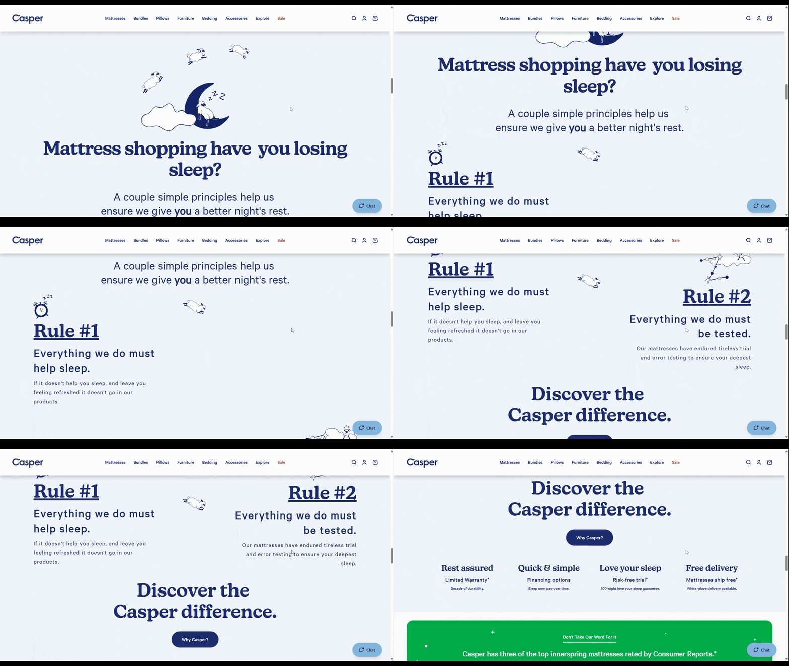
Oftentimes when we see sections broken up into subsections like this, they’re designed in an alternating pattern. For instance:
| H2 heading: Mattress shopping have you losing sleep? | |
|---|---|
| H3 heading: Rule #1 Everything we do must help sleep. | [accompanying graphic] |
| [accompanying graphic] | H3 heading: Rule #2 Everything we do must be tested. |
In this example, we see the two H3 headings merge into the same row. “Rule #2” ends up displacing the white space that sat alongside “Rule #1” initially. The designer has chosen to fill the white space with content instead of leaving it bare as the user scrolls down the page to read more.
This isn’t the kind of effect you can use site-wide and throughout every page. However, if you can find a key section to draw attention to, adding this white space-consuming effect could be really useful.
Wrapping Up
White space will always serve a functional role in web design. Without it, our interfaces wouldn’t be:
- Minimalistic and clean
- Readable and legible
- Well-organized
- Harmonious
Nor would we be able to control where our users’ attention goes as effectively.
That said, just because white space is a very practical design element, that doesn’t mean we can’t experiment with and reap other benefits from it. As we’ve seen here, there are ways to draw greater attention to content with unique applications of white space (or by removing it).
If you’re struggling to get visitors to pay attention to your content, try something different with your white space. With so much of the web looking alike, your visitors are likely to notice.

Suzanne Scacca
A former project manager and web design agency manager, Suzanne Scacca now writes about the changing landscape of design, development and software.
