Navigation Design Best Practices for Websites

Website navigation design might seem so intuitive at this point that we may be taking it for granted. Let’s look at how decisions regarding styling, white space, ordering, hierarchy and more can impact the usability and effectiveness of your navigation.
The navigation that sits at the top of your website has a number of important jobs to play.
For starters, it’s what orients people to your website when they initially enter it. From a bird’s-eye view, they get a sense for what the website is about and what the brand offers.
Secondly, the navigation empowers users to explore the pages of the website and to go deeper into the journey without having to depend on internal text links or buttons.
Lastly, a well-built navigation can help with search engine optimization. The structure and labeling of the navigation communicates to search engines a high-level summary of the site and its content.
To make your navigation is as effective as possible, it needs to be well-designed. In this post, we’ll unpack what that entails.
Website Navigation Design Best Practices
Here are some tips for using styling, white space, ordering, hierarchy and more to improve the usability of your navigation:
Define Styles for Different Link States
There are three states for a navigation link:
- Normal: This is how the link looks when the user does not interact with it.
- Hover: This is how the link looks when the user hovers over it.
- Active: This is how the link looks when the user is viewing the page.
Each state should have a unique style to it.
When it comes to the normal and active states, the difference in appearance allows users to use the navigation as a reference point, to see what they’re currently viewing within the context of the rest of the site.
When it comes to the normal and hover states, the changed appearance of the hovered-over links can help improve user confidence as the UI responds to their cursor movements.
Let’s take a look at the navigation on the MINI USA website. This is what it looks like when all the links are in the normal state:

All the navigation links are black. No additional styling is present.
When a user hovers over any of these links, they turn blue. This includes any top-level links as well as secondary dropdown links:

Here we see “Models” and “Countryman” in blue. The Models dropdown tab also has a blue line under it to indicate it’s open. In the active navigation state, the text changes back to black. However, a thin blue line appears beneath the link.

In the case of this website, we don’t see any of the top-level links presented in the active state. Only the secondary navigation links that show up at the top of the pages, like in this example on the Countryman page.
In terms of best practices, it’s ideal that you mark the link trail whenever possible. Think of it as a visualized breadcrumb, leading from the primary navigation in the header to any secondary navigation below it.
Another best practice that would’ve come in handy on this website is accessibility.
While someone with blue-green color blindness might be able to recognize a subtle change to the text color in the hover state, it might not offer a strong enough contrast. So, whenever possible, make your hover and active states clearly distinct for all users and not solely differentiated through the use of color.
Use White Space to Enhance Readability & Clickability
White space is an essential element in UI design. It enables us to build some breathing room into our interfaces so that the most important information and components are easy to find and interact with.
Because of how little space the header takes up on a website, white space may not be as spacious as it is in other areas of the site. Yet, it has just as important of a job to do.
Case in point: This is the header on the L3Harris website:

It might be a bit distracting to view the header in isolation with the dark background, so let’s view it in its hover and scroll state when it goes from transparent to white:

Notice how the designer has used white space in the following ways:
- Separating the logo from the navigation
- Building space and a consistent rhythm between the links in the navigation
- Adding a secondary information/navigation bar above the primary one
- Placing a buffer between the header content and the main content on the page
The space between and around the primary navigation links, in particular, is crucial. Without ample and consistent spacing, it can be difficult for some users to tell when one link begins and one ends.
While a distinct hover and active state can help them notice the difference, users shouldn’t have to depend on their interactions with a page to understand what they’re seeing. So, the best practice here is to maintain enough space to tell one link from the next. This will also help prevent users from making errors when clicking or tapping links.
Order & Organize Links Accordingly
When you’re dealing with a smaller website, the order of navigation links might not seem like a big deal. But it’s a matter of perception, just like everything else your visitors encounter on your site.
Take, for instance, a navigation with links in this order:
- Contact
- Plumbing Services
- About
- A/C Services
- Free Estimate
- Blog
This looks messy. Not only that, it’s going to require more attention and work on the part of your visitors. Instead of looking through the navigation from left to right (which they’re naturally inclined to do), they have to closely review each link to figure out what to do first. It’s our job as designers to guide them.
Navigation link order becomes even more of a critical component to pay attention to on larger websites.
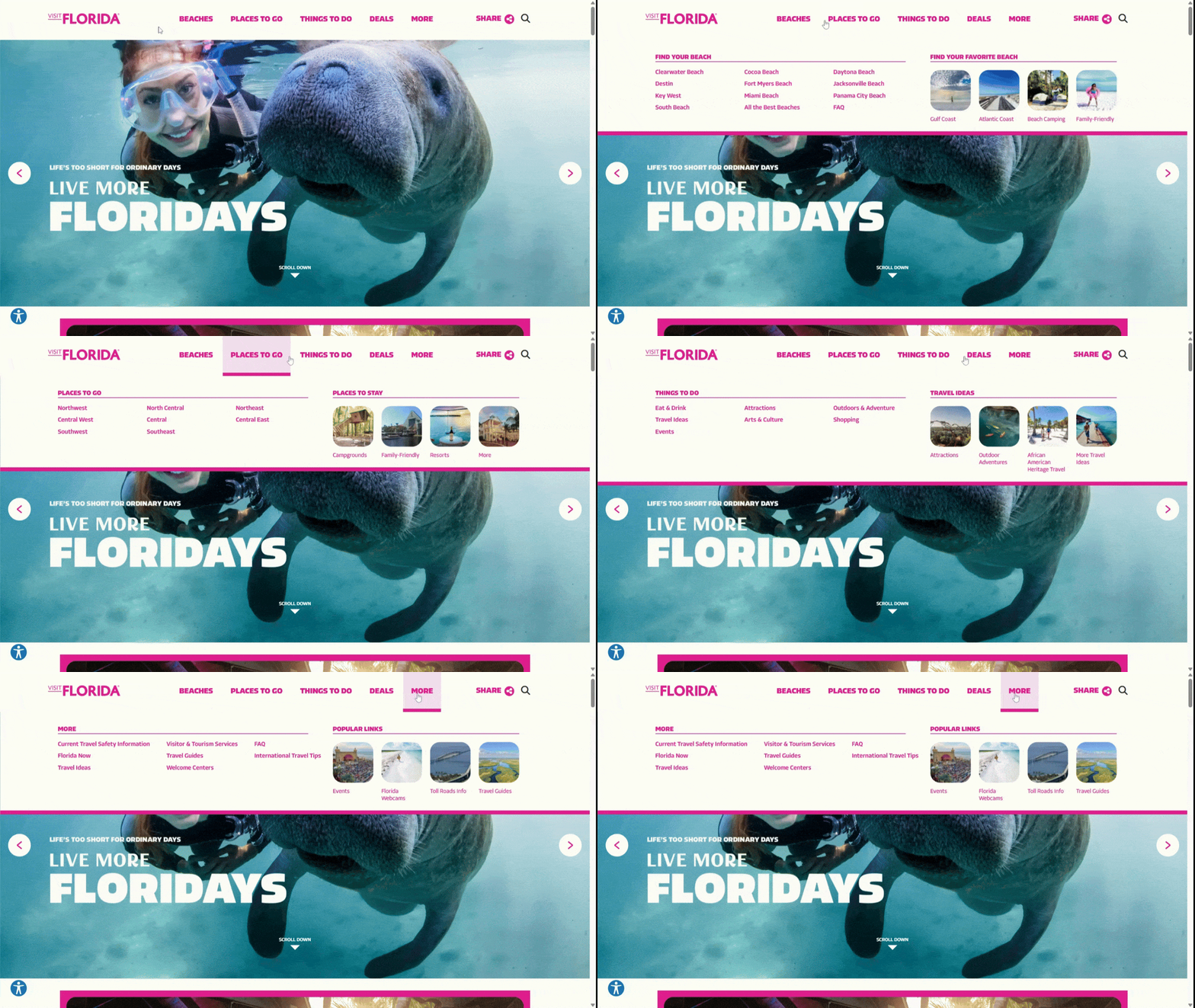
Let’s take a look at the Visit Florida website navigation:

Realistically, this page has hundreds if not more than a thousand pages on it. So, it’s definitely up to the designer to decide the best way to take visitors on a journey through the website.
The primary navigation at the top of the website is going to be a trusted resource they constantly return to. So, what belongs in this clutch position? The designer has made these the top-level categories/links to peruse:
- Beaches
- Places to Go
- Things to Do
- Deals
- More
They likely chose these categories based on in-depth user research.
The secondary links that appear beneath each category are also worth looking at.
Notice how when I move from category to category, the structure of the dropdown menu stays the same. You don’t always see this on websites, which can create a jarring experience for users.
By organizing the main links on the left and the visual card links on the right in the same way throughout the navigation, this designer created a predictable visual rhythm. This, in turn, makes the navigation much more user-friendly. It also gives off a positive first impression about the website and the content that’s to be found within it.
Set Your Secondary Navigation Apart
Some websites are large enough where a second or even third navigation is needed. There are a number of places where you can put these secondary navigations, but they won’t be suitable for every website.
Let’s look at three examples and the best use cases for each.
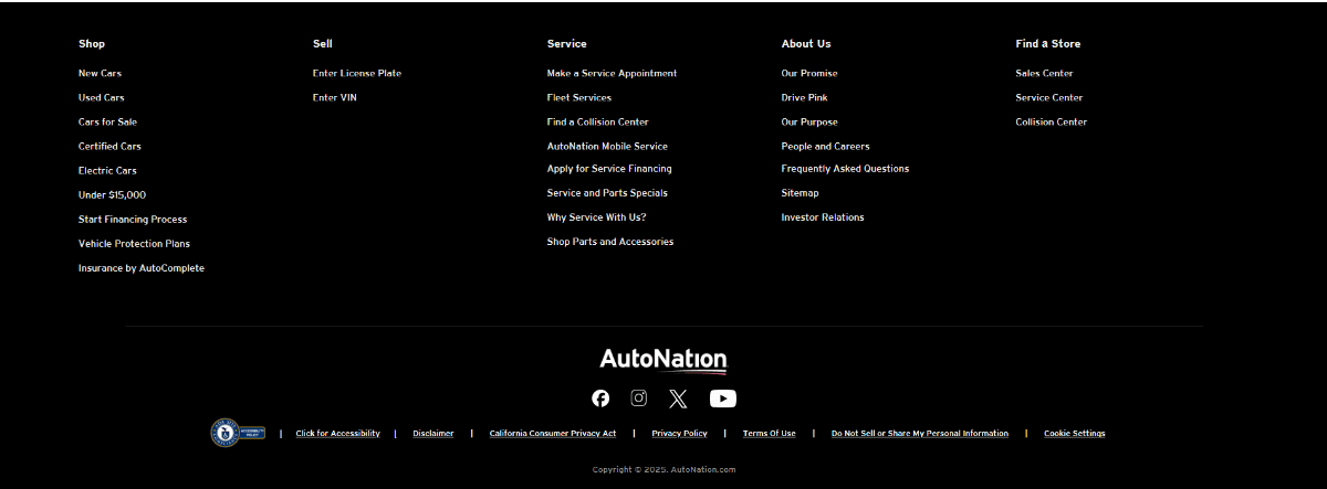
The first place you can put secondary navigation links is in the footer as we see on the AutoNation website.

This is a good option for larger websites where the primary header navigation needs to be relatively simple. At the same time, users shouldn’t have to dig through homepage links or internal pages to find the rest of the info on the site. That’s what the footer is for.
In this example, we see that AutoNation has organized its secondary links into:
- Shop
- Sell
- Service
- About Us
- Find a Store
And instead of including all the legal and accessibility info in this secondary navigation, the designer has placed it in a tertiary bar at the bottom of the page.
Another place you can store extra links is in a bar above the header. Here’s how it looks on the Universal Studios website:

The primary navigation includes links that cover the main experience at the theme park, like things to do, buying tickets and trip planning.
While the designer could’ve placed the rest of the links in the footer, there may be valuable information in some of them, like park hours and customer support. This kind of info shouldn’t be relegated to the footer. At the same time, it doesn’t make sense to dedicate prime real estate to them in the primary navigation. That’s why this secondary navigation bar is necessary.
You can also place commonly used functions there as well. For example:
- Login or Register
- Account management
- Language switcher
- Shopping cart
- Website search
And, in the case of Universal Studios, there’s a domain switcher so visitors can toggle between the different locations.
While this example is from a large website and brand, this kind of navigation is also useful for dividing up links on smaller websites based on importance and value.
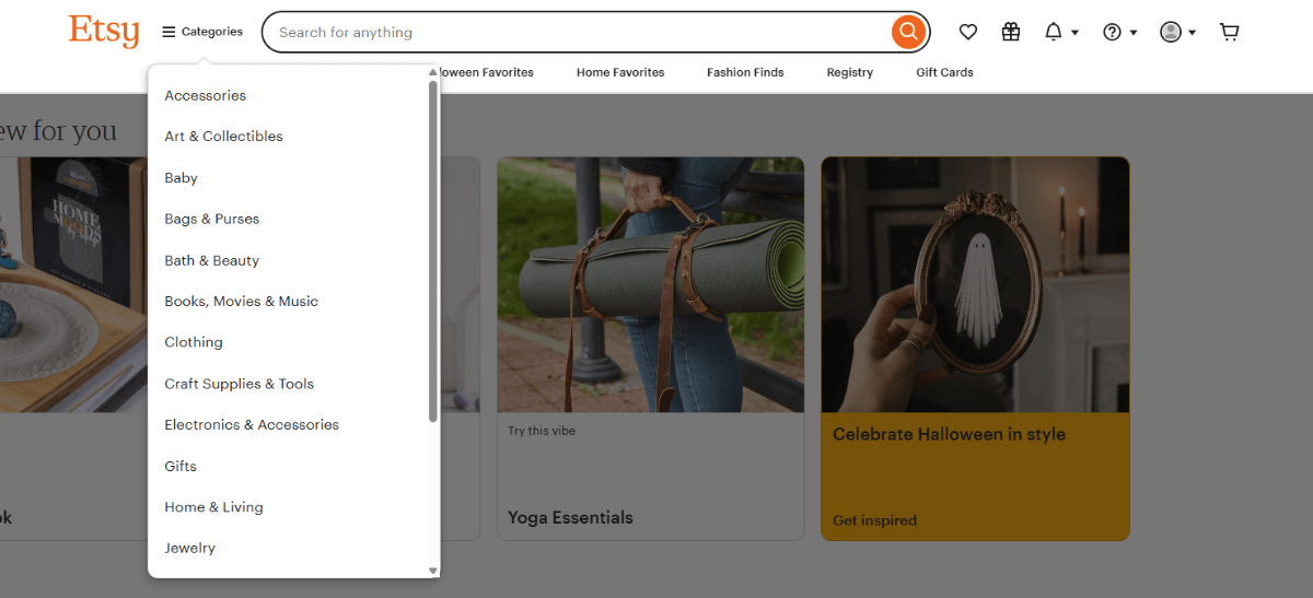
Another way to separate out important but not critical links from the main navigation is to do as the Etsy website does:

The primary navigation beneath the search bar has links to:
- Gifts
- Halloween Favorites
- Home Favorites
- Fashion Finds
- Registry
- Gift Cards
But this is an ecommerce site. Shoppers can’t realistically be expected to use the search bar to explore all the categories. So, Etsy has placed them under a hamburger menu between the Etsy logo and search bar. Shoppers can then use filters and sorting to narrow down their results.
Although the hamburger menu is commonly associated with mobile interfaces, it’s a handy tool for designers that want to simplify navigation on large websites, especially in ecommerce.
Instead of using the primary navigation solely to list out a dozen or so choice categories, the hamburger menu gives you the ability to add other kinds of links (like Gift Cards and Registry) to the primary navigation. Then you can showcase all of your categories under the dropdown.
There’s another option available, which we saw earlier with the MINI USA example. The secondary navigation only appears when a visitor goes deeper into the website and it changes based on which page they view. This kind of navigation is useful for websites with products or services with tons of related information. Instead of including all the sub-links in the navigation, they appear within the individual ecosystem of each product or service page.
You can also use this type of secondary navigation on blogs. In that case, though, the navigation links would remain the same and continually display the categories as the user visits other pages on the blog.
With these last few use cases, hierarchy in design is going to be an important consideration. When you have two navigational components next to one another, it needs to be as clear as day which one is the most important one (i.e., the primary one the user will use). And you can demonstrate this by using smaller text sizes, lighter font weights and other stylistic choices to distinguish secondary links from the main ones.
Include No More Than One Button
Not every website needs a call-to-action button in the header. If you scroll through the examples I’ve included in this post, you’ll find that most don’t have one.
That said, an eye-catching button can be useful for websites where there’s a singular, high-priority call-to-action for visitors.
For example, this is the header on the Lennar website:

The navigation on the left side of the screen includes only three dropdown categories and an additional link:
- About Lennar
- Shopping tools
- Owner resources
- Lifestyle (link)
On the right, there’s a small search icon, an account icon, and a prominent blue “Contact us” button.
It’s 100% clear what the owners of this website and company want visitors to do when they glance at the header and navigation. It doesn’t mean it’s the only thing that website visitors can do with this website—that’s what the navigation is there for. However, it does continually remind them that, “Hey, we’re here and ready to talk to you!”
When laying out the links for your navigation, something to consider is this:
Do any of these links deserve the spotlight?
For websites with hundreds or thousands of pages, the answer is “Probably not.” You can’t afford to give too much precedence to one link or action over another. But if your brand has a consolidated path that most visitors go down, then a button could be useful. For example, SaaS websites might include a button for “Book a Demo” or “Buy Now.”
If you’re struggling to decide between two links you want to turn into buttons, you might be able to get away with including both in the header. They’d need to be the same size and in the same location, so as not to cause too much distraction. That said, one of them should be a primary solid button (like “Buy Now") and the other should be a secondary ghost button (like “Book a Demo").
Wrapping Up
The website navigation is a vital part of the user experience. It’s also an important tool that allows brands to guide visitors throughout that experience instead of leaving them to their own devices.
The choices you make with regard to layout, styling, order and organization, and more can either help or hinder the user experience.
Start by paying attention to what the most important information is for users on the website. Then, flesh out the navigation so that it prioritizes their priorities while allowing your brand to accomplish its goals. Also, don’t be afraid to use secondary navigational structures to keep things simple up front and then to encourage visitors to go deeper in their exploration when they’re ready.

Suzanne Scacca
A former project manager and web design agency manager, Suzanne Scacca now writes about the changing landscape of design, development and software.
