Do You Need Storyboards for UX Design?

While some might say that storyboarding is valuable the larger and more complex a website or app is, that’s not always the case. Keep reading to find out what storyboards are, why you might need them on some projects and not others, and how to build them.
When you search for “storyboards”or “storyboarding” on Google, you’re going to get a mix of results. Many of them deal with storyboarding in film, while the rest relate to video storyboarding, app storyboarding and other marketing-related types of storyboarding.
But is Google a good indicator of what you can do with storyboards? If so, designers might want to skip them and stick to common planning tools like wireframes and prototypes.
The thing is, if you look more deeply at the topic and what real designers say about it, there can be really big benefits to creating storyboards in UX design. Sure, it’s more time and effort you have to put into the planning stages. But if storyboards make collaboration easier, stakeholder sign-off simpler and later revisions less likely, then they’re probably worth it.
In this post, we’re going to look at what storyboards are in the context of design, tips for creating them and who would benefit the most from storyboarding.
What Is a Storyboard?
A storyboard is a graphic representation of a linear sequence or story. Each part of the sequence is represented by a visual sketch or image as well as some supporting context.
In film (where the concept of storyboards originated), storyboards visually show how a scene will be executed, step-by-step. It gives directors, producers and other stakeholders a chance to visually see how the story unfolds. It also makes it easier for set designers, costume designers and other creative contributors to collaborate around a clear visual concept for the movie.
In web design, storyboards visually depict the user journey—not just the tangible steps they take, but how they feel and respond at different points, too. What’s more, you can use storyboards for different parts of the user journey, like:
- App onboarding
- Homepage-to-checkout
- Account creation and logging in
- Landing page conversion
- Interacting with a chatbot
- Discovery of your store through an Instagram ad
- Navigating the app menu
Because of how complex this is these days—with many customers moving in and out and in between a variety of channels—storyboards can look a lot different than what you’d see in the movies.
In the next section, I’m going to explain how to piece together a storyboard for your next project. Along the way, I’ve provided examples of a storyboard I created using StoryTribe.
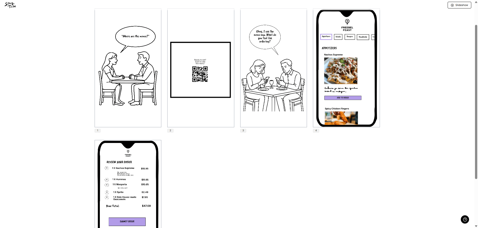
This is a short storyboard that I drew up quickly and is not meant to be a fully accurate representative of what UX storyboarding looks like. However, you can see in this snapshot how this might differ from a motion picture storyboard which often follows the protagonist on their journey. Or it shows how action unfolds still by still.
In this one, I’ve set the stage for how diners discover the online menu and ordering system when they arrive at a restaurant. So, the first three panels aren’t even concerned with the app itself. Yet, they’re an integral part of planning the user journey.
Storyboards vs. Other Planning Tools
Storyboards add another layer to the planning of your website or app.
Sitemaps depict the architecture and hierarchy of your pages or screens. They’re typically drawn in a very rudimentary tree map-style layout.
Wireframes depict the layouts of your pages/screens and how they connect to one another. These are very rough mockups that focus on the structure as opposed to details of each page.
Storyboards can be high- or low-fidelity illustrations that depict user flows. Unlike the other planning tools listed here, storyboards can also depict real-world scenarios as well as scenarios that occur on digital channels outside your site or app.
Mockups provide a detailed design of the interface of each page or screen. This allows designers to hash out all the nitty-gritty details that go into each page.
Prototypes bring the whole thing to life, enabling you to interact with and test out the working product.
While it may seem redundant to add storyboards to the mix, you can see how they have a unique role to play. They’re not always necessary, but you may find them beneficial for many projects you work on.
The Benefits of Storyboarding
There are many reasons why designers set time aside for storyboarding:
For starters, storyboards really help you get inside the mind of your user, anticipate their needs and reactions, and design a journey that’s truly made for them.
What’s more, by viewing your website or app as a “story,” you’ll always be thinking about how everything fits together rather than building it out one separate piece at a time. This can lead to the experience feeling more streamlined and intuitive.
Another way storyboards lead to better user experiences is by being a means for problem-solving and troubleshooting. It can be much easier to identify and solve problems and remove friction when you can see how it plays out in real time.
In the end, this can reduce how much time you end up spending on QA, testing and development.
Storyboards aren’t just beneficial for designers. For example, with a storyboard, you can turn your concept into visuals that are easy for laypeople to understand. This may include non-designer marketers, project managers and clients.
You also have to think about the role storyboards play internally within your design and development team. They can improve collaboration with these team members by having a visual reference to work from as well as simple sketches that can be updated in real time.
How to Create a Storyboard
Ready to build your own storyboards? Here are some tips to get you started:
1. Conduct User Research
With storyboards, you imagine how the user journey will play out. In some cases, the panels of your storyboard will focus on your UI and where your users’ attention will be drawn or how they interact with it. In other cases, the panels will depict the genuine thoughts and emotions they go through during this experience of interacting with your product.
For example, let’s call my illustrated people Mr. and Mrs. Smith. This is the first panel of my storyboard:
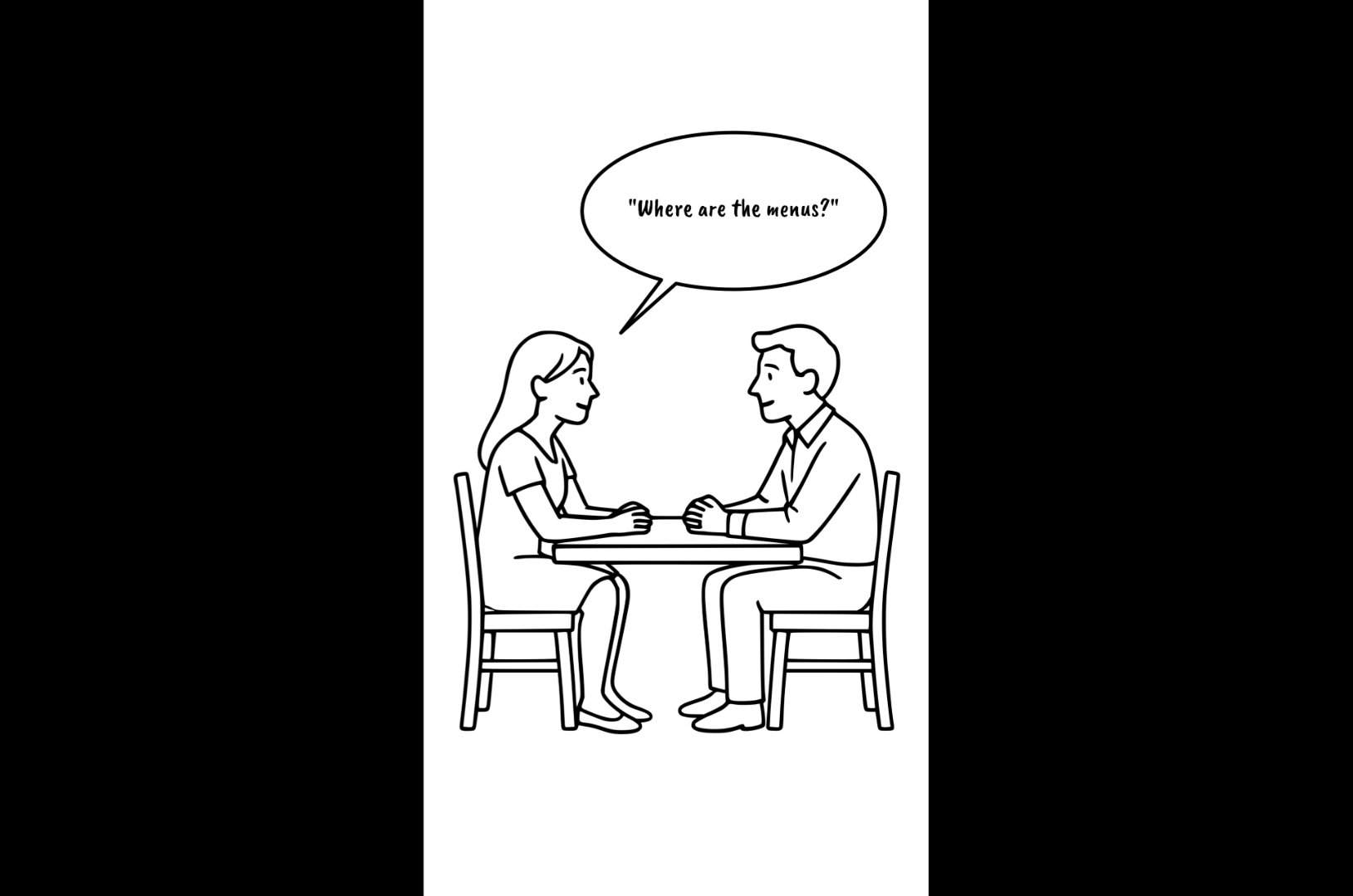
Since I am building a phone-based ordering app for restaurant diners, I envision this is where the journey will begin for most of them. They’re seated at a table and, if not directed by the host or server, they wonder to themselves, “Where are the menus?”
Now, I could probably have guessed what this first step in the user journey would be based on my lived experience. But it’s not always that simple or clear cut, especially if you’re coming up with a novel app or website idea.
This is why it’s important to research your users ahead of time. User research gives you a chance to get to know your target users beyond basic demographics. It can answer questions like:
- What pain or challenge are they trying to solve?
- What other solutions have they tried?
- Do they have unique preferences when it comes to the digital user experience?
- What are going to be their biggest obstacles to converting?
- Are there different groups of people drawn to your solution?
Getting to know your users makes it much easier to imagine the scenarios that bring them face-to-face with your solution. Storyboards allow you to anticipate how these scenarios play out and then visually depict these interactions.
While you can use storyboards to plan out general flows that occur when users interact with your website or app, you can also do this for different user segments. Take, for example, the scenario above. What if it were a couple without phones? In that case, you might want to show what happens when the server gives them an iPad to input their order.
2. Decide Which Stories You Need to Hash Out
The data you collect during the research phase will help you determine the most realistic and common scenarios that will take place within your website or app. That way, you can focus on sketching them out instead of trying to imagine all the possibilities on your own.
It’s not just about deciding which scenarios to storyboard, but also which part of the experience is worth storyboarding.
Storyboards, in general, should be simple sketches. We’re not going for anything ornate here. Just an illustration that depicts each key moment or touchpoint within the specific flow we’re looking at.
For instance, here’s the second panel in my storyboard. It’s just a QR code with basic instructions on a “tabletop”:
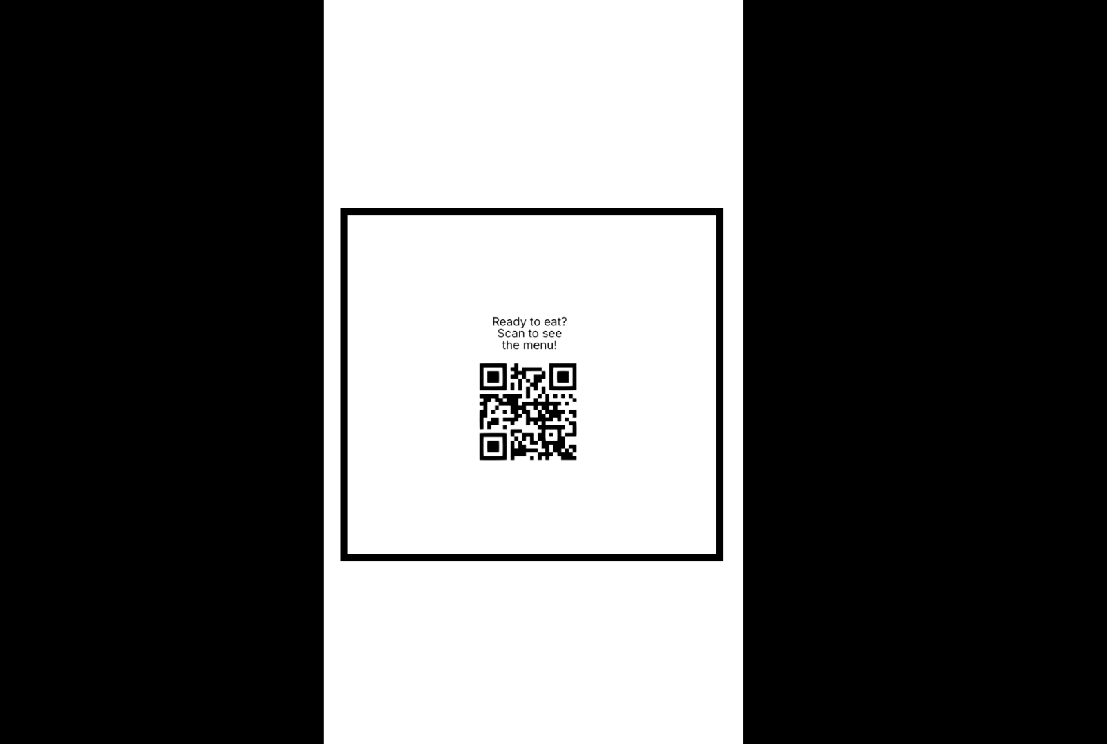
While storyboards may be simple enough in terms of design, they do take time to think out and sketch. Because of this, you don’t want to storyboard your entire website or app. There are many different pathways your users could take and it could end up being like a choose-your-own-adventure book to try and illustrate them all.
Instead, come up with a list of priorities. Which parts of the user journey do you believe are the most crucial?
If you’re building an app or website from scratch, it’ll likely be the interactions and paths that directly move the user closer to conversion.
For example, let’s say you’ve built a website for a financial advisory firm. Visitors can’t buy anything on the website. However, the sales reps have an average 63% close rate if they can get the visitor to fill out the lengthy intake form and sign up for the free consultation.
So, the main pathway you’d want to storyboard would be:
Homepage > 401(K) Strategy page > “Book Your Consultation” button > 3-step Consultation form > “Book It Now” button
The panels would include sketches of the pages or components of the website they’ll interact with. But they also might include illustrations of the visitor’s thought process or other behaviors that take place throughout. Because this is such a crucial part of your website’s success, you’ll need to figure out what exactly happens here and to fill in those gaps.
And, really, that’s how you should decide what’s worth sketching and what’s not. In other words, if you spend the time sketching this part of the journey out, will it make a difference in terms of your outcomes? If not, then skip it for now. If it does, then assign it a priority level of High, Medium and Low. Arrange your storyboards based on priority and tackle the High ones first.
3. Select up to 7 Moments to Highlight
Unlike movies that can have two hours of airtime to tell a story, you don’t have that luxury in web design. The entire user’s story or journey online is much shorter than that. So, you don’t need monstrous storyboards that depict dozens of action stills.
Instead, choose up to seven or eight key moments that will take place during each leg of the user journey you’re sketching out.
In my example, the third moment shows Mr. and Mrs. Smith finally accessing the menu from their phones. They have some drinks, they’re feeling relaxed and they’re talking about what they want to order.
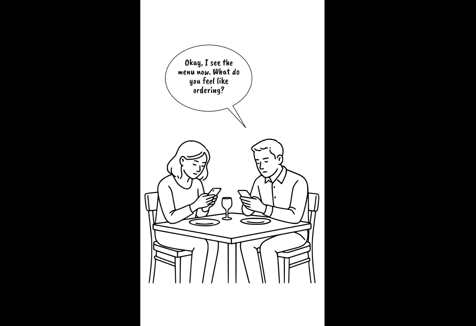
Is this a key moment in the story? I believe so. We’re still not inside the app with them. However, we’re seeing that the process we’ve come up with has caught up to what they’d experience when dining at a restaurant with physical menus.
If this were a real app I were working on, one of the things I’d want to know is what the biggest hurdles would be when using our app. While I haven’t done this research as this is a hypothetical project, I feel pretty strongly that getting users into the app in the first place would be pretty close to the top. So, this is an important moment to illustrate.
When creating your storyboard, figure out what those key moments are. If you start to sketch things out and find that you’re reaching that seventh key moment too quickly, then the process may be too convoluted.
Go back and see if all those panels are necessary. Remove any that are not. It could be that you’re depicting too many user reactions or redundant or irrelevant parts of the journey. On the other hand, you might discover that there’s something inefficient about the process leading to unnecessary friction.
Now, if you feel that all those panels are necessary, see if there’s something you can do to keep your visitors’ feeling engaged and comfortable throughout the lengthy storyboard and process. The more satisfied they are with the experience, the better the outcome (i.e., greater conversion rates, client retention rates, average order values, etc.).
4. Figure Out What Level of Fidelity You Need
Fidelity refers to how much detail you plan to imbue your storyboards with.
A low-fidelity storyboard is going to be a simple sketch, something with stick figures or that you might quickly draw out by hand. It’ll give you a basic idea of what’s going on in terms of the flow and interactions, but not be super clear on the visual details, thoughts or emotions.
A high-fidelity storyboard, on the other hand, is more visually detailed. It may include your branding and more distinct UI components. Not only that, it can go deeper into the user’s personal experience, reflecting their emotions and reactions.
Here’s an example of what a high-fidelity storyboard might look like. This is the fourth panel of my storyboard:
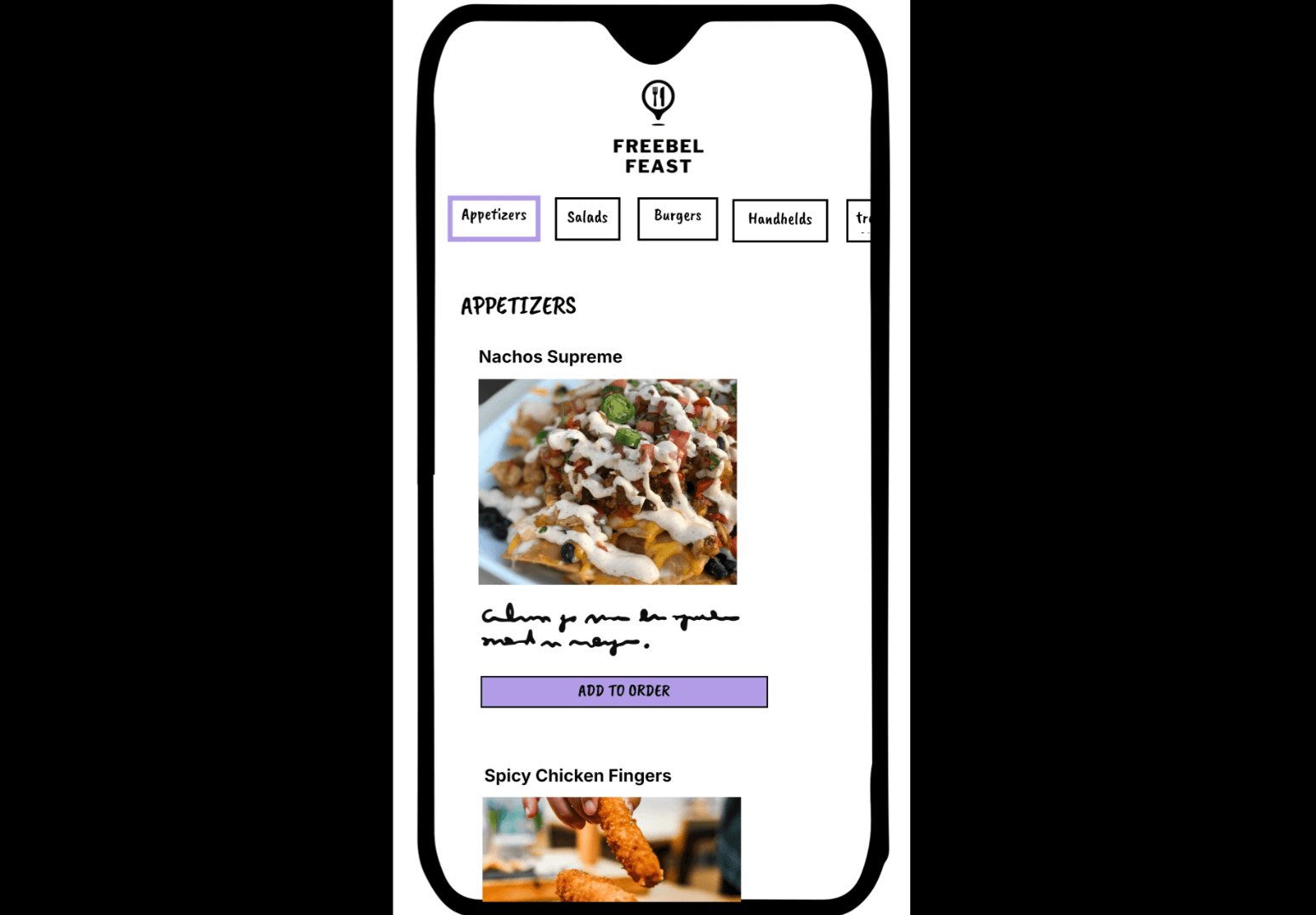
In this screen, we see the restaurant’s phone-based menu for the first time. The food categories are in a horizontal line at the top with the relevant food items down below based on the category selected.
While the food items aren’t final and the descriptions are missing, we still have an accurate depiction of what the diners are looking at as they contentedly sit at the table and hash out their order for the evening.
Typically with a high-fidelity storyboard, we’d want descriptive captions to accompany each panel. Captions can be included in low-fidelity storyboards as well, but they’re a must when taking your sketches to this level. Although the sketch may tell you a lot on its own, you want to provide as much detail as possible so there can be no confusion about what’s going on.
So, how do you decide which to create?
Low-fidelity storyboards are definitely faster to draw up. So, if you’re short on time, that might be a determining factor.
That said, lo-fi storyboards are going to be best when they stay internal. To designers and developers who build apps and websites all day long, they might not need so much detail and instead want to use the storyboards to quickly convey concepts or flows.
Storyboards can also be useful during early ideation stages when you’re trying to all get on the same page about what you’re going to do.
High-fidelity storyboards are going to take longer to make. For some, that may be a dealbreaker. If you’re already spending days drawing up the sitemap, wireframes, mockups and prototypes, this may just seem like a waste of time.
Again, you have to consider the context and the audience. If you’re sharing your storyboards with anyone else, hi-fi storyboards are probably in order. Imagine your boss or a client trying to interpret quick sketches vs. more elaborate storyboards in full color.
If your goal is to tell a story, pitch a concept or convince a decision-maker to go down the path you’re advising, then high-fidelity storyboards will be very useful.
5. Create Your Story Frames
Last but not least, you need to create your storyboard. There are a number of tools you can use to do this:
- Pen or pencil and paper
- Digital drawing board/sketchpad (like Sketchpad)
- Collaborative design apps like Figma or Illustrator
- Storyboarding tools like StoryTribe or Boords
As I mentioned earlier, I built my storyboard using StoryTribe:
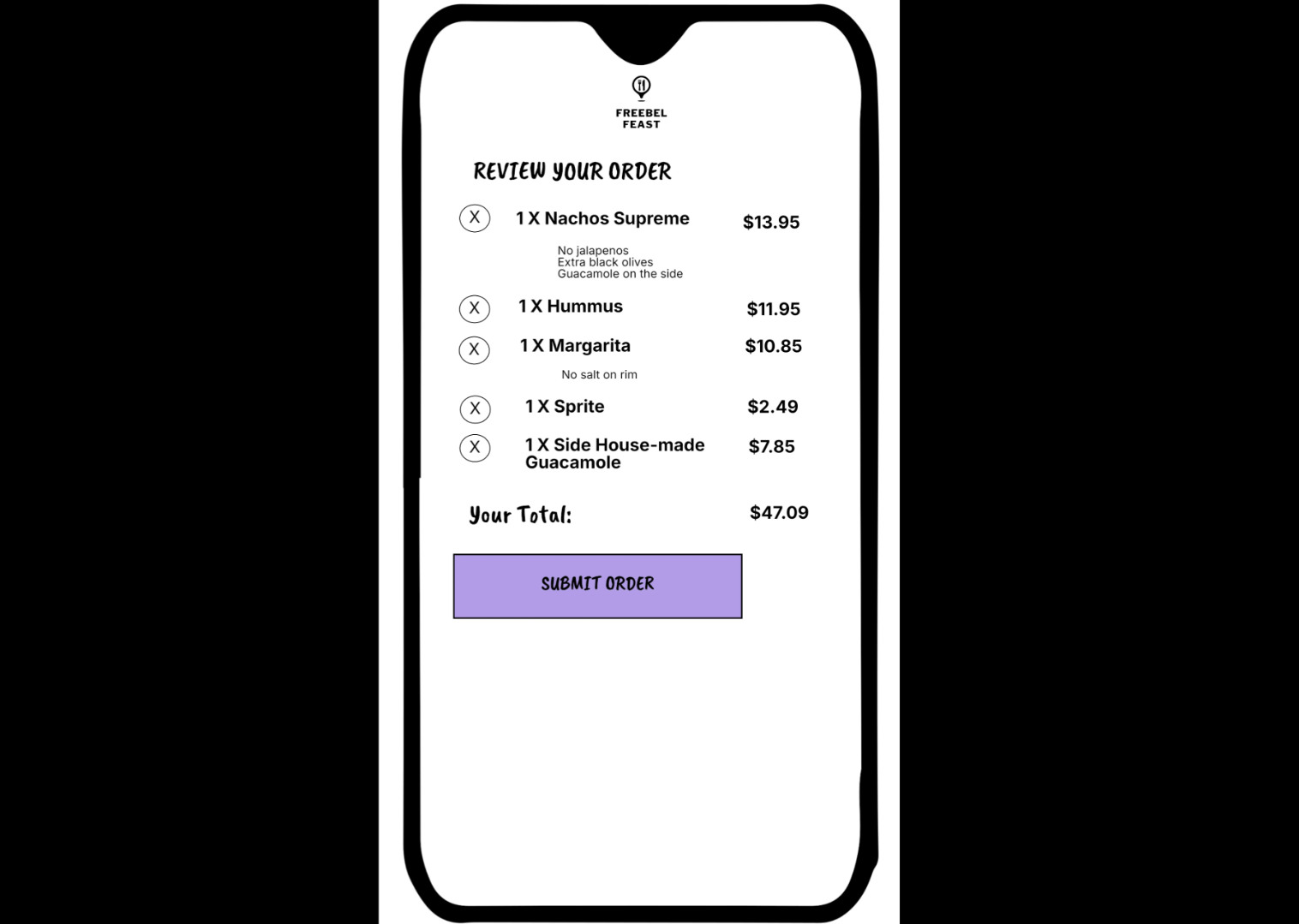
What you use depends on the fidelity of storyboard you’re building, if you need to collaborate with others on it and if you want it to sync with your design software.
Once you pick the tools, start bringing the story together.
First, name the “hero” of the story. In other words, if you’re working with multiple user segments, include the name of the storyboard after your hero. For example:
- “Older Couple (60s-plus) sits down to eat”
- “Recent College Graduate researches 401(K) options”
- “Return Shopper redeems loyalty points on next purchase”
This will set the stage for your story, so that anyone looking at it will instantly understand the context.
Next, list out the steps or panels (up to seven) of your story.
Do very basic sketches to represent each panel. Give them a look when you’re done or, better yet, show them to someone else and make sure they make sense. You don’t want to spend a ton of time on the sketches if they don’t belong.
Finalize your sketches once you know which panels you’re keeping.
Finally, add annotations or captions to each panel. If you’re just drawing up lo-fi storyboards in the early stages of your project, they’re probably not necessary. But if you plan on using these storyboards as a reference or a selling point, then further context is needed.
At the very least, the captions should explain what is depicted in the scene. As these aren’t animated, the extra context is helpful. You can also get into what the user is doing, thinking or feeling in the moment.
You may also want to provide even more details. For example, let’s say these storyboards are being done during a redesign. The user journey is the same as before, with the exception of one panel/step. So, the caption explains the obstacle users were running up against and how this new solution or scenario should fix it.
Do Web Designers Even Need to Create Storyboards?
Should you spend your time creating storyboards? It depends.
Here are some reasons why they may not be worth it:
- You’re too short on time.
- You’re designing a small website or simple app and don’t feel like there’s anything too complex to map out.
- You’re confident you can build your solution and get buy-in from stakeholders without storyboards.
- You’ve already had a ton of success with wireframes, mockups and/or prototypes, and don’t feel it’s worth rocking the boat.
- You don’t know who your target users are just yet. You feel that the time and effort spent hypothesizing these scenarios won’t be worth it.
And here are some reasons why you may want to start integrating storyboards into your workflow:
- You build large and complex websites and apps, and feel like any extra amount of upfront planning could be useful for your team.
- You can use all the help you can get when selling your ideas to your clients or managers. Wireframes don’t mean much to them, but you don’t want to spend time on mockups if they’re not entirely sold on your vision.
- You have a large team of contributors, and it would be helpful to have a single source of truth to work from when it comes to user journeys and flows.
- Omnichannel marketing is hugely important and you need a better way to visualize how users will weave in and out of different channels and back into your website or app.
- You’re doing a redesign or rebrand, and want to make sure the reimagination of the experience is just as engaging and effective as it was previously.
- You have a number of user segments and want to visually see how their journeys differ.
- You want to gather feedback on the user journey and flows while doing user research. You could explain the process, but feel it would be most effective to show the interviewed users your storyboards to see if they resonate.
As you can see, there are plenty of reasons why your team would benefit by using storyboards. At the same time, there are valid reasons why they may not be worth it. Have a look at your process as it stands now. If it feels like something is missing and you’re spending too much time on reworks, storyboards may be helpful (even if they do add some extra time upfront).

Suzanne Scacca
A former project manager and web design agency manager, Suzanne Scacca now writes about the changing landscape of design, development and software.
