How to Come Up with the Right Style for Your Brand Imagery

Imagery plays an important role in establishing the look, personality and even trustworthiness of a brand. But with so many tools out there to help you curate or create imagery, where do you start? These three steps can help you find the right graphics for your brand.
Our lives are driven by visuals. We watch TV shows and movies that are beautifully shot or look cool. We pick out products at the store that stick out from the rest. We also follow social media accounts with visual content that resonates with us.
It’s important to keep this in mind when developing the visual brand for your business or a client. Because while you want it to look and feel good to you (or whoever owns and runs the business), you have to make sure the end users feel the same way.
Now, visual branding is a catchall term for the components that make up a brand’s visual style—from the logo to the color palette, and the UI style to the imagery. In this post, we’re going to hone in on the imagery piece. Specifically, the importance of brand imagery and the steps needed to curate the right imagery for your brand.
Why Does Brand Imagery Matter So Much?
There are other reasons why a well-thought-out brand imagery strategy matters:
- A cohesive strategy makes a brand instantly recognizable.
- It makes each digital experience and channel look more welcoming and attractive.
- It conveys the tone, personality and values of the company.
- Each image tells a mini story about the brand and what it sells.
- Imagery that resonates with users makes the brand more relatable and trustworthy.
Thankfully, we have abundant options for sourcing and creating imagery these days. It wasn’t always this way.
When I got my first job in web design and marketing in 2013, it was for an agency in the telecom and IT industry. The majority of websites being made back then (not just by our agency) were littered with photos that looked like this search for “servers” on Pexels:
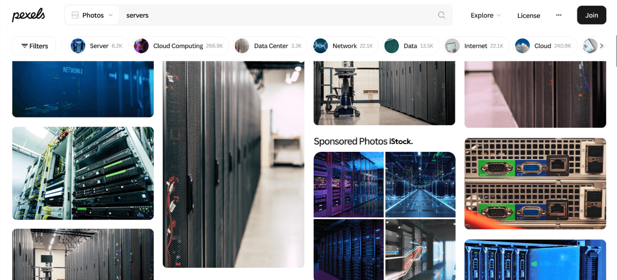
There were lots of close-up photos of server stacks, blue-tinted photos, men in suits shaking hands and abstract photos of networks (which were really just light trails behind cars on the highway).
Over time, stock photography became more affordable and accessible, and the quality of it vastly improved. This helped a ton in terms of choosing imagery for companies that didn’t have custom photography or illustrations.
For example, here’s a snippet of the homepage for an IT services company called Digital Boardwalk:
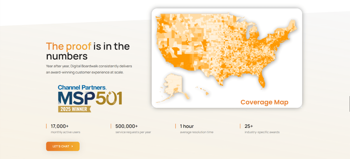
The website doesn’t rely as much on photography as it does great-looking illustrations and even app screenshots. This is leaps and bounds better than what we saw a decade or so ago for a website of this nature.
While we were able to get by with generic lookalike stock photography back then, that sort of thing doesn’t fly these days. Just as our technology has greatly advanced, so too have our design capabilities.
Consumers want to buy from and hire modern brands, not ones relying on outdated techniques. And unoriginal or poorly thought-out imagery will make a brand look anything but modern.
Crafting a Successful Imagery Strategy for Your Brand
Before you start selecting or creating images for your brand, you need a strategy. To demonstrate how greatly the results can differ from brand to brand, I’m going to use some clothing companies for our examples.
Step 1: Describe Your Business
These first two steps are going to help you figure out what you want your imagery to say. In other words, who are you and who are the people you sell to?
Let’s start by focusing on you (i.e., your business).
We’ll use Alo as our first example on how to explore this idea.
Here is a screenshot of the images used for the “Trending Now” product categories on the homepage:
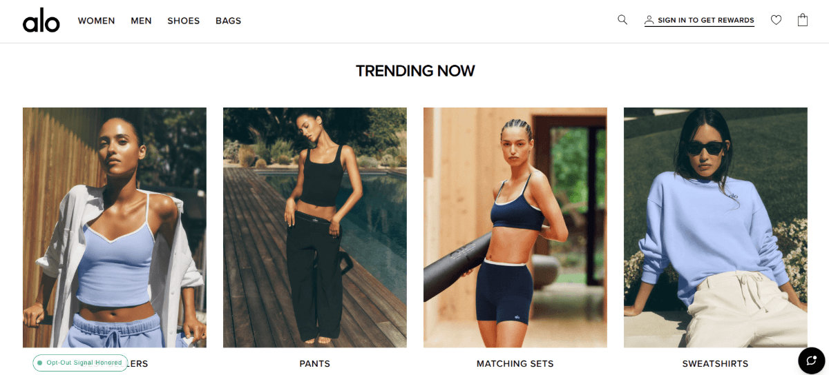
How exactly did they come up with these images? Don’t just focus on the products depicted. Also look at the models wearing the clothes and the settings in which they appear.
According to the Alo website:
“Our mission is to empower you to live an optimal life—one that aligns with your highest goals and intentions, and allows you to be the best version of who you are.”
This kind of inspirational messaging is common in the wellness space. Think yoga studios, wellness coaches and even yoga-inspired clothing companies like Alo. But this doesn’t exactly tell us what makes this company special or different from others.
It’s also not clear enough on how it should inform the brand imagery. “An optimal life” is subjective. So we have to dig a little deeper. Here’s what their Philosophy statement says:
“Our Studio-to-Street Philosophy enables you to take the mindset you develop through physical practice into the rest of your life, using your mind to push your body to new limits and your body to quiet your mind.”
If you had to choose five qualities to describe this brand based on this statement, what would they be? For instance, these are the ones I’d choose:
- Mindful
- Limitless
- Practical
- Flexible
- Peaceful
Now take a look back at the screenshot. How well do you think the brand did in aligning their imagery with these brand descriptors?
I think it’s pretty spot-on. The clothing looks comfortable, but adaptable. The models also appear to be at ease. The background settings also suggest that you can take these clothes from the yoga studio to the street.
Step 2: Describe Your Target User
Next, we need to focus on the target (ideal) user.
Let’s use the example of men’s clothing brands. Is it enough to describe the target user as “men”? In most cases, it’s not.
Again, we need to really explore who they are and what makes them different from other target niches.
For this example, let’s look at two very different ways in which men’s clothing is visually marketed to this audience.
The first is a company called Southern Tide. Here’s a product gallery from the homepage showing men’s styles:

Here we see four different button-down shirts being modeled. Some with short sleeves, others with long. The long sleeves are both rolled up with the hems tucked in. The short sleeves are paired with untucked hems.
Just as we’d choose descriptors for our brand, we should do the same for our target users. For this particular segment, they might be:
- Masculine
- Casual
- Practical
- Active
- Social
We can drill down even further. For instance, we could give them an age range (e.g., 30s and 40s) and a location (e.g., beach towns, coastal cities, etc.).
Now let’s compare these images to those on the Jos. A. Bank homepage:

Again, we see men in button-down shirts, but the vibe is completely different. In many of the images, the button-down shirts are either paired with ties or suit jackets.
That’s not the only difference we see in the photos. Southern Tide tends to set their models against casual tropical-looking backgrounds, like Florida beach towns.
On the other hand, the imagery from Jos. A. Bank looks like the men are in far-flung destinations or resorts. The man at the top of the screenshot could realistically be in Greece or southern Italy. Even the casualwear photos on this site show men in more lavish settings, like on yachts.
This target user group’s descriptions might include:
- Masculine
- Luxurious
- Professional
- Wealthy
- Stylish
What we’re doing here is reverse-engineering the photos in order to make sense of who the brands’ target users are. You’ll need to come up with your own user descriptions and personas first before you can start piecing together your photos.
Step 3: Find Images That Fit Your Visual Language
Now, in terms of clothing companies, there’s not a whole lot you have to decide in terms of the kind of imagery to use. Photos and videos are about the only choices you have. For other companies, though, you have the ability to use other kinds of graphics, like illustrations, charts and patterns.
So, that’s the first decision you have to make style-wise—what type of imagery best speaks your language?
Once you have that hashed out, it’s time to narrow down the details. Here are some examples of what you might pay attention to when choosing or composing your imagery:
- People vs. no people
- Number of people
- Demographics (e.g., age, gender, race)
- Facial expressions or body language
- Close-ups vs. panoramic shots
- Locales
- Natural environments
- Climate
- Buildings or structures
- Lighting (or lack thereof)
- Colors
- Saturation
- White space
- Symbolism
- Motifs
Let’s take a look at some examples of brands that do this well.
D’IYANU is a company that makes African-inspired clothing. Here’s a snippet from their story:
“D’IYANU is a celebration of African culture, but not just for those with African heritage. It’s a way to be bold, be proud and express yourself, whoever you are.”
When you visit the homepage, you’ll see this pride and personal expression on full display in their imagery.
The product and promotional images are either set against a plain background or a tropical backdrop. Neither detract from the models though. Here’s a still from the video in the hero section:
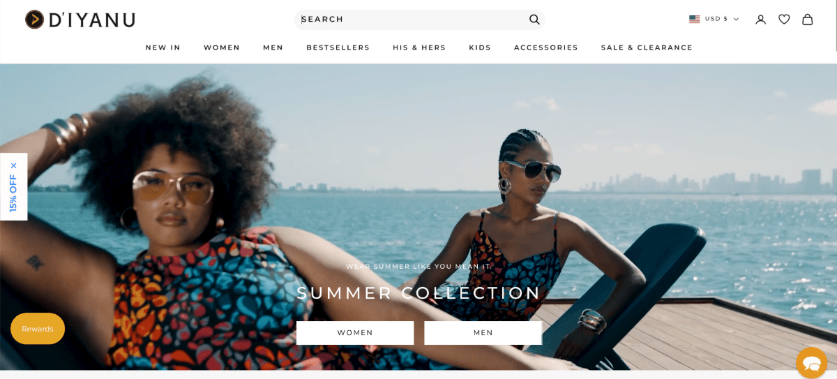
All of the models in this video stop and confidently pose for the camera. It’s a great pairing for the bold, colorful clothing they’re wearing too.
Now let’s take a look at a brand like Carter’s. This is the company’s mission:
“Everyone at Carter’s has a passion to make stylish, affordable products for every growing family. It drives our designers who dream up the next big thing, and it drives our store associates who guide you to a cozy take-me-home set or the cool graphic tee your toddler can’t stop talking about.”
This is a practical and affordable children’s clothing company that aims to make clothes that every family—with kids of all ages—can wear.
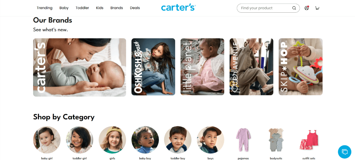
If you look through the imagery on the site, you’ll find a lot of versatility here. From the ages of the children to the kinds of clothes they wear.
Also take notice of the details around the photos. While you may find the occasional photo that looks like a kids’ photo shoot, most of them depict realistic settings. From the kids hanging outside together to the babies playing on the floor at home, parents can relate to these concepts.
When selling products like clothing, creating a relatable or aspirational setting can be important. But it’s not always necessary.
Take MyEllement Boutique, for example.
The initial goal of this brand was simple enough. As the owner and founder explains:
“I had a deep desire to help women feel confident, beautiful, and ultimately in their element!”
The problem was, she was experiencing struggles with finding the right color clothing for herself. As a result, she felt like the company was falling short in terms of serving their clientele.
“That’s when our journey began! In 2019, we partnered with our local House of Colour franchise to sort all of our clothes by season. Taking the guesswork out of shopping for women that knew their best colors.”
It’s a really interesting concept, enabling women to shop by color. Their approach to imagery is also pretty unique.
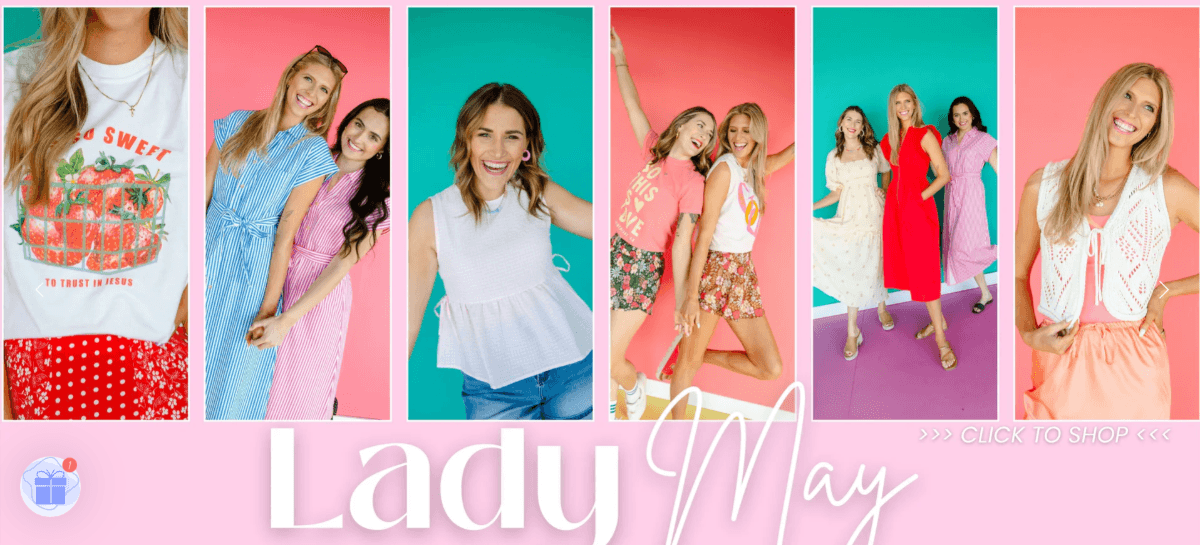
Unlike some brands that use image backdrops and accessories to convey luxuriousness, sportiness or other characteristics, MyEllement doesn’t do that. Their product and promotional imagery is set against colorful backdrops like the ones you see above. This allows them to cater to all kinds of women while playing into the color focus that drives their brand.
This also puts the focus on the models. They have done a great job selecting images that convey happiness and playfulness through their facial expressions and body language.
Wrapping Up
The good news is, if you’re at the stage where you’re looking for images for your brand, you’ve probably thought through some of these questions before. Once you know who your brand is, how it fits into the lives of your users and how you want them to feel, you can start working on curating your imagery.
If you’re not sure if all the images you want to use fit together and within your brand identity, develop a mood board and style guide. Once you have them all in one place, these tools will allow you to clearly see what you’re working with.

Suzanne Scacca
Freelance Writer & Consultant