6 Interior Design Styles for Website Inspiration

Want your brand’s digital “home” to feel as cozy and welcoming as your own home? Consider these interior design styles for inspiration as you design your site.
Whenever visitors come into your home, you want to give off a good impression, right? Ultimately, you want them to feel safe, comfortable and maybe even a little envious of what you’ve done with it. Certain interior design styles and choices can help make this a reality.
If you think about it, a website is a lot like a brand’s home. If you’re looking to create a digital “home” that feels comfortable, builds trust and also impresses visitors, tapping into a popular interior design aesthetic could be useful.
In this post, we’ll take a look at six interior design styles and ways you can use them in web design.
6 Interior Design Styles to Inspire Your Web Design Work
Before we jump into the following interior design trends, make sure you really know your target audience. Because while an interior design trend like hygge might work well for a yoga studio website or wellness app, it probably won’t be as effective for a financial services app.
Before choosing an interior design style for inspiration, spend some time fleshing out your user personas, revisiting your brand’s vision and values and establishing the goals for your digital product.
When you’re ready, here are some interior design aesthetics to consider:
Hygge
Although hygge is a Danish word, it has its origins in old Norwegian. The general idea of hygge is coziness. And while we often associate coziness with warmth in the winter, it’s a concept that works well all year round.
When it comes to interior design, hygge exudes the following traits:
- Accessibility
- Approachability
- Softness
- Comfort
- Light (especially natural sunlight)
- Minimalism
- Naturalness
Hygge has an inviting style that beckons to people to come inside and relax.
Imagine yourself out playing or skiing in the snow all day. Then you enter a home or lodge with a roaring fire and lots of cozy blankets to warm up beneath. If we equate this scenario with websites, then a hygge-inspired web design would be one that provides a safe and inviting space for people tired of the coldness of the internet.
The Hyde & Hare website is a good example of hygge web design.
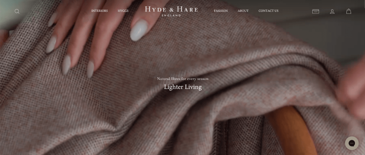
It’s not just the cozy, soft imagery of the ecommerce company’s products that make this a hygge-inspired website. The site is very light on copy and the typography is small. It’s as though the brand wants to speak softly while allowing their comfy products to fill up the space and tell their tale.
Hygge works in this case because of the brand’s personality as well as what they sell. It could also work for wellness companies, local retailers and female-centered business concepts.
Industrial Chic
Industrial chic is an interior design style that came about as a form of restoration.
Property owners and interior designers took defunct factories and warehouses and turned them into stylish living quarters. At the same time, they maintained the raw, industrial look so as not to lose touch with their roots. It also gave these spaces a unique charm compared to the sleek new properties being built up around them.
In web design, industrial chic is very much a style of brutalism. It just has more panache than more traditional brutalism.
Here are some of its more distinctive traits:
- Honesty
- Transparency
- Rawness
- Practicality
- Geometric
- Sober or monochrome palette
- Soft lighting
- Warm colors
We can’t build websites with bare materials like concrete, stone or exposed beams. However, iIndustrial chic does still feel somewhat exposed.
For example, this is the homepage footer for Alley Cat Lounge:
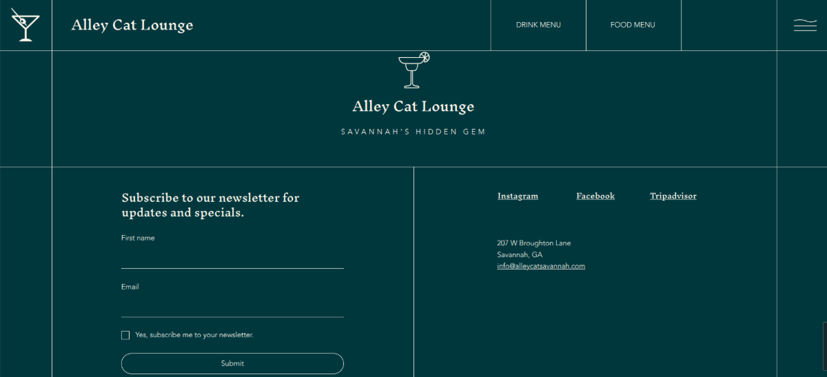
The page transitions between fullscreen imagery and exposed grids. In this screenshot, we see grid lines around the header, navigation links and page gutters. Although it gives the page a somewhat unfinished look, it simultaneously looks sophisticated. The fine lines and the deep color palette help achieve this effect.
Industrial chic is a good choice for brands that prefer practicality to ornateness, but that still want to appear elevated or stylish. Balenciaga, for instance, is another brand that does this style well.
California Coastal
When you imagine a coastal style in general, you might see lots of stark whites and deep blues as well as anchor and seashell symbols everywhere. They’re certainly prevalent here in the beach community where I live.
But California coastal is different. While you still get that laidback and breezy vibe, it doesn’t feel as stereotypically nautical.
California coastal is synonymous with the following traits:
- Serenity
- Comfort
- Timelessness
- Sophistication
- Cleanliness
- Minimalism
- Warm whites and sandy tones
- Hints of blues, greens or terracotta
- Natural textures
This type of styling can feel luxurious, but at the same time very grounding.
I really like the Hotel Sylvia website as an example of California coastal. I found more obvious ones like Cipriana Residences, but I feel like this demonstrates how versatile the style can be when you’re willing to play with color and texture.
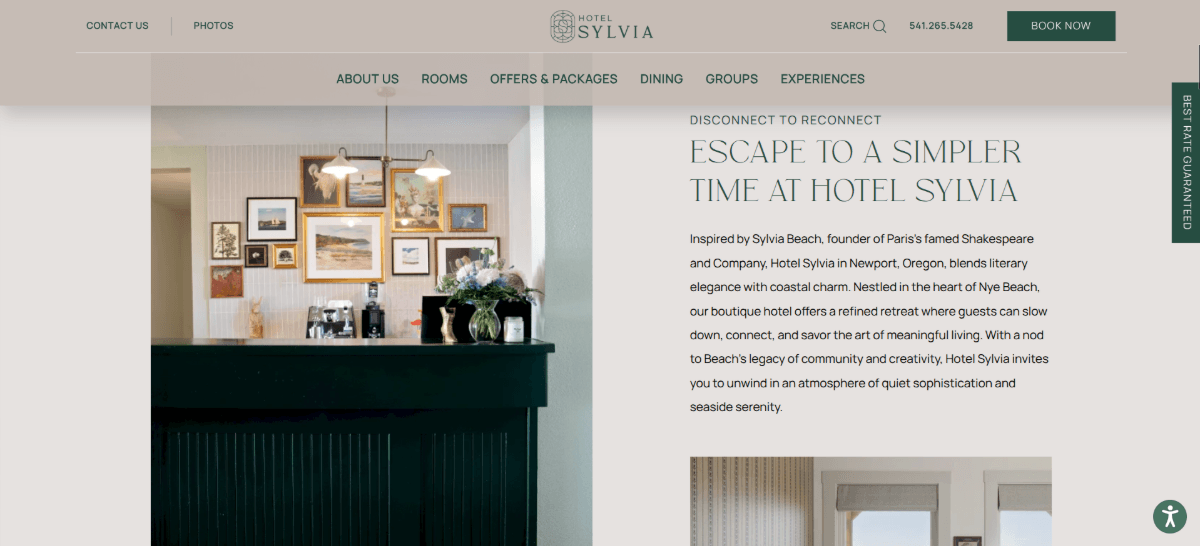
This style feels very grounding and safe. At the same time, it does exude sophistication.
While brands that operate close to (or on) the water may be the most likely to adopt a California coastal style, this aesthetic is quite versatile. If your brand offers nature-based products or holistic services at a higher price point, this might be a style worth experimenting with.
Biophilic
Biophilic refers to the tendency to interact with nature—not just nature either, but other life that exists within it (e.g., plants, animals, the earth, running water, etc.). As such, biophilic interior design brings different aspects of nature indoors.
People who love plants aren’t the only ones who appreciate this aesthetic. This style is meant to bridge the divide between humanity and its natural environment. And with the growing popularity of Big Tech and AI, it’s something that many people are craving at the moment.
Here are some of its defining traits:
- Connectedness
- Harmony
- Wellness
- Natural light
- Natural materials
- Sustainability
- Earth-inspired colors
- Organic forms and patterns
If your aim is to foster a deeper connection with your target audience and your brand has some ties to nature, a biophilic approach to web design could work. Take Lancaster Farmland Trust, for example.
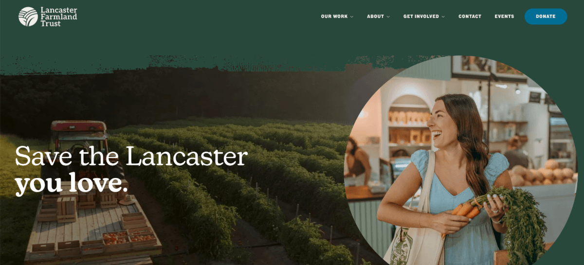
The website still feels, looks and acts like a website. However, there are elements of it that make it feel more homegrown. In this screenshot, for instance, notice the border between the header and the hero image. It looks as though someone hand-painted the dark green background onto the page. This gives the content a more organic feel to it.
As for who can use biophilic design to their advantage, it would definitely be useful for brands that operate in nature—arboretums, zoos, botanical gardens, hydroponic farms, etc. But nature-centered brands like beauty companies and healthy meal prep businesses could utilize it as well.
Kitsch
Kitsch is a word of 19th century German origin that referred to art that was low-brow and lacking in artistry. These days, kitsch has become something that’s much more accepted and has taken on a positive connotation.
A kitsch interior design is one that’s campy, eccentric and perhaps a bit nostalgic. People don’t necessarily lean toward kitsch because they lack taste. Instead, they prefer it because it makes them feel deeply.
Here are some of the defining characteristics of kitsch:
- Nostalgic
- Whimsical
- Sentimental
- Playfulness
- Quirkiness
- Boldness
- Maximalist
- Exaggeration
- Bold choices—colors, fonts, layers, compositions, etc.
If you’re looking for a visually distinctive web design style, kitsch will definitely give you that. You just have to be careful about taking it so far that it leads to sensory overload.
I think Ryan Haskins Design is a nice demonstration of how to play with kitsch but still create a user-friendly UI.
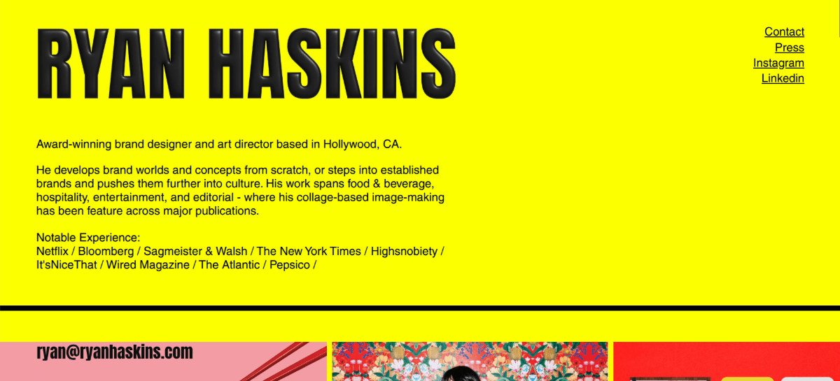
The one-page website is well-organized. However, it’s a hodgepodge of content, often laid out and designed in ways that’s not typical of what users encounter on other websites. There are also some bold color and stylistic choices, like the 3D-looking font and texturing of the artist’s name in the header and footer.
In order to create a kitsch-inspired website, you need to make sure it works well with your brand identity. It’ll likely be best for artist portfolio sites, retro-inspired brands and ecommerce companies that specifically target Gen X and Millennials.
Dark Academia
Want something darker and moodier for your website? Then the dark academia aesthetic may be more your style.
Dark academia is an interior design style that fuses together a number of old-world elements—intellectualism, fashion and architecture. While this aesthetic might not be super common, you’ve likely seen it before, even if only in the movies.
Imagine you’re walking through a mansion and the owner invites you to their study. The room has dark features but it’s not a complete blackout. There’s soft overhead lighting or ambient lighting coming in from the windows. There are books and papers everywhere. And there’s ample furniture for lazing about, usually made from worn leather or crushed velvet.
This style is generally depicted as:
- Dark
- Moody
- Mysterious
- Vintage
- Romantic
- Intellectual or artistic
- Natural, aged textures
- Rich color palettes (especially deep blacks, browns and greens)
Not every brand is going to be able (or even want) to pull off this aesthetic. But ones like The Library at The Public will find that it gives them a distinctive edge over the competition.
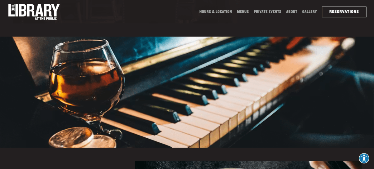
This website is for a supper club that’s inspired by New York City and named after the first public library in the United States. The dark academia interior design depicted in the photos is perfectly complemented by the dark theme of the website.
As for which types of businesses can adopt this aesthetic, the most obvious would be literary and intellectual institutions. Harvard University, for instance, plays on this theme, but in an understated way. Restaurants, speakeasies and tattoo parlors are other establishments that could adopt this style, so long as it goes along with their interior design.
Wrapping Up
Interior design can be a great source of inspiration for web design.
For starters, if you can capture an aesthetic that people are already familiar with, it may make the digital experience instantly feel more comfortable.
Secondly, one of the main aims of interior design is to help users fluidly navigate a space. So, there tends to be a lot of order and reason within these styles that lend themselves well to creating user-friendly interfaces.
Also, interior designers use colors, white space, textures and other assets to bring everything together. If you’re struggling to create a unique UI that feels cohesive, these examples could serve as helpful inspiration.
As you can see from the interior design styles above, there are many websites already reaping the benefits from creating comfortable, navigable and relatable digital spaces. If you don’t find an aesthetic that fits your vibe in this list, have a look at other examples of interior design. You might find inspiration in a style that feels a bit closer to home and that resonates more effectively with your niche audience.

Suzanne Scacca
Freelance Writer & Consultant