4 Best Practices for Credit Union Website Maps

More than half of all credit union members prefer to visit branch locations in person. With a map feature of your own, you can provide your users with all the info they need to take the next step.
Recent data from PYMNTS revealed that 51% of credit union members prefer to visit in-person locations. What’s more, these visits happen fairly frequently.
According to DBSI, 45% of Americans go in-person to a bank or credit union every 30 days. And about 25% of consumers won’t even consider doing business with one if they don’t have a location nearby.
Knowing how important the in-person experience continues to be in personal banking, your website helps members find local branches. In this post, we’ll take a look at how an interactive map is a must for credit union websites and some tips for helping your members get the most from it.
A credit union website map is an interactive branch and ATM locator that helps members find nearby locations, operating hours, available services and directions. The best credit union maps combine location search, service filters, clear branch information and actionable options such as directions or appointment scheduling.
What Are the Best Practices for Credit Union Website Maps?
While a list of locations is helpful to include on your website, an interactive map is a must as well. Everyone has different preferences, so including different ways to access information about your financial institution’s locations will help improve the user experience for all.
Let’s have a look at four things you can do to build out a user-friendly map experience on your website:
1. Keep Credit Union Map Details Simple
When it comes to credit unions and other traditional banks, there’s a ton of information to share about each location, like:
- Branch address
- Distance from user
- Phone number
- Operating hours
- Location summary
- Banking features
Somewhere on your website, you’ll need to include all the pertinent details about each location. But you’ll have to decide how much of it should go inside or around the map.
The ultimate goal when creating a location mapping experience for your credit union is to keep the interface looking tidy. Between search filters, map pins and location blocks, there’s a lot going on.
Here are some ways you can minimize the amount of information present in the map:
Format 1: Relegate the Details to a Separate Page
One option is to keep the details as basic as possible on the Locations page and map. This is what Valley Strong does.
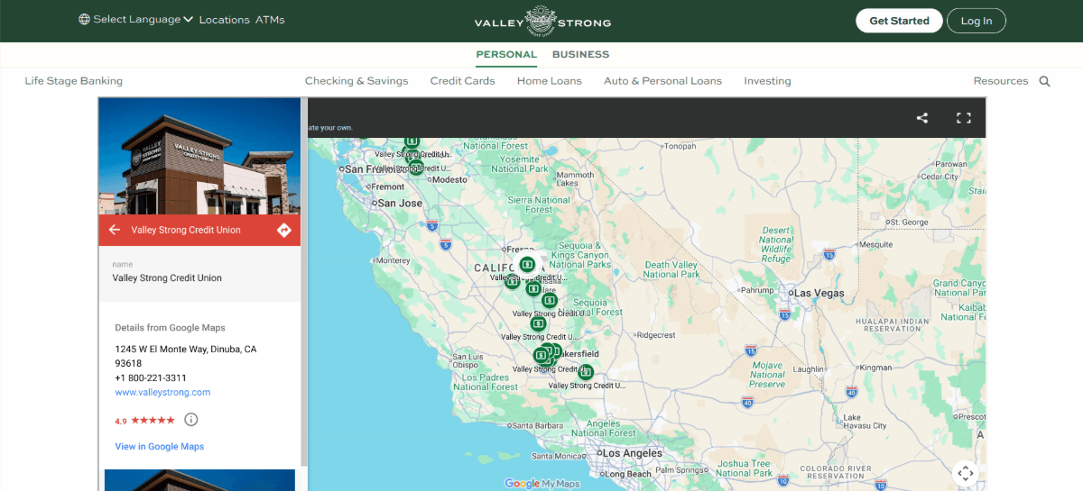
Although there is pop-out information on the side when someone selects a location pin, all it shows is information from Google Maps. So they’ll find the branch location, phone number, Google star rating and images from the Google Business account.
To learn more about the location from the credit union, the user has to scroll below the map, find the location, and click on the “Branch Details” button.
This is a viable option for a few reasons.
For starters, it gives the Locations page and map a clean and usable appearance.
Secondly, a separate page offers more space for details than a sidebar typically would allow for. For instance, this credit union has information about the branch manager, wealth management services and social media.
Lastly, it’s good for local SEO. Having separate pages for each location means they can rank for local “near me” searches and not just generic credit union/banking searches.
Format 2: Summarize the Details in the Sidebar
Another option keeps the map interface mostly clear of details about the branch. When a location pin is clicked in the menu, the details appear in a sticky left sidebar.
We see how this can work on the American Heritage Credit Union Locations page:
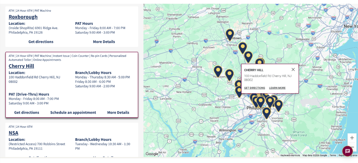
What’s nice about this design is that the sidebar and map are synced. So, when a pin is clicked in the map, the sidebar instantly scrolls to the corresponding location block. And vice versa
Here we see how the two complement one another. The pin includes the location address as well as links to “Get Address” and “Learn More.” The sidebar expands on this, providing info about:
- Features (in the breadcrumbs at the top)
- Location address
- Branch/lobby hours
- Drive-through hours
- Links for directions, appointment scheduling and learning more
By putting the info in the sidebar, it keeps the map clutter-free and other pins easy to see and click on if the user doesn’t find what they’re looking for in the first location.
Format 3: Add Details in the Map
Typically, interactive maps will include pop-up info over a location. But there usually isn’t a ton of space to work with (see previous example).
Logix is one such credit union that’s found a way around this obstacle.
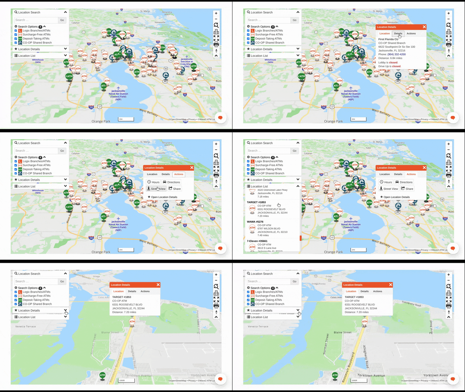
This map, in general, is designed with a minimalist mindset. There is a Location Search and filters box in the top-left corner which is automatically opened. However, like the other two blocks along the left side, this one can be minimized and tucked away.
This is great as it allows users to focus on the map and find the right location for the services they need.
As you can see in the video, when a user clicks on a location pin, a tabbed pop-up appears. The three tabs include info on the Location (address and distance), Details (features and limitations) and Actions (buttons for Hours, Directions, Street View and Share).
This enables users to get pertinent information about location without having to leave the map. For users who want these details presented in a larger space and all at once, all they need to do is open the Location Details panel on the left.
2. Add Branch and ATM Search Filters
Most maps you encounter online come with search and filter capabilities. Your credit union’s map should be no different.
To start, there should be a search bar where users can type in location names. This includes the branch name, street address or even just the town. By allowing for this flexibility, you’ll cater to a larger segment of users.
The search bar should also come with auto-populate capabilities, so the user doesn’t have to do all the work. This can also help cut down on errors that might yield zero results simply because of a typo.
Texans Credit Union demonstrates how to make a search bar that’s both simple and smart:
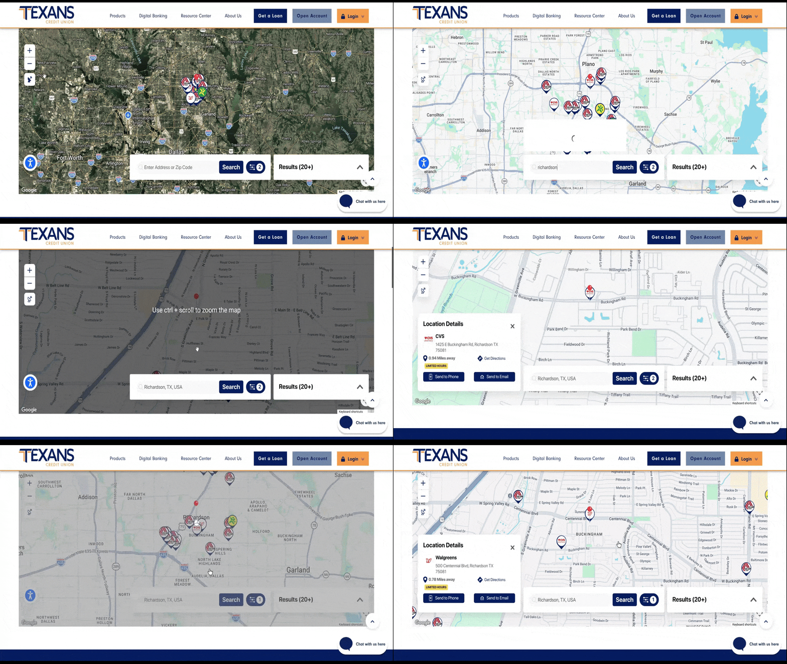
As users begin to type their query, the search bar provides matching results which they can click. In this case, I searched for “Richardson” and the map immediately zeroes in on the town of Richardson, TX.
This allows users to focus their search efforts on a specific geographical area and then zoom out only if they can’t find what they’re looking for.
Filters are also important, though it depends on your credit union. For instance, Royal Credit Union has locations with different banking capabilities. Members looking for actual walk-in branches are able to hide any locations that don’t fit this criteria.
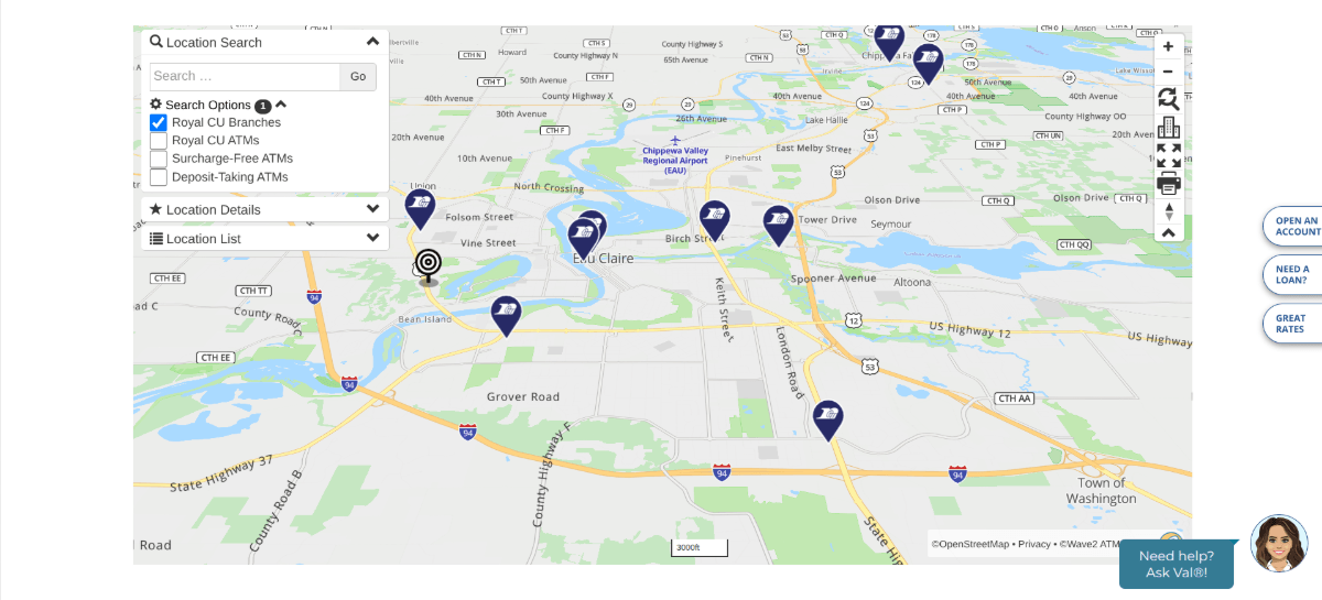
They’re able to do the same based on the type of ATM they’re looking for. This is helpful if your credit union has ATMs at locations not associated with a branch as well as locations that offer benefits like no surcharge fees or that accept deposits.
You could also use filters to help users find branches that offer certain features, like 24/7 ATMs, online appointments, coin counters and more.
Another thing you might want to do is include a sorting option for the map’s list results. Users would be able to sort the list by name, distance or another factor. This would allow users who start with the list and then refer to the map to have better control over their search experience.
3. Make Branch Information Easy to Scan
Even if you’re only including basic details about each location—for instance, address and operating hours—a lack of formatting can make the info block challenging to read.
I think one of the reasons why this happens is because designers try to use out-of-the-box mapping solutions that weren’t made for credit unions.
For other businesses, it might be OK to include a few scant details over a map pin. But credit union members often want more than just an address. So, it’s important to find a way to provide as much information without overwhelming the search experience and interface.
As we’ve seen above, you can place branch details on different pages or in different areas of the map (like a sidebar). And I think if you go that route, it’ll allow you more control over formatting all that data.
One example I particularly like is Altura Credit Union.
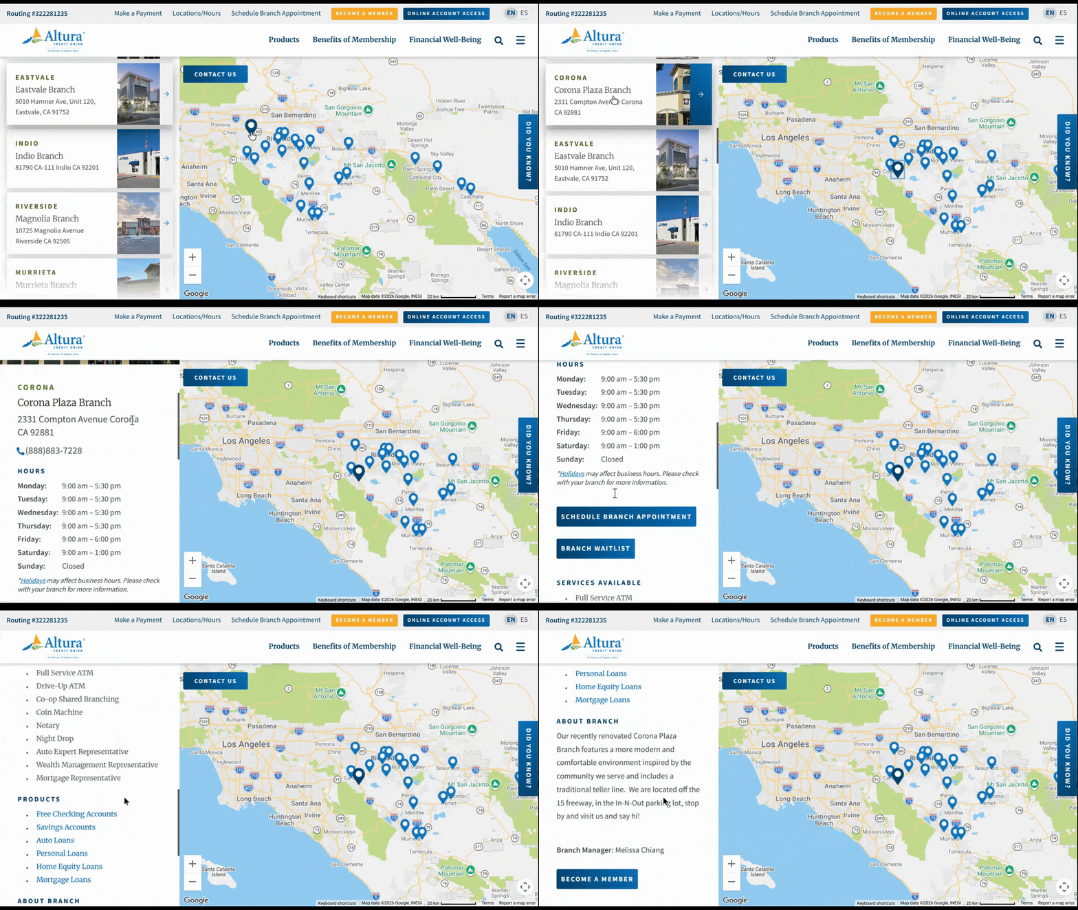
Now, the map experience in general feels a bit underwhelming at first. You click on the map and all it does is highlight the branch name on the left. However, when you click on that info block, that’s when you see all the details.
The scrollable sticky sidebar is beautifully formatted. There’s a lot of information here, but the spacing, headings, bulletpoints, buttons and overall formatting choices make it easy to read through.
If you decide not to create separate location pages for your credit union site, this is a great alternative. The sidebar includes all of the info you’d find on one of those pages, only it allows your users to stay on the Locations page. If you find that they search multiple branches in a single sitting, this approach would be the most user-friendly for sure.
Of course, there are SEO benefits to having separate locations. If you choose to do that, then you don’t need to include that many details within the map or sidebar. However, formatting still matters.
Here are a couple of others I think do a good job of formatting:
Langley Federal Credit Union has an interactive locations map. When a user clicks on one of the pins, the map zooms into that location and an information box appears in the bottom-left corner of the map.
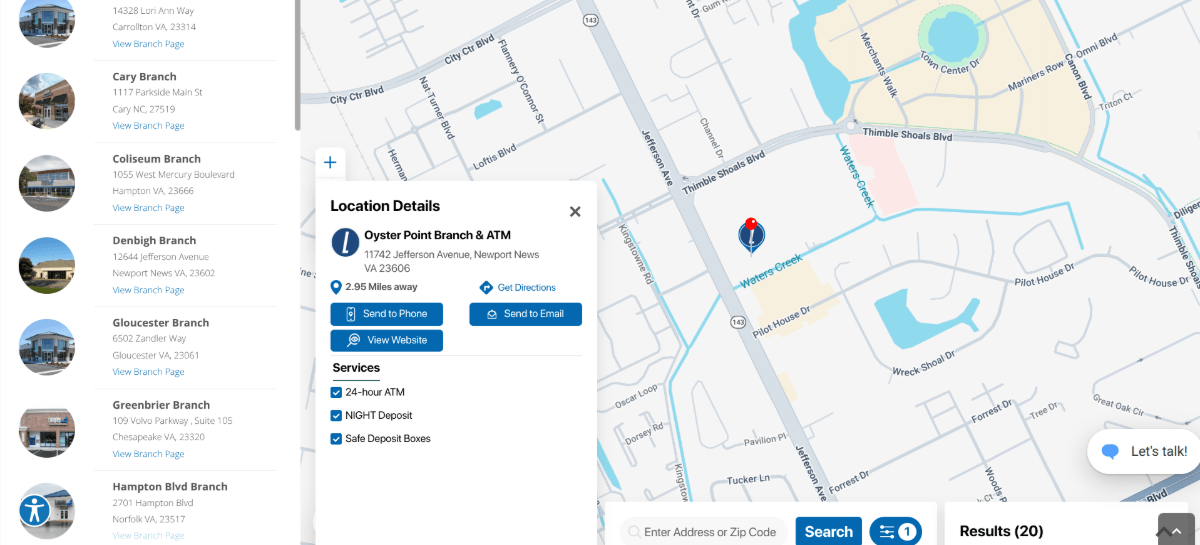
This is a really well-organized and cleanly formatted location card. It includes location details like:
- Branch name and type
- Address
- Distance
- Link for directions
- Link to landing page
- Checkbox list of available services
There are also buttons that allow the user to send details to their phone or email. I’ll talk more about why this is a good mapping feature to have on credit union websites in the next section.
Industrial Federal Credit Union (IFCU) is another one that formats its data well.
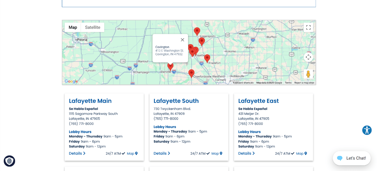
Unlike Langley which keeps the info inside the map, IFCU moves almost all of the data out of the map (save for the location address). There’s no sidebar here. Just location cards located beneath the map.
The location cards look nice and are easy to refer to for details about location, phone number, lobby hours, Spanish speaking capabilities and 24/7 ATMs.
4. Add Clear CTAs to Each Location
Even if you only have a little bit of information associated with each location, there are likely dozens of branches for your members to look through. This can be a lot of information for them to process and it can easily create a feeling of overwhelm if the page is nothing more than an information dump.
To make things feel more manageable, your branch pins and/or info cards should include calls-to-action.
Usually, I would say limit your CTAs to one, maybe two for each location. But in the case of a credit union, you’re likely going to have people with a variety of needs.
- One person may be looking for banks that are open now.
- Another person may be looking up the branch manager so they can call them about an experience they had.
- And another might want to schedule an appointment to open an account.
While this information exists in other areas of your site, there are ways to organize your map so that it can all be included here. Instead of choosing one link per location card, give your users a number of next steps they can take.
Credit Union One, for instance, includes three buttons in each location card:
- Details (which links out to the individual location page)
- Directions (which links out to Google Maps)
- Call (which opens your device’s dialer)
![On the Credit Union One Branches & ATMs page, users will find three call-to-action buttons on each location card. There’s a red “Details” button, grey “Directions” button, and a “Call [phone number]” text link.](/images/default-source/blogs/2026/cuone-map.png?sfvrsn=38b550da_2 "Credit Union One location map")
The buttons and text link are easy to notice amidst all the text. And the labels clearly describe what action happens next.
This approach keeps things nice and simple. If users want to do something other than these actions, they’ll find most of them on the Details page.
Here’s another example of how to integrate buttons within the map experience. This one is on the Premier America Locations page:
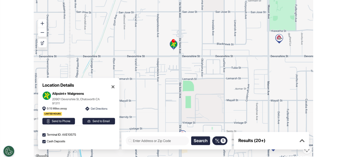
There are three buttons on this one as well:
- Send to Phone
- Send to Email
- Get Directions
“Get Directions” is a must-have CTA for the Locations page. But the other two you don’t always see. So, why would the designer include them?
It’s likely part of an omnichannel customer experience strategy. Their user research and testing may have revealed that users frequently bounce from one device to the next. “Send to Phone” would allow them to seamlessly do this.
Or their research could have revealed that it takes users a few visits before they’re ready to convert. Rather than leave it up to the users to remember which credit union site they visited or which location they were interested in, the “Send to Email” button enables them to forward that info to themselves or to share it with others.
When choosing CTAs to add to your Locations pages, use buttons/links that make the most sense for your target users. If you haven’t gathered any data on them yet, check back in a few months and adjust your map UI once you do.
What Should a Credit Union Location Map Include?
A credit union location map should help members quickly identify the right branch or ATM and take the next step. Useful information can include:
- Branch name and address
- Distance from the user
- Operating and lobby hours
- Phone number
- Available banking services
- ATM type and availability
- Directions
- Appointment scheduling
- Accessibility or other location-specific features
For credit unions with many locations, filters can also help members narrow results by branch type, ATM capabilities or available services
Wrapping Up
With over 50% of credit union members preferring to visit a local branch, interactive maps are an essential component on credit union websites. But embedding a map with pinned locations into your website isn’t enough.
The Locations/Branches page on your site can help members achieve a number of outcomes. For instance:
- Locate and get directions to the nearest branch.
- Get info on the branch’s operating hours.
- Contact the branch manager.
- Find a branch that offers specific services.
- Schedule an appointment with someone.
- Locate a 24/7 or fee-free ATM.
In order to provide members with all of the info they’re looking for as well as links to next steps, your map has to be designed well. This means deciding which information to include and what to leave out, where to place the info, and how to organize it so the interface doesn’t look cluttered or feel overwhelming. You can use the best practices laid out above to cover your bases.
By the way, if you need help building a fast, secure, compliant and user-friendly credit union website, explore how Progress Sitefinity CMS can help.

Suzanne Scacca
Freelance Writer & Consultant