Why A/B Testing is Important for Website & Marketing Success

Without a solid A/B testing strategy, website updates are just a guessing game that could cost you. Learn why A/B testing is important for website and marketing success.
Many times, we redesign our websites or make minor tweaks to them based on industry trends or our own personal assumptions. (“Well, if everyone else is collecting leads with a pop-up, then we should be, too.”)
In some cases, we get it right. After all, web design is an ever-evolving organism that needs to keep in step with consumer expectations and behaviors. So, if we feel as though our websites have somehow fallen behind, our gut is probably steering us in the right direction that a change is needed.
The only problem is, without a solid A/B testing approach, this all just ends up being a guessing game.
Sure, we know who our target audience is. We understand their pains and how the website will call their attention to them while presenting a much-needed solution. And we believe that designing the on-site experience a certain way will motivate them to engage and convert.
But we don’t 100% know what the outcomes will be.
The only way to know for sure is through A/B testing. With A/B testing, you can stop relying on assumptions, theories, and follow-the-leader trends and start implementing meaningful changes based on real user data.
Today, I want to examine why regular A/B testing is important for your website’s UX as well as your marketing performance. I also want to look at various cases when A/B testing is an absolute must for working out the kinks in your website.
What Should Your A/B Testing Process Look Like?
Do you remember learning about the scientific method back in school? The process served a number of purposes. First, it removed any bias or erroneous thinking from the equation, so that all we were left with were facts. Secondly, it gave us a predictable way to collect measurable data and make informed decisions moving forward.
Best practices for A/B testing are basically the same process, but for marketing. It works like this:
Observe
Analytics show us that the homepage subscription pop-up converts at a rate of 0.5%.
Question
Why aren’t more people subscribing to the newsletter? Our blog readership numbers are high, so we know they find our content valuable and would enjoy being informed when new articles are available.
Research
With the help of heatmaps and session recordings, we see most people dismissing the pop-up without taking the time to read it or fill it out.
Hypothesize
If we display the pop-up after a timed delay on our blog posts, then our subscription rate should go up to at least 5%.
Experiment
With Sitefinity A/B testing, we design an alternative scenario whereby 50% of blog visitors only see the pop-up 30 seconds into reading a blog post. The other 50% continue to see the subscription pop-up a few seconds after entering the homepage.
Test
With the “A” and “B” versions in place, we set a start and end date for our test. It needs to be enough time to collect sufficient data that gives us a winning version we feel confident about. It also needs to take place during a stable period of traffic.
Our blog receives 5,000 visitors a day, so we believe that seven days is enough time to collect the data we need.
Analyze
Upon completion, we review the test results. Version “B” wins with a conversion rate of 6.2% compared to the 0.5% conversion rate we continued to see with Version “A.”
Implement
The significant difference between conversion rates justifies committing Version “B” to the site. We implement the update and monitor the situation to make sure the new user experience continues to be well-received.
Iterate
We start considering other ways to improve the conversion rate of this pop-up. Timing. Form layout. CTA copy. Colors and images. And so on. This gets us thinking about other things on the blog we could tweak to keep readers engaged, which also gets us thinking about how we approach them over email. There’s just so much we can do.
This is just one example of how you can turn an observation into a huge win for your company.
What Kinds of Wins Are We Talking About?
Really, it depends on what kind of problem your website is experiencing and what your hypothesis is for fixing it. But A/B testing has the potential to:
- Remove friction along the user journey
- Build greater trust with visitors and prospects
- Improve engagement with your content
- Pull in more leads
- Increase sales
And this all happens because you’ve taken a data-driven A/B testing strategy to updating your website.
Think of A/B testing as a way of collecting valuable user feedback.
While this is something you could certainly do early on with user experience testing or after launch with a feedback survey, the findings you get from those approaches are open-ended and subject to tester/reviewer bias.
With A/B testing, you end up with verifiable and reliable data that can’t be misinterpreted. This allows you to more confidently update your website because you know exactly what your visitors will respond positively to. And because A/B testing is a never-ending process (at least, it should be), your website and the user experience will only get better as time passes.
When’s the Right Time to Begin A/B Testing?
You can A/B test practically anything on a website, from the color of your hyperlinks to entire landing page designs. But A/B testing takes time and resources. You can’t afford to spend weeks waiting around for a test to run on something you’re simply curious about.
You should save A/B testing for variables that will have an impact on your key performance indicators (KPIs).
That means the “then” statements in your hypotheses should revolve around improvements on things like:
- Time on site
- Bounce rate
- New vs. return visitors
- Engagement rate
- Conversion rate
- Average order value
- Funnel completion rate
If you know your website isn’t doing the best it can, but are struggling to narrow down one area or element that needs fixing, check out these case study examples. You may find some inspiration on where to start.
When Mobile Conversion Rates Need to Be Better
Think with Google shared this case study from Car Finance 247.
When Car Finance 247 noticed that 75% of its traffic was coming from mobile, it realized that improving the mobile experience was going to be critical in capturing as many sales as it could. So, it redesigned its mobile homepage with speed optimizations in mind.
This was what the homepage looked like in 2018:
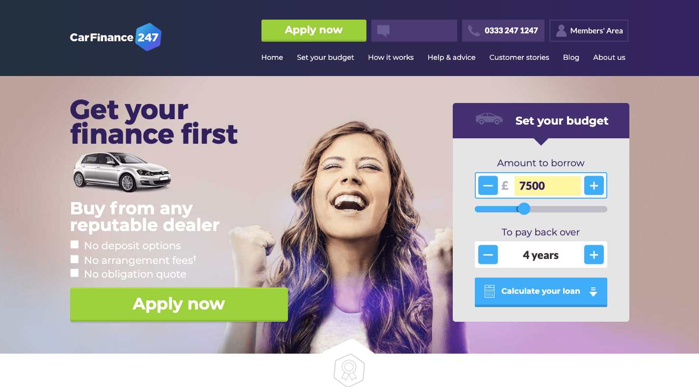
The 2018 homepage for the Car Finance 247 website contains heavier elements like an interactive calculator, clickable CTAs in the header, and much more content.
This is what the much more minimal design now looks like:
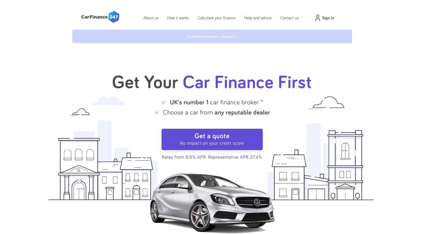
The 2021 version of the Car Finance 247 homepage is minimal, sleek, and contains just one major CTA outside of the navigation.
Thanks to the mobile-first redesign which cut down on a lot of distracting elements and lightened things up immensely, the Car Finance 247 homepage loaded four times more quickly than the original version. And, as a result, saw a 31% increase in conversions.
When Discoverability Is a Problem
This example also comes to us courtesy of Think with Google and it has to do with the impact navigation has on content discoverability (be it products, blog posts, etc.).
The website in question was that of Matalan. Specifically, they wanted to see if a search bar in the header of the mobile site would improve product discoverability and, thus, their conversion rates on mobile. And it did:
This is what the header looks like today:

The Matalan website was updated to include a mobile search bar just beneath the header.
While they experimented with other changes (like making the navigation bar stick to the bottom of the site), this design was the winner. And it led to a 49% increase in mobile conversions.
When Your Landing Page Leaves Visitors Confused
Data36 had a six-week online course that it advertised through a lengthy sales landing page. The owner of the site and course realized there were issues with the page since people who signed up kept coming to him with the same questions, confusions, and doubts.
The landing page could clear all of that up, but it would need to be much, much longer to do that. After looking at their metrics pertaining to time-on-site between high- and low-quality leads, they decided it was worth creating and testing the lengthier page.
This is what the resulting “B” version looked like compared to the original:
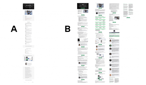
Data36 shares with readers what its landing page A/B test variables looked like. Version A is the original landing page and Version B is the lengthier page to test.
This longer page would take four times as long to get through. However, it proved to be worthwhile as serious leads were more than happy to go through all of it. Data36 nearly doubled its course signup rates with Version B.
When Checkout Is Too Tedious
Ubisoft Entertainment is a big brand in video games, so you wouldn’t think they’d have trouble selling any of their products. However, one game, in particular, had sluggish sales and they believed it was due to the on-site sales process.
With VWO’s help, Ubisoft simplified its multi-step and seemingly lengthy sales process from this:
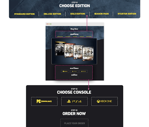
WO shows what Ubisoft’s old landing page consisted of: 3 sections: Choose Edition, a panel with the video game covers, Choose Console, and then finally an Order Now page.
To this scroll-less order page:
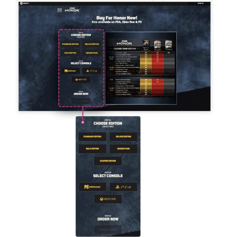
WO shows what Ubisoft’s new landing page consists of: all 3 order steps merged into one block along with a product comparison table.
VWO and Ubisoft merged all three steps into one block and removed the need for customers to scroll. They also add a product comparison table for reference.
This new version resulted in 12% more leads.
Wrap-Up
You can and should be A/B testing your website as much as possible. There are always tweaks you can make (big or small) that impact your visitors’ experience and, in turn, your engagement and conversion rates.
Just remember to focus on A/B testing opportunities that will help you work out major kinks in your site. If you’re not seeing positive changes in your KPIs as well as your visitors’ and customers’ responses to the site, it’s going to be very difficult to keep investing time into this ongoing process. Every test you run should move the needle forward, even just a little bit.

Suzanne Scacca
A former project manager and web design agency manager, Suzanne Scacca now writes about the changing landscape of design, development and software.
