Tips for Designing UI Grids

Although the grid is invisible to users, it’s always there. Not every designer or developer may choose to work within a set grid when building an interface. However, those who do find that they can work more quickly and effectively with it. Here are some tips for putting your grid to good use.
Unless you’re building websites and apps with elaborate templates each time, your starting point will likely be nothing but a blank page. While it’s easy to get carried away with all the things you want or need to put on that page, the best place to start is with a UI grid system.
This structure allows you to bring order to the randomness of the blank page. Which structure you use depends a whole lot on what kind of content you’re going to fill the page with. For instance, the grid for an online newspaper is going to look much different than a grid for a SaaS business website.
In this post, we’re going to look at the layout of a grid, some best practices for building one and some reasons why grid-based design is the way to go.
What Is the Grid in UI Design?
A user interface grid is a way of organizing a page or screen and consists of rows, columns and other layout elements. It provides the framework that designers and developers work within on a page.
Here are some very simplistic visual demonstrations of the key elements that make up a grid:
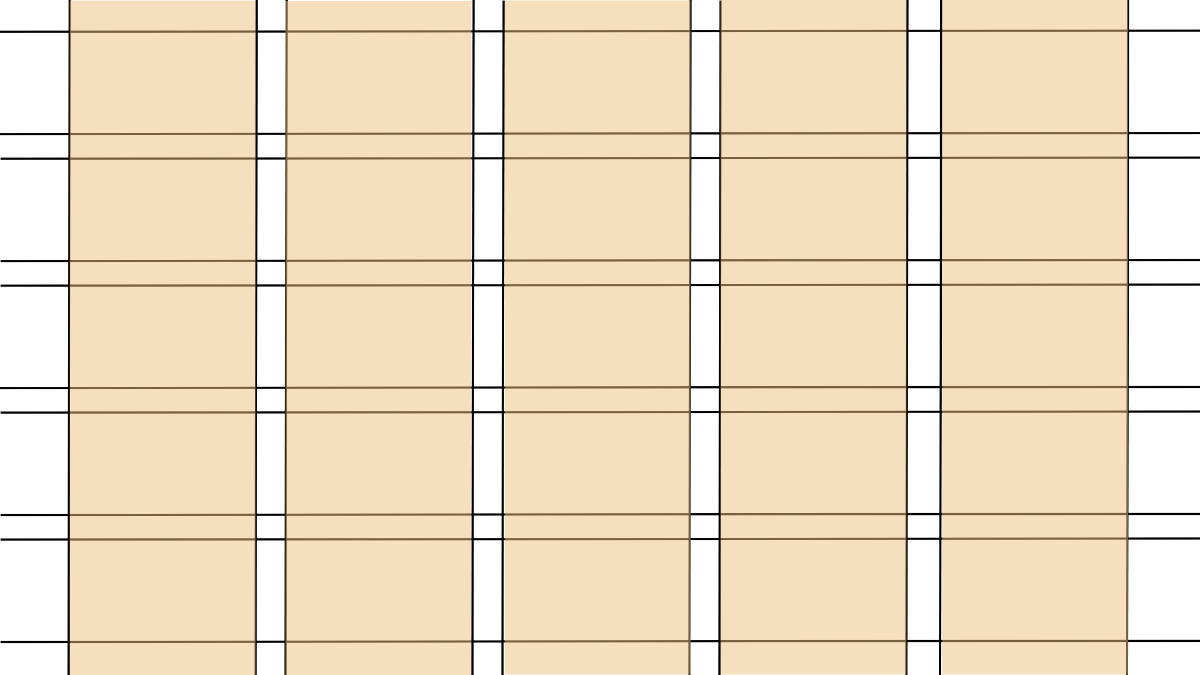
Columns are the wide sections that enable you to lay out, organize and align content vertically.
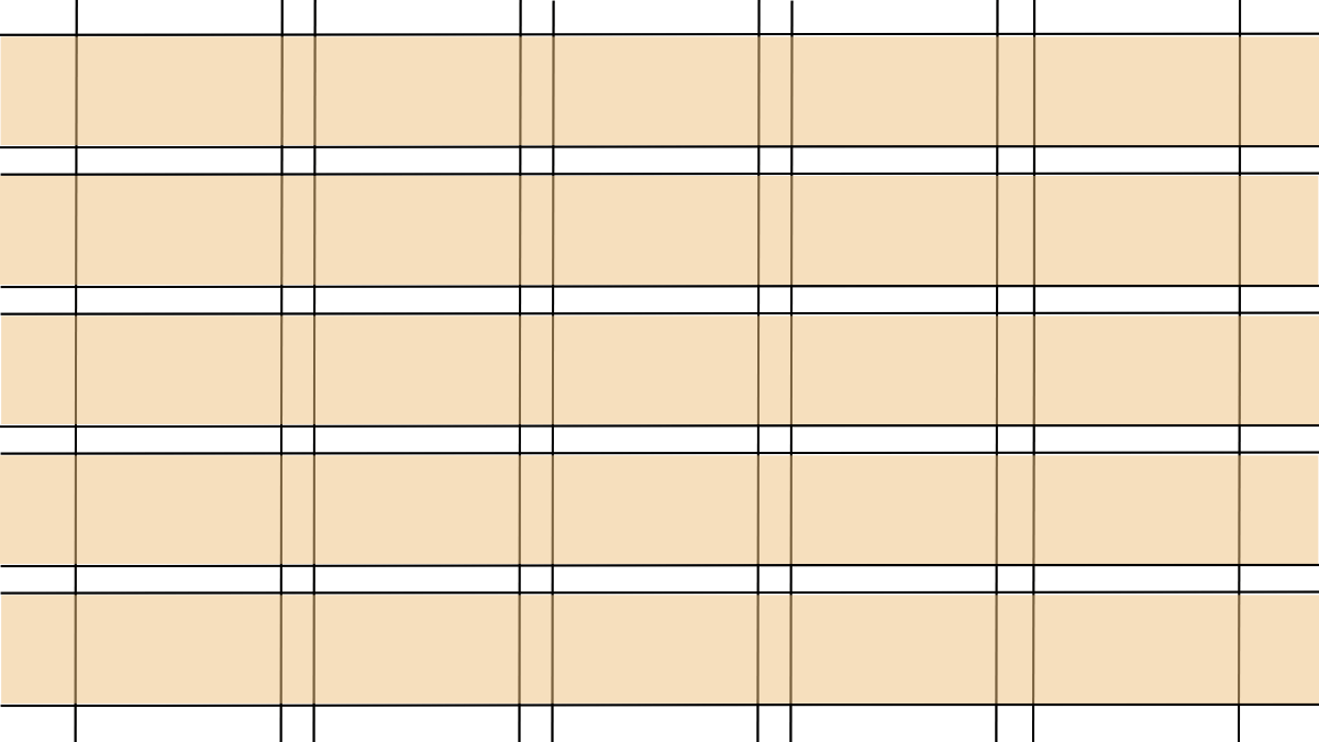
Rows are the sections that enable you to lay out, organize, and align content horizontally.
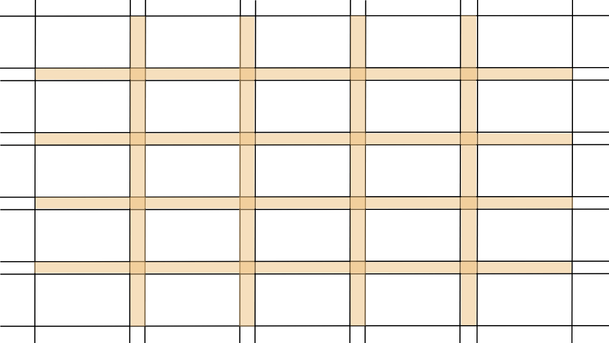
Gutters are the white space between each row and column. They give your content space to breathe:
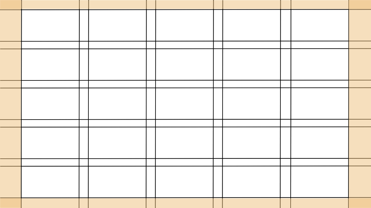
Margins are the white spaces that surround the content on each page or screen. They keep content within a container so that visitors’ eyes don’t have to bounce back and forth between the full width of the screen.
Modules are units or containers of content. These are the building blocks of UI design and can span multiple rows, columns and gutters.

This example demonstrates how the grid structure makes it easier to create well-balanced designs. We see this particular component layout when designing pricing plan structures.
Best Practices When Designing UI Grids
Here are some tips for setting up your grids and placing content within them:
Choose the Right Kind of Grid for Your Content
There are different kinds of grid systems you can use. The type of website you’re building will be one factor that determines the grid type. Another factor is the kind of content on the page.
Let’s look at some examples.
A manuscript grid contains a single column—just like a book manuscript. It’s one we commonly see for blog posts and other kinds of long-form informational content that’s meant to be read (versus browsed).
For example, here is a post from the Toast blog:
Notice, though, that the single column doesn’t span the full width of the content container or page. This is because it would create a challenging reading experience—too many words on a line can create strain and fatigue.
So, when using a single-column manuscript grid, the size of your margins is something to consider.
This example from OfferingTree’s Pricing page is an example of a column grid:
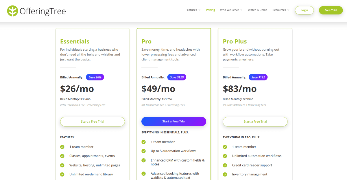
This type of grid is the next level up in complexity. In it, we see the content divided up into columns.
Now, this example shows clear borders around each container because it’s a pricing table. However, the dividers don’t always have to be visible so long as you group your content together and use white space to provide a clear delineation between each grouping.
Column grids are good for content like pricing tables, data-based grids and tables and more.
Another type of grid is the modular grid. This is a grid that brings rows into the mix.
Here we see the Personal banking page on the Zelle website:
Modular grids add visual complexity to the design, which is useful for keeping visitors engaged as they scroll down the page. So, instead of seeing content all in one column (or multiple columns), the visual rhythm changes from full-width rows to split columns and so on.
A modular grid looks well-organized and has some predictability to it. This is different from a hierarchical grid.
Here’s a screenshot from the Technology page of the Wall Street Journal that demonstrates what this may look like:

While the design still contains a mix of columns and grids, you can see how they’re not evenly sized compared to the Zelle interface. By building a grid in this asymmetrical fashion, the designer is able to organize a greater quantity of content within a smaller space.
At the same time, they’re able to convey information related to hierarchy (i.e., importance). For instance, the left-aligned posts with featured images are likely the ones that editors want to most be noticed. That or they’ve received the most engagement and will stay there until different news stories take over.
Hierarchical grids are useful for new and magazine websites, though you can also use them on websites with a lot of content. Think of something like a portfolio gallery or if you wanted to present information about services on the homepage in a more dynamic and eye-catching way.
Create a Design System for Your Grid
Once you have a grid type you want to use, it’s important to come up with rules for how you’ll use it and what goes in it.
To start, how many columns will there be on each page?
This is an important question to ask as it’ll influence how much content fits horizontally across the page.
For something like the Wall Street Journal that needs space for stories, ads and featured bits, you’ll probably need five or more columns.
An ecommerce shop, on the other hand, may only need three or four columns, like Natural Life:

And for business websites, you may only need three columns.
With the columns established, you can bring rows into the mix. The combination of columns and rows will give you the ability to define your visual language and rhythm for the website.
For example, this is a snippet from the Trulia home page:
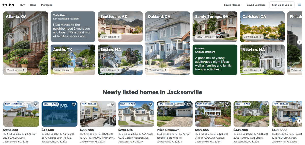
The designer has come up with rules for certain types of containers. In the first section:
- Featured cities like Atlanta take up two rows
- Regular cities like Austin take up one row
- Testimonials also take up only one row
In the second section, each card is designed equally. Featured images make up the top half of the row. The price, property size and address fill in the bottom half.
Notice that the text doesn’t run onto extra lines. Everything is neatly kept within its space.
This can be a challenge to do when the content comes from a writer as opposed to a list of specifications. So, if you’re creating blocks for your grid, make sure size limits or character restrictions are clearly conveyed to your writing or marketing team so they know how to properly fill the space with imagery and text.
For example, this is the call-to-action section on the Trulia homepage:
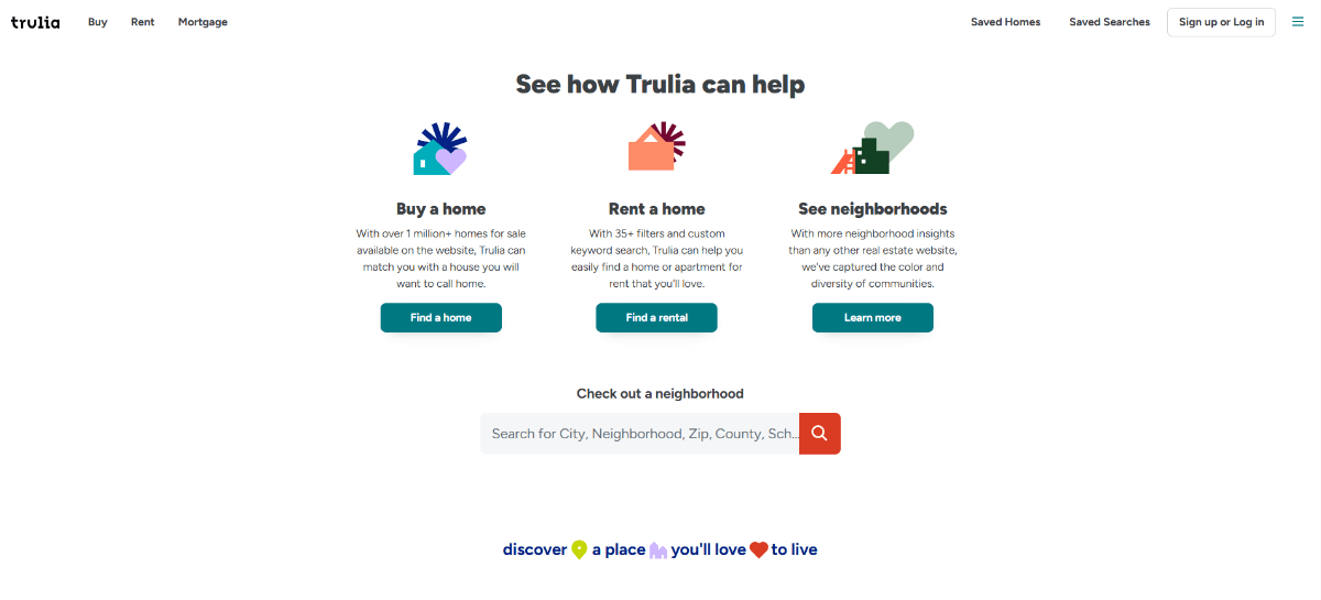
There are three columns of content here—“Buy a home”, “Rent a home” and “See neighborhoods.” Despite the differing length in the title text as well as the descriptions, all of the columns are equally sized.
I’ve been on both sides of this situation (as a designer and writer) and can tell you that it’s not always straightforward. As a designer, you might tell the writer they can fit up to three words in the headline and up to 20 words in the description. But look at the third content block—“See neighborhoods.” If I added an additional word, it would shift the headline to a second line and make the block longer than the rest.
What I would suggest is, first, creating a design system that defines what containers are used for certain kinds of content and how much space they take up in the grid. Then, come up with guidelines for how to fit and space content within each block. Finally, provide your writers and marketers with visual guidelines so they can see how images and text need to fill the space.
This will make it easier for everyone involved to contribute to the visual rhythm and balance you’ve established with the grid in the first place.
Utilize UX Laws to Improve Usability
UX laws explain how we can use spacing, sizing, organizing and positioning to visually communicate with our readers.
For example, here’s a container of content on the Asana homepage:
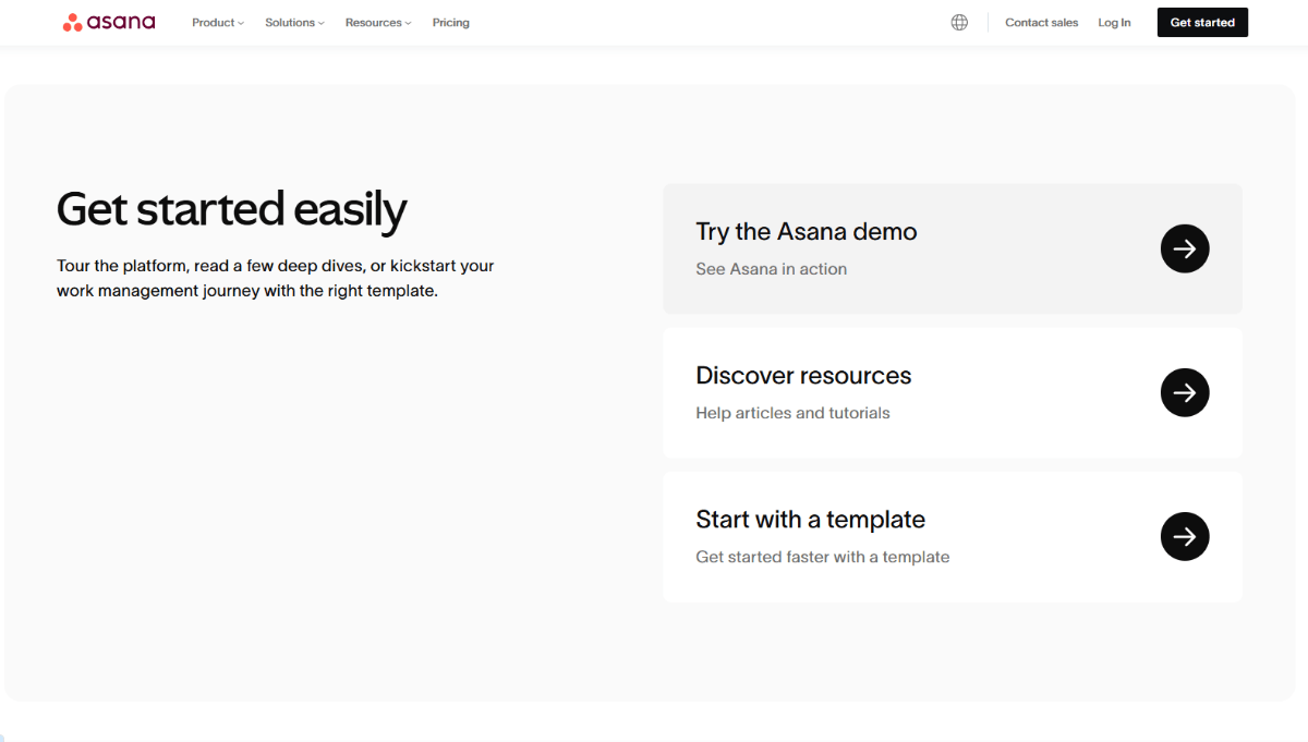
There are two columns in the larger container. And three rows of content in the second of the two columns.
The Law of Common Region says that content within a distinguishable region (i.e., with defined boundaries) is related. So, we know that the “Get started easily” text on the left is related to the three containers on the right since they all live within the gray container.
The Law of Proximity then tells us that content placed together should be consumed as a whole. This is what enables us to first read through the “Get started easily” text on the left, and then to turn our attention one by one to the startup guides on the right.
The designer used a number of elements to achieve this effect:
- Background shading to create containers
- Font sizes to establish hierarchy and priority
- Line spacing to group content together
- White space to delineate between one group and another
UX laws come in handy when it comes to working with the grid. Not only can they help you to create complex hierarchical layouts like this one, they can help you define the general rules for your grid, like the amount of space to be allocated to the margins and gutters.
On pages containing more text, this is especially important as you won’t be able to depend as much on white space or shading to separate your content. For example, this is the Pricing page on the Asana website:
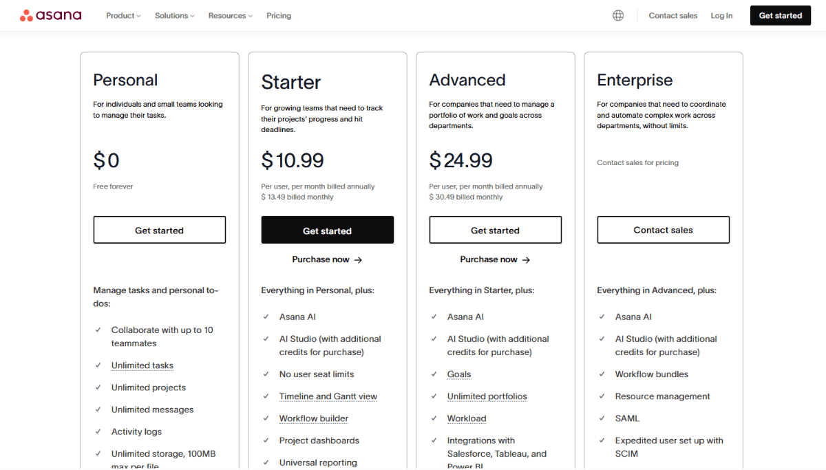
There’s substantially more text in this section than in the one we looked at previously. Yet, we’re still able to glance at this pricing table, determine where one section starts and the other ends, and read the content in each without issue.
This is because the designer added gray boundaries around each pricing tier. Also, there’s sufficient padding around the text so that visitors won’t struggle to keep their focus on one pricing plan at a time.
By using the basic elements of design and the rules of good UX, you’ll help visitors to easily understand and navigate your interface, no matter how complex the grid gets.
Wrapping Up
Why should you start with and use grids when designing for the web?
- Consistency in designing across an interface and the entire digital experience
- Harmony and balance in design
- Better content organization
- Improved usability
- Improved readability
- Contributes to more responsive websites
- Can improve accessibility
- Speeds up your process
- Removes complexities and questions when collaborating with others
Instead of staring down a blank page and trying to design without any rules or order, use grids in your UI design work. They’re simple enough to set up and will help things go more smoothly as you tackle the design and layout of your website or app, bit by bit.

Suzanne Scacca
A former project manager and web design agency manager, Suzanne Scacca now writes about the changing landscape of design, development and software.
