Design & Marketing Trends We’ll See More of in Email in 2026

Email is one of the more effective marketing channels. But that doesn’t mean it will automatically bring you more engagement or conversions. If you’re looking to switch things up in 2026, here are four trends to explore.
Evaluating your email marketing strategy and wondering what you can do to get more subscribers, click-throughs and conversions? Experimenting with the latest trends in email marketing and design might be just what you need.
There’s no guarantee that adopting a popular marketing trend will improve the success rate of your email campaigns. However, if you’re disappointed with your email performance as of late, it may be worthwhile to try something that’s working for others.
In this post, we’re going to explore four marketing and design trends for email. Have a look at each and see if anything resonates with you.
4 Email Marketing Trends for 2026
Thousands of posts go out to users every second on social media. Unless someone is tuned directly into your channel, it’s all too easy for your content to get buried there.
One of the great things about email as a marketing tool is that it’s not as easy for emails to get lost in the shuffle. What’s more, there’s not as much of a sense of urgency. If someone misses your Instagram post from 8 a.m. and the algorithm doesn’t push it to the top, they may never see it. But with an email, they could choose to keep it unread and tackle it when they have time.
The trick now is to figure out how to make those email opens and click-throughs actually worth their while. Here are four trending strategies to explore:
1. Thought Leadership Content
According to Content Marketing Institute, 54% of marketers use emails to publish their thought leadership content. They say it’s effective, too.
I think this is an interesting trend because it goes against a lot of what email marketing has become today—time-sensitive offers done up in a flashy manner. Or a round-up of all the content or products a company wants subscribers to focus on.
I’m not saying that those kinds of emails don’t have their place or aren’t effective. However, it’s just like any other marketing channel. You can’t spend 100% of your time pushing for a sale. Consumers need something more from you. And thought leadership content when it’s done well is a great way to build trust.
Thought leadership emails read like personal letters. They give a more human face and voice to your brand than other kinds of emails. And for brands that are looking to stand out from all the AI-generated or automated content out there, this might be the exact trend to start experimenting with.
Let’s look at a couple examples:
This is an email I received from Hale Pule:
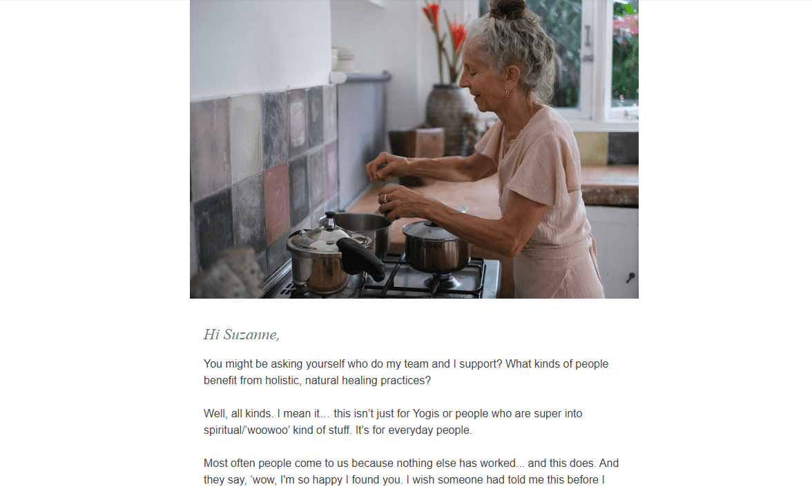
Hale Pule is an organization that offers training and coaching in ayurveda. This email could easily have been a bunch of cards showing off their different offerings. Instead, they have this very real and relatable photo of founder Myra Lewin cooking in the kitchen. I listen to her podcast and this lengthy email feels much like the discussions she has over there. It’s authentic, empathetic, and educational.
Teeccino is another brand that sends out thought leadership emails.
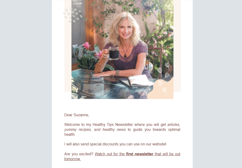
When I first subscribed to Teeccino’s newsletter, this is what I received from Caroline MacDougall, the founder and CEO. The newsletter sounds like her and her brand—helpful, empathetic and calming. It’s also chock full of healthy tips and information about coffee alternatives.
While education isn’t part of what this brand does, per se, this style of newsletter fits the brand really well. Unlike a regular coffee company that doesn’t have much to teach its subscribers and customers, Teeccino and MacDougall do. These newsletters serve as helpful resources about herbal coffees and teas and their many benefits.
Thought leadership email marketing probably won’t work for everyone. However, I do think it’s worth experimenting with if:
- Your brand is independent and trying to make a mark in its space
- You have a well-informed CEO/founder who is relatable and has a lot of wisdom to share
- Your product or service is relatively unique
- Your audience is the type that loves to consume longer content like blog posts and YouTube videos
- You already have a repository of content that you could repurpose and share with new customers
The nice thing about this type of email marketing is it doesn’t require a ton of design. Just find a great looking photo of your brand representative, and then get to writing!
2. Navigation Links
It used to be that we wanted to minimize the calls to action in email marketing. By limiting our subscribers’ choices, we could more effectively direct them to a target landing page, product, etc.
However, a new trend I’ve noticed this year is that emails come with navigation links at the top. Case in point, here is a recent BringFido email I received:

This newsletter is called “Fido’s Favorite Things.” It’s a round-up of articles and recommendations related to celebrating the holidays with your furry best friend. So, it’s not as though this email is short on links. That said, just below the BringFido logo is the app’s primary navigation.
One reason I suspect the brand includes the navigation is because the newsletter features links to the blog. It’s not as though people can’t access the app from the blog. However, it does create an extra step for them. By including the navigation here, it allows people not interested in the aggregated content to take a shortcut to what does interest them.
So, let’s say the email shows up in my inbox. I scan through it, but don’t find any content that’s relevant for me as I already bought my dog some treats for Christmas. The email is still useful, though, as it keeps the brand top-of-mind. And, with the navigation there, it might spark another idea, like maybe I should research Airbnbs for a trip we’re taking in January.
I suspect that’s why a brand like Hair Cuttery also includes a navigation in their emails:
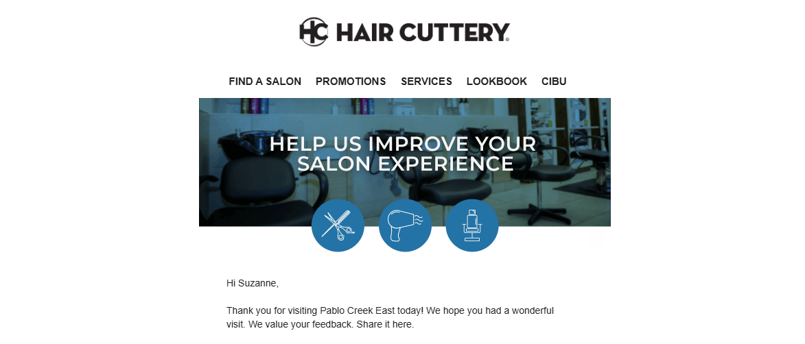
Hair Cuttery is a chain of hair salons, so their emails are rarely full of content and calls to action. This one, for instance, asked for my feedback on a recent visit.
Again, I think having the navigation at the top of the email gives subscribers convenient shortcuts in case they don’t want to take the action prescribed in the email itself. At the same time, I suspect there may be another reason why more brands are going this route. And it relates to trend #3.
3. Beautiful Hero Sections
There’s absolutely nothing wrong with sending out short emails or ones with minimalistic designs. If you have an important message or offer you need to share with your subscribers, there’s no time to waste. Cut right to the chase.
That said, there is something particularly nice about this latest trend of emails being designed more like websites.
In this first example we see the “hero section” for the Yoga Trade newsletter:

The top of each edition of their newsletter is designed this way:
- Logo against a dark green leafy background
- Tagline against a neutral-colored background
- Photo of a yogi in a seated forward fold with her hands in a heart shape
It’s beautifully designed and feels in line with the rest of the company’s branding. Even if someone missed who the sender is at first glance, this design will remind them. It’s a great way to capture their attention and ease them into the content. It also reinforces Yoga Trade’s visual identity every time they open an email from them.
Another newsletter that has a spectacular above-the-fold design is this one from the Tennessee Department of Tourist Development:
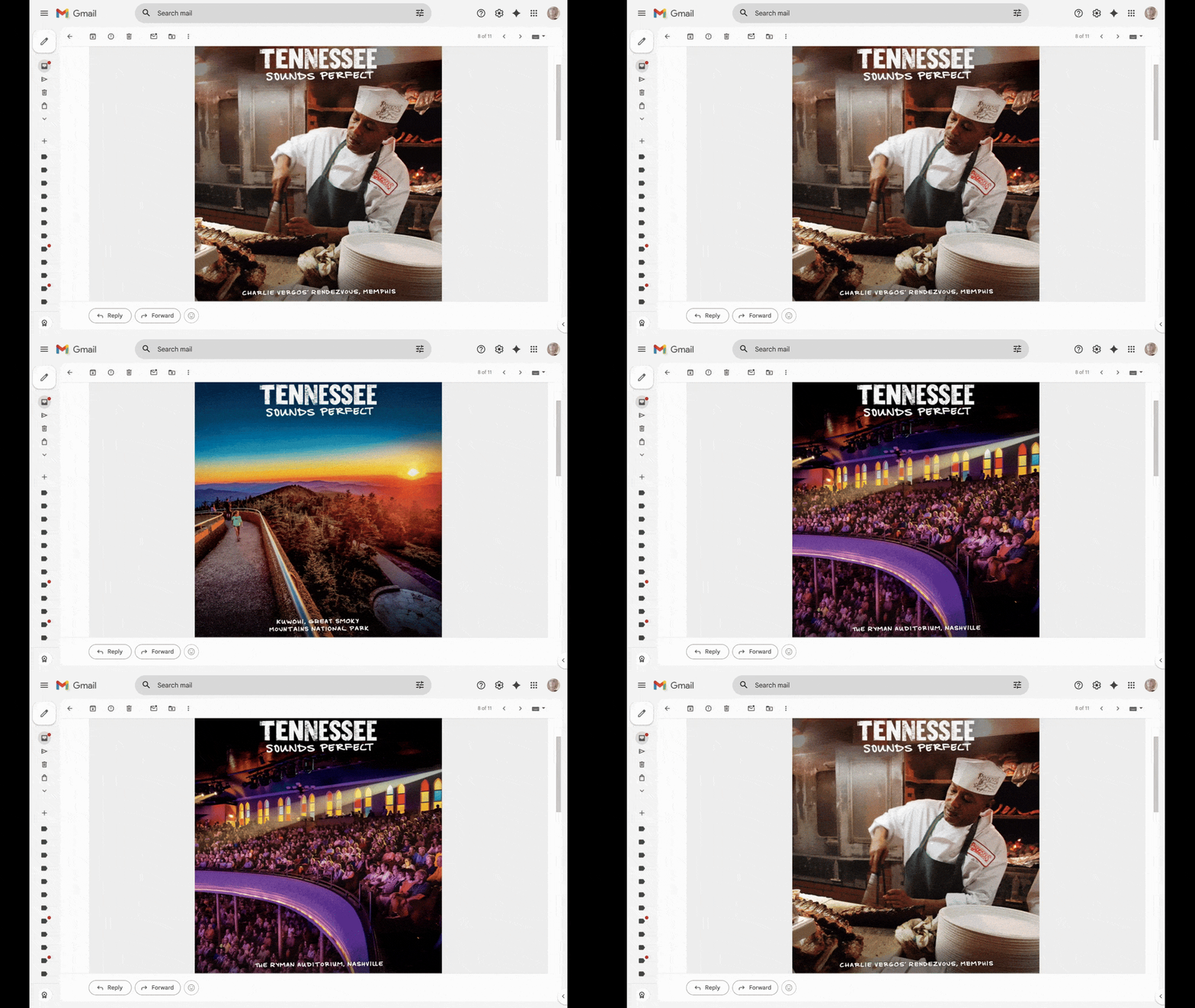
Before the subscriber scrolls, they get an eyeful with this auto-rotating slideshow of some of Tennessee’s top spots—the Ryman Auditorium, Charlie Vergos’ Rendezvous and the Great Smoky Mountains National Park. Each image is well-framed and full of enticing colors and imagery. The motion also gives additional flavor to this newsletter.
But why do this? Doesn’t the logo suffice for the top of a newsletter? I think it does, in some cases.
However, there are some brands that would really benefit from adopting this trend of designing the top of the newsletter like a hero section on the home page.
For starters, it makes a newsletter feel more immersive. In the first example, the yogi subscriber may feel a sense of calm or joy wash over themselves before they jump into the content below. In the second example, the person interested in vacationing in Tennessee gets a taste of what lies ahead. Instead of pushing them to click a link, your newsletter engages them with visual storytelling.
Also, if you’ve been working on creating an omnichannel experience for your customers, this could be a valuable trend to adopt in 2026.
If you visit the websites I linked to above each image, you’ll notice that the designs of their websites are very similar in style and imagery. By adding more design elements to your newsletter, you’ll make it feel more like it’s part of the greater whole.
4. Small Animations
Even if you’re sending out lengthy thought leadership emails, you want to keep motion to a minimum. While numerous transition effects, autoplaying videos and other animations might look OK on a landing page, they can become too much too quickly in a format like email.
So, if you’re going to add animations to your design, choose one that works particularly well and leave it at that. The Tennessee tourism email is a good example. There’s no need to add any other motion to that message. The first one is effective enough at drawing the reader in.
Here are some other ways in which you might add motion to your emails:
Yoga International sent this email announcing a free course and discounted membership:
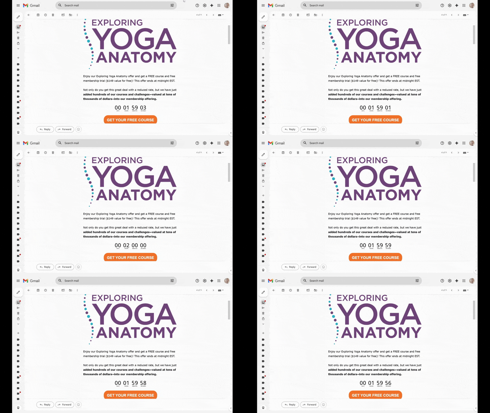
If you’re sending out an email with a time-sensitive offer, adding an animated countdown ticker like this one could be really useful. Sure, you want your subscribers to notice the message and offer. However, sometimes it takes a little motion to motivate them to pay attention and take action now.
Another way to use animation is to apply it to a key message, like Hotels.com does:
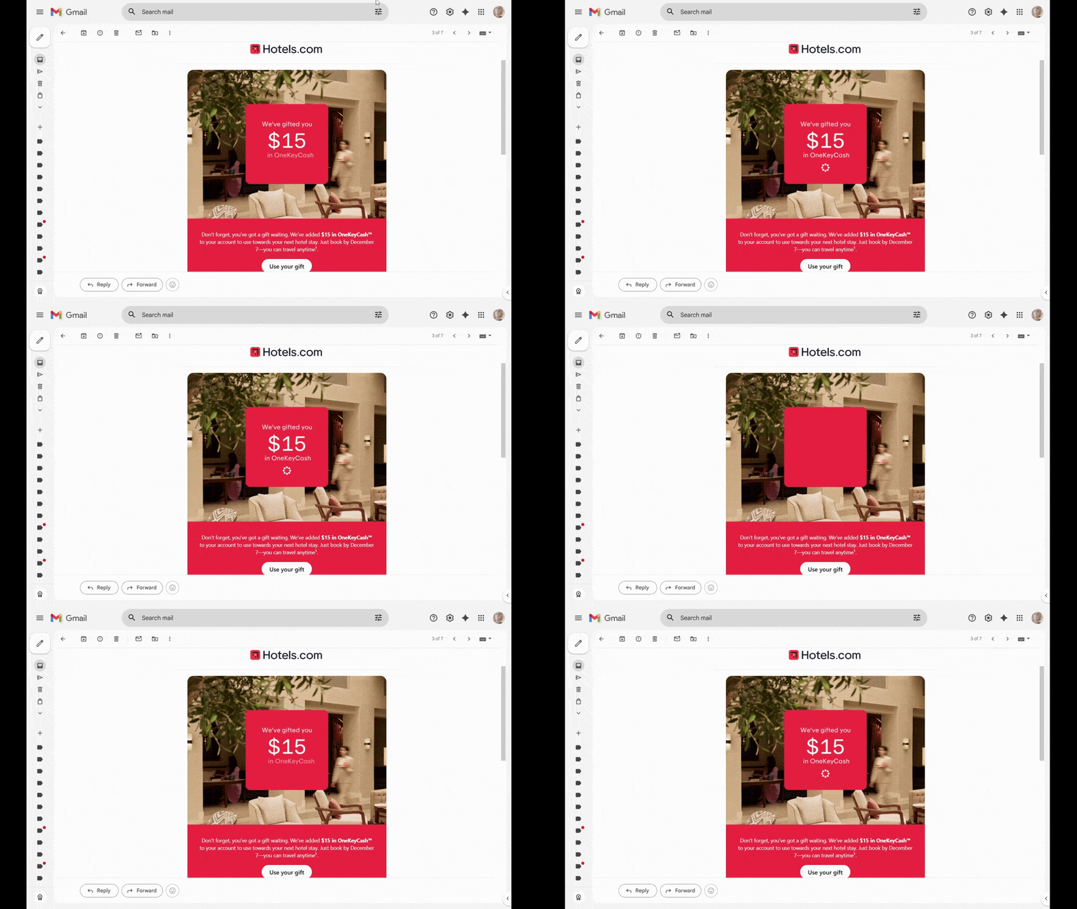
This is the top part of a recent Hotels.com email sent to reward members. Instead of including a featured image and describing what the gift is down below (which they also do), they added an animated text block on top of the graphic. It reads:
“We’ve gifted you $15 in OneKeyCash”
The three lines of text and subsequent icon slowly slide into place one at a time, forcing subscribers to pay attention to what’s being revealed.
This is an effective maneuver if your email has a singular offer or benefit to share with the subscriber. It could also be useful if you find that subscribers quickly scan through static emails and miss the most important or valuable bits. By trickling out a juicy offer like this one with a well-timed animation, you can get more of them to stop and notice what’s going on.
In addition to keeping motion relegated to one item in your emails, also try to use it on only the most important elements. While it might be tempting to animate icons, your logo or some other piece of the UI, only do so if it’ll motivate your subscribers to take meaningful action afterward.
Wrapping Up
I had thought about adding personalization to this list. However, I was hard-pressed to find examples of it in my own inbox. Sure, there are tons of emails that start with “Hi Suzanne.” But beyond that, I rarely feel as though I receive personalized emails, except maybe the “You left this at checkout” message.
If we’re looking even further ahead, that is the one trend I expect to see marketers explore. With the proliferation of AI, there’s no excuse not to. For instance, brands could send better curated recommendations of products, courses, and other offerings to subscribers. Or service providers could send summary emails with useful information instead of links to log in and check things out in their app.
For now, though, I think the four marketing trends we’ve explored are going to be really helpful for brands. While it’s great if your subject lines can get subscribers to open the email, what’s most important is if they engage with them. By turning your emails into something that feels more experiential and familiar, you can do just that.

Suzanne Scacca
A former project manager and web design agency manager, Suzanne Scacca now writes about the changing landscape of design, development and software.
