How to Do A/B Testing for Websites: A Practical Guide for Optimization

Learn how to do A/B testing for websites with this complete A/B testing guide to optimize UX, test variations and boost conversions with data-driven decisions.
The most successful websites are ones that are built with their specific end users in mind. The thing is, we can’t really know what our users want or need without their input.
Design principles and UX laws give us good insight into what’s effective in general, and studies on user behavior and preferences can be helpful. However, every business has a unique target audience with their own preferences and needs to fulfill. And, so, it’s not a simple task to craft a website that looks and feels good, with copy that resonates and with a user journey that target users are eager to take.
There are many different methods you can use to gather user input when designing a website. This post deals with A/B testing websites, a process of experimentation and optimization that we use when redesigning and optimizing live websites.
If you have a website that is underperforming, has stagnated in terms of growth or you simply want to enhance its performance, keep reading.
How to Do an A/B Test
An A/B test is an experiment. It pits the original version of a webpage (or a small segment of it) against an alternative. We then use software to run the test. If there’s a clear winner at the end of the testing cycle, the designer or developer implements the winning version on the website if it’s not already there.
Here’s a more in-depth look at the process of running an A/B test:
Step 1: Review Your Data
Before you can initiate an A/B test, you need something to go off of. And it has to be more than just the fact that your sales are too low or have recently and inexplicably dropped.
You need to poke around inside your existing data to see if you can hone in on something that needs improving.
For instance, let’s say you launched an ecommerce site that sells apparel with inspirational quotes. The launch was eight months ago, definitely more than enough time for all that SEO work you did to kick in. And it shows. Your website traffic increases from week to week.
The problem is that your sales don’t align with all the website traffic and activity.
Without examining the data, anything could be at fault. Trying to formulate an A/B test for your website on a lack of sales alone would be a waste of time and resources.
Instead, you need to use all the data at your disposal. It could come from places like analytics, website feedback surveys, heatmap testing tools, customer data platform insights, or other user research and testing methods.
Here are examples of the kinds of things you might discover just by looking at your website analytics:
Scenario 1: You have a 50/50 split in website visitors—half use desktop devices, half use smartphones. The desktop conversion rate is 3.5%, whereas the mobile conversion rate is 0.3%. This statistic alone would suggest that there’s something flawed in the mobile users’ journey to conversion.
Scenario 2: 46% of your visitors add items to their shopping cart during their sessions. However, only 4% of them end up completing their purchase. With the help of an analytics dashboard, Customer Data Platform conversion and funnel reports, heatmaps and session recordings, you discover that you’re losing most of these shoppers somewhere between the Cart page and the final Checkout step.
Scenario 3: There’s an entire category of pages on your blog that goes ignored. While some people on the team worry it’s because the content is irrelevant, you notice that the visitors who do discover this content are highly engaged and spend more time on these pages than other blog posts.
While this data doesn’t tell you what’s wrong per se, it does suggest that there’s something about the discoverability of this category that’s an issue. So you may want to test your blog’s navigation or search bar functionality to see if that improves things.
Step 2: Identify the Component to A/B Test
Once you have an idea of the page or general area that needs improvement, you need to narrow it down further. But how do you identify the weak spot in your user journey or website?
Heatmaps and session recordings can be really helpful in this regard. So, too, can moderated and unmoderated usability tests. You can use other observational (direct and indirect) user research methods to narrow down your focus, like tree testing and diary studies.
The weak spot could end up being something as small as a button or headline or as extensive as a page’s layout or choice of styling.
Here are some examples of variables you might want to test:
Hero section – headline, imagery, button text, button color, layout
Videos – content, placement
Images – in the hero section, for products, in the blog, etc.
Headings –text, font size
Button – text, color, size, placement
Pricing table – content, symbols, price size, price placement, button placement
Contact form – labeling, required fields, number of steps, progress bar design
Navigation – full width vs. hamburger menu, page names, font size
Checkout – cart page upsells, checkout form length, security features, surprise fees
Page – layout, length
This is why it’s so critical that you examine the data before making any decisions. A/B testing can be a time-consuming process to set up and run. So you want to make sure you’ve honed in on the right aspect of the page or journey.
Once you have, create the variation you want to test.
If it’s content-based, what should it say instead?
If it’s a graphic, what should the new one be?
If it has to do with the design, what will you change about the component—the size, color, layout, functionality, something else?
Step 3: Come Up with a Hypothesis and Goal for Your A/B Test
The next thing to do is hypothesize what you believe will happen by changing this particular element on your site. You can write this as an if/then statement. For example:
IF I change the order of options on the Pricing page, I’ll increase my sales.
This is just a starting point. You want to get extra clear about why you think this hypothesis will work. Let’s flesh out this example by providing some more context:
Currently, the Pricing page on my private yoga instructor website includes a list of private session options:
- 60-minute in-person yoga session ($50)
- 60-minute online yoga session ($40)
- 75-minute in-person yoga session ($65)
- 75-minute online session ($50)
- 2-hour in-person yoga and meditation session ($90)
Beneath these session blocks is one in a slightly lighter font color and box outline. It promotes a free 30-minute online postural analysis session.
Most of my regular, long-time clients (85%) started with this free session instead of a paid one. Only 19% of my shorter-term clients started with the free session. I believe that by placing the free session at the top of the Pricing page options, I’ll increase the number of clients I have and sales over time.
In addition to expanding upon why you’ve reached this hypothesis, you need to think about what a realistic outcome is. Because of how much work can go into A/B testing, you want to make sure the results of this test contribute to your business’s goals and provide some substantial improvement of outcomes.
For instance:
On average, short-term clients book two sessions with me over the lifetime of our relationship. The value of those sessions comes to about $100.
On the other hand, long-term clients book an average of 20 sessions with me over the lifetime of our relationship. The value of those sessions comes to about $1,000.
With 85% of those long-term clients starting with a free postural analysis vs. 19% of short-term clients who do, it appears that this free session is a great way to attract and convert higher quality leads.
By prioritizing the postural analysis session in my list of offerings, I believe I will increase its visibility, exposing it to 75% more leads (as data suggests that 75% never scroll past the page fold). This will enable me to get more short-term and long-term prospects into my pipeline. And since long-term prospects convert at a greater rate with this session, I should see an exponential boost in my sales this coming year (about 31% more than last year).
If you don’t have enough data to come up with such a specific hypothesis or goal, that’s OK. At the very least, you need to decide what goal you’re aiming for.
For instance, what do you want to improve:
- Visitors?
- Page views?
- Reading times?
- Clicks?
- Scroll depth?
- Video views?
- Leads?
- Subscribers?
- Sales?
- Upsells?
- Bounce rate?
- Cart abandonment rate?
- Something else?
And, more importantly, can the hypothetical change you’re proposing help you realistically achieve this outcome? If not, then you’re targeting the wrong page or element. But if you have some good data to work with, it should increase your confidence in mapping out this hypothesis.
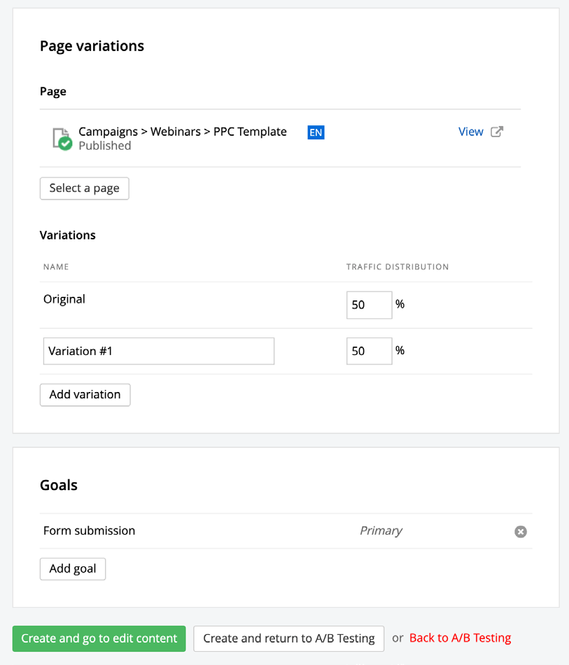
Step 4: Create the Variation
The variation or challenger now needs to be created.
If you’re going to be making complex changes, consider using a wireframing or prototyping tool to map out the redesign. That way, you can hash out the new design and content before doing anything within your A/B testing software. Also, if you need to get it vetted by decision-makers before running the test, this is the best way to go about it.
Once you have your variation ready to go, recreate it into your A/B testing software. You’ll select the original (control) version on your existing website. Then make your modifications in the “B” version.
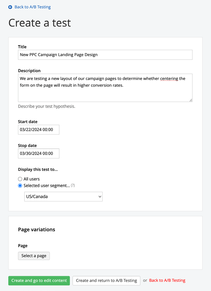
Step 5: Set up the Parameters for the Test
Before you run your A/B test, there are some parameters to define. For example:
Sample size: How many visitors would need to see these pages before you consider the results significant?
For instance, if your site is relatively new, it might only get a couple dozen people visiting it every week. While a few dozen people might be representative of your current traffic, would that be enough data to justify redesigning the page?
Timeframe: How long do you need to run the test? Timeframe matters for a couple of reasons.
For starters, for some sites, it goes hand-in-hand with sample size. Some websites may need three or four weeks (or even more) to generate a reasonable sample size.
Also, a longer timeframe gives you a chance to see how different visitors under different conditions respond to the changes. For example, larger websites might be able to collect a sufficient amount of data within 12 hours. However, the data we see from people browsing the site over the weekend might be much different from people who visit it when they’re in more of a crunch during the workweek.
Result: Which metric will you be tracking? This ties back to the hypothesis statement you outlined in the previous step.
You don’t need to stress about defining the conversion or success rate. You just need to decide which data point you’ll be monitoring. The software will help you determine later if the results are significantly in favor of one version over the other.
Step 6: Run the A/B Test
In an A/B test, the original control version of the page (A) is shown to an equal number of visitors as the alternative (B). The test typically runs for weeks to accumulate a sufficient amount of data.
So, now that you have everything defined, set the test to run for the allotted time.
Come back to check on it in about 24 hours to make sure that data is being collected and everything looks all right. It’s also a good idea to look in on it every week for the duration of the test to monitor progress. Otherwise, leave it be and let it do its thing until the test is done.
Step 7: Analyze the Results and Implement the Changes
When the test finishes, it’s time to evaluate the results.
The first thing to consider as you review the results is whether or not the test was sufficient. For starters, did you reach your target sample size? If not, how far off was it? And would you feel confident implementing the winner based on the results?
The second thing to consider is the result you were tracking. Let’s say you reached your target sample size. However, the number of people who filled out the form you were tracking is way below what you were predicting. Can you confidently choose a winner if the engagement levels were subpar?
Assuming that all the parameters were met, you can now examine the end results of the test. You’ll be shown the conversion rate for the A version and the conversion rate for the B version.
Progress Sitefinity Insight and some other A/B testing tools will also show you the statistical significance. If yours doesn’t, many websites often offer a handy A/B testing calculator. Basically, what you want to see in statistical significance is that one version has a more significant conversion rate than the other. You also want there to be a strong confidence indicator.
If you receive a statistically significant result and the variation is the winner, the next thing to do is update your webpage. If the control won, then no changes are needed. However, you may want to think about rereviewing your data to see if there’s a different test that could improve the performance of this page.
Tips and Best Practices for A/B Testing
There are a lot of things you need to do to keep a website in good shape. Managing technical maintenance is one. Adding new content and updating outdated content is another. And optimizing your website’s performance via A/B testing is another.
In addition to the steps above, here are some tips to help you get the most from your experiments:
Run One Test at a Time
To be able to narrow the results to a specific change, there should only be one A/B test going at a time. It might take longer to revise and improve your pages this way, but you’ll have more accurate results to work with.
Always Do A/B Testing in Conjunction with Other User Research and Testing Methods
As you can see from the steps above, data analysis prior to running an A/B test is vital. You’ll also want to keep an eye on your analytics and continue to gather user feedback afterward to be confident the winning results you saw in the test weren’t just a fluke.
Schedule Your A/B Tests Ahead of Time
The amount of time isn’t the only thing that matters in A/B testing. The time period does as well. Take, for example, an ecommerce site that sells kids’ school supplies. You should schedule your A/B test when you know you’ll have a good amount of traffic on the site.
However, you might not want to do it right in the middle of your busiest sales season. If the variation you’ve created doesn’t go over well with visitors, you might unintentionally cost your website sales during what would otherwise be a super profitable time.
Find a CMS That Allows for A/B Testing
The ideal solution is to use a content management system that includes its own A/B testing solution, like Progress Sitefinity CMS. It’ll be much easier to run A/B tests and to collaborate with other teams during the process.
This not only simplifies workflows but also accelerates the entire optimization cycle—from setting up tests to analyzing results and publishing the winning variation. In contrast, using a third-party A/B testing tool often involves exporting and importing data, manually applying changes and coordinating across teams, which slows down progress and introduces more room for error.
Don’t Be Afraid to Throw Out Test Results and Not Make Any Changes
The goal of A/B testing isn’t to change something no matter what. The goal is to see if a potential change receives a more positive reception from visitors and that it helps you achieve greater outcomes.
That said, the statistical significance in an A/B test should not be ignored. If you get to the end of the test and a winner can’t confidently be determined, then no changes should be made.
Always Be Testing
Some people may use A/B testing as a way to identify and fix a friction point in the user experience. However, A/B tests can be done even when things are going great on your website. Even the smallest changes can help improve the pages of websites over time.
Wrapping Up
Every A/B test you run has a unique goal, like getting more visitors to click on a button vs. improving the read times of a blog post.
The overarching goal of doing A/B testing, however, is the same for everyone: To maximize the impact your website has on your marketing and business outcomes.
It’s your job to take a look at your website in its current state and decide how to achieve this. Other user research methods will give you ideas about where to look for areas of friction or opportunities for improvement. But A/B testing is the tool you use to validate those insights and theories, and then make them a reality.
Ready to try A/B testing for yourself?

