Examples of Web Personalization That Improve Engagement
A personalized web experience doesn’t mean using everything you’ve gathered about someone to greet them by name, summarize their engagement with your brand and so on. Sometimes the subtlest variations in the experience can make a visitor or user feel more comfortable and satisfied.
Why is it that we spend so much time learning about our target users? It’s not just so we can craft relatable messaging and aesthetically pleasing UIs.
We can also use this info to inject personalized content into their web experience. Whether they’re first-time visitors or long-time customers, personalization can make a big difference in how they feel on your website and about your brand as a whole.
That said, you don’t need to go to great lengths to design completely different pages based on your users’ demographics, behaviors and interests. Sometimes switching up a small component or offer is enough to capture their attention and make them feel noticed.
In this post, we’ll take a look at three subtle ways to incorporate personalization into the websites you build.
3 Ways to Add Personalization to Your Website
There are numerous reasons to personalize the content on your website. For starters, personalized content can make the experience of navigating and interacting with a website feel easier and more satisfying. In the long run, personalization can also improve customer retention.
Here are three ways to start using personalization to improve the experience for your visitors and users today:
Customize the Header
The website header is a good place to start with personalization.
The most common type of personalization we see here is when the “Sign In” button becomes a greeting, like “Hi Suzanne” or just the person’s name. Either way, it’s a signal to the user that this experience going forward has been tailored to their needs.
There are other areas to hone in on in the header for personalization, too.
One of the examples I like is on the Banyan Botanicals website. Here is what the header looks like for visitors who haven’t logged in:
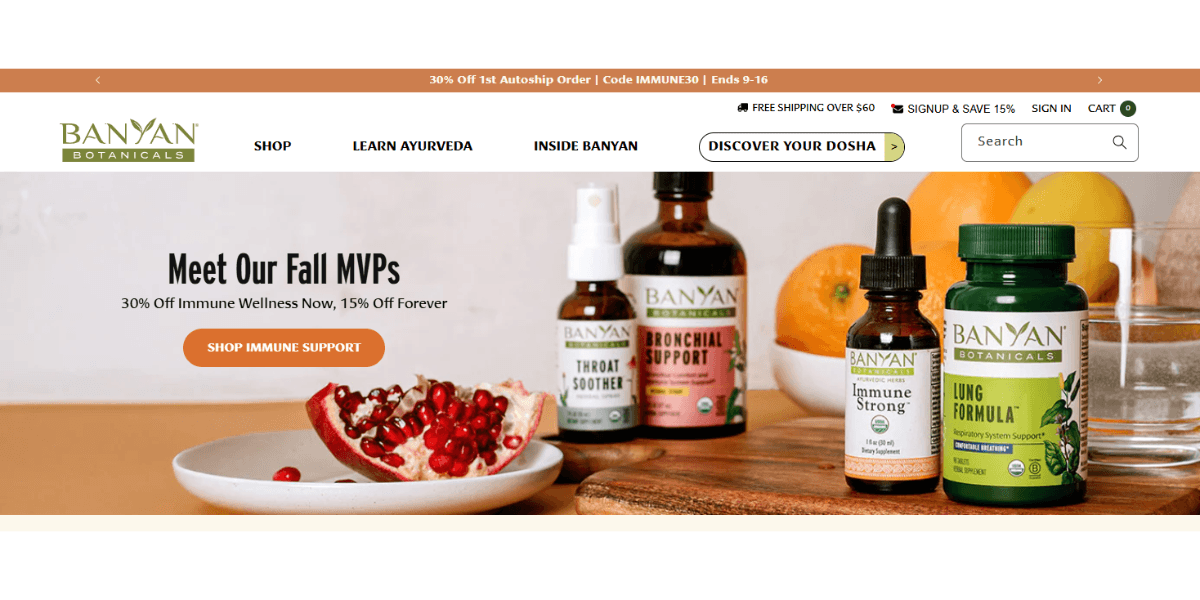
Focus on the links above the main navigation and search bar. They include:
- “Free Shipping” notice
- “Signup & Save 15%” membership deal
- “Sign In” link
- Shopping cart icon and counter
When a customer signs in, this part of the header stays the same except for two changes.
The first is that the “Sign In” button becomes the customer’s name and offers a dropdown with links to their account, subscriptions and a “Sign Out” button.
The second change is a new link called “Reorder.”
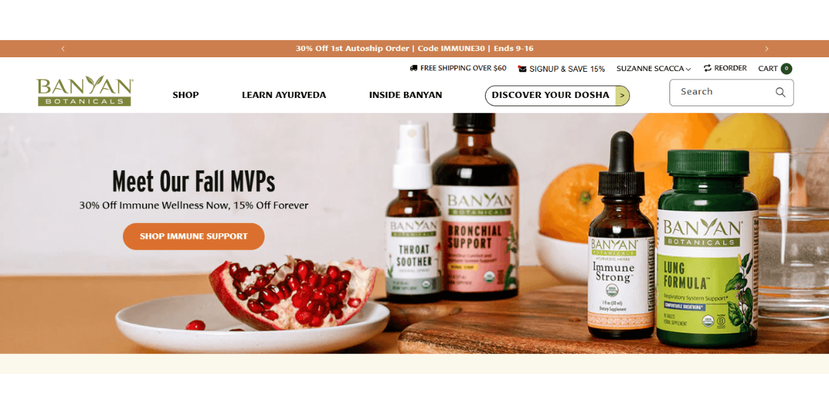
It’s a subtle change and not one that’s common, even in ecommerce personalization. Typically, users have to navigate to their “Orders” screen to find their history and reorder items. Or do a new search for the items on their own.
With a “Reorder” button at the top of the site, this makes stocking up on their favorite products super fast and easy to do. It might not seem like much, but this kind of personalized header detail adds extra value in the form of convenience for returning customers.
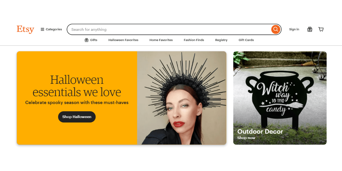
Etsy’s header undergoes a more drastic transformation after someone logs into their account.
For regular visitors, the following links appear to the right of the search bar:
- “Sign In”
- Gifts icon
- Shopping cart icon
Here’s what the header contains after someone logs into the page:
- Favorites icon (new)
- Gifts icon
- Deals icon (new)
- Help & Support icon (new)
- Your account icon (replaces “Sign In”)
- Shopping cart icon
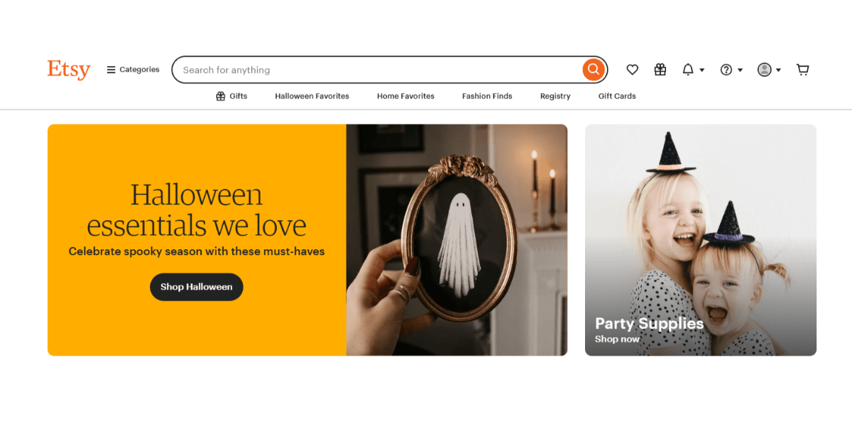
The “Sign In” button goes away and four new icons take its place with customer-specific functionality (like Support) and value-adds (like Deals and Favorites).
Just because you have an ecommerce site doesn’t mean you need to add all of these links for logged-in users. This is why doing user research upfront is important—it lets you know what kinds of functionality and features your users will need and appreciate. Banyan Botanicals, for instance, might have customers who value a speedy reordering experience over tools to help them explore more of the store.
So, refer to your user input and research to inform what kinds of personalization you make to the header.
Also, you can do more than just personalize the header for logged-in users. You can add components like language and currency switchers to auto-detect the users’ preferences. You could also reorganize navigation links or add custom buttons for mobile users vs. desktop.
Switch Up the Sidebar Content
On lengthy pages full of perusable information (like blogs, listings, forums, etc.), the sidebar can be a helpful way to get secondary or supplementary content in front of visitors. But not everyone should see the same content.
If you have a website like Hotels.com that primarily uses the sidebar to display ads, personalization would be useful.
For example, here is what the search results page looks like when I’m not logged in:
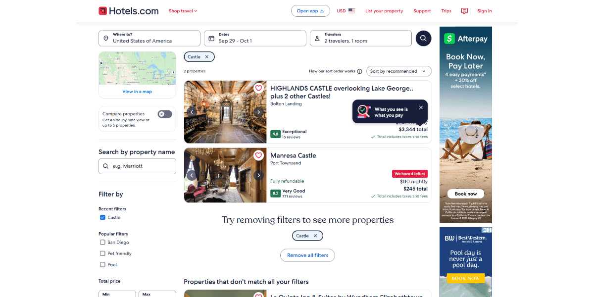
There’s an ad for Afterpay as well as one for Best Western. Both have a generic summer vibe to them. They’ll be appealing to the average Hotels.com customer, but not in the same way that these ads might be when someone like myself is logged into the site:
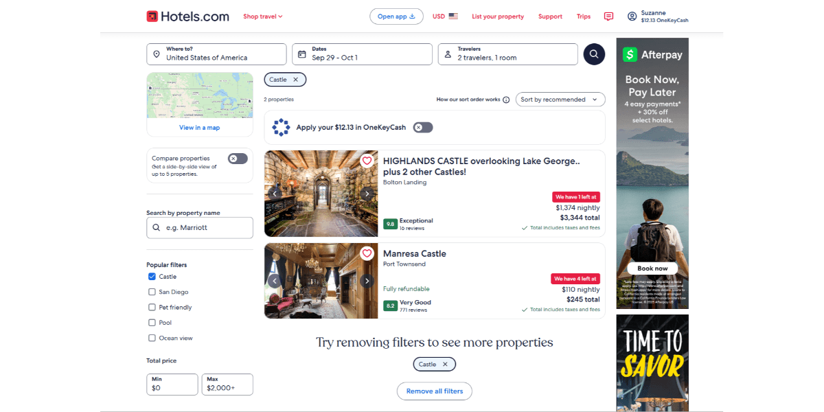
This is the same search results page, just tailored to my interests. The first ad is also for Afterpay. However, we see a person wearing a backpack, staring out on a beautiful lake and mountain (which is more in line with my search history). The second ad is for Visit Tampa Bay, which not only aligns with my previous purchases but my current location.
By targeting ads based on interests, demographics, geographic location, order history and more, this sidebar content is more likely to get noticed.
It’s not just ads-based sidebars you can do this for either. For instance, if you have a sidebar on your ecommerce site, you could include variable sections like “Most Popular Products” for visitors and “Based on Your Purchases” for customers.
We see a similar concept on Reddit.
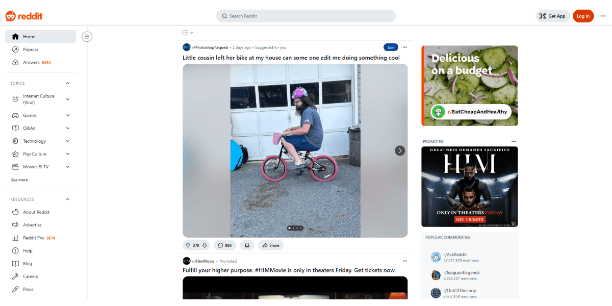
On the Reddit page for a visitor, the right sidebar contains a couple of ads along with a list of “Popular Communities.”
The sidebar navigation on the left is also quite generic with sections for “Topics” and “Resources.”
But after logging in, you’ll see that the content changes.
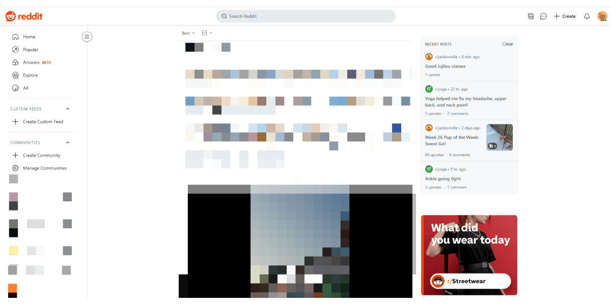
On the right sidebar, the user finds posts they most recently viewed along with an ad. This makes it easy for the user to backtrack and revisit posts that interested them.
On the left navigational sidebar, they’ll find more customized options, like “Custom Feeds” and “Communities” that they’ve bookmarked. Again, this makes it easier for them to find more of what they like without having to rely on the search bar or a generic website navigation.
Similar to the point I made about header content, you really need to get to know your users to determine how custom your sidebar content needs to be. In some cases, swapping out a single section may be sufficient. In others, it might be more valuable to reimagine the sidebar experience (like in the case of Reddit) to improve usability and engagement.
Create Landing Pages Specific to Certain Segments
We create landing pages for the purpose of turning targeted visitors into paying customers. There are a couple of reasons to personalize these pages based on who visits them.
For example, if you have different segments of users, then it could be beneficial to create different versions of the page. These segments don’t even need to be the user personas you target. Instead, it could be as simple as showing a different version of the page to mobile vs. desktop visitors.
On the other hand, you may also want to personalize a landing page if it’s part of a targeted campaign. Let’s use beYogi’s Insurance page as our example.
This is the Insurance application page that general website visitors see after clicking through the navigation:
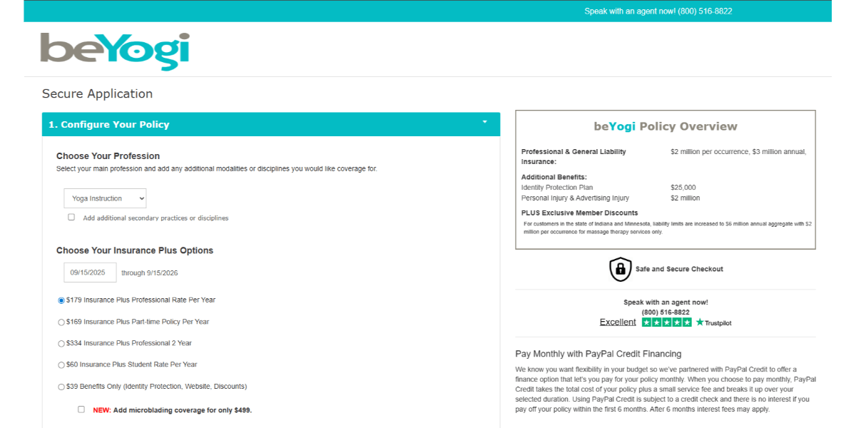
It’s a pretty straightforward application page where the user selects their profession and the insurance plan they need.
Now, for yoga instructors who clicked the referral link they received after attending a beYogi webinar, this is how that same page looks:
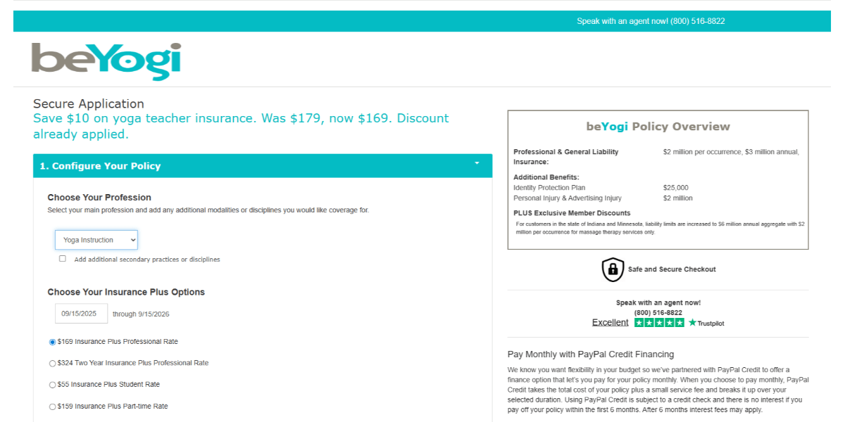
Notice the message in blue under “Secure Application.” It reads:
“Save $10 on yoga teacher insurance. Was $179, now $169. Discount already applied.”
This isn’t the only difference between the two page versions. The rates under “Choose Your Insurance Plus Options” are different as well.
As a user, it can be quite frustrating when you receive a discount code but can’t find the field to enter it into (not to mention having to copy-and-paste or memorize it). By creating a custom landing page for people who click a button to secure a special rate, you’ll save them that bit of extra work and frustration.
In cases like beYogi, slight variations in landing pages can make a big difference in the user’s experience with a website and its brand. For others, more robust customizations to the content may be in order.
Case in point: Barnes & Noble.
When a website visitor goes to the Membership page, this is what they see:
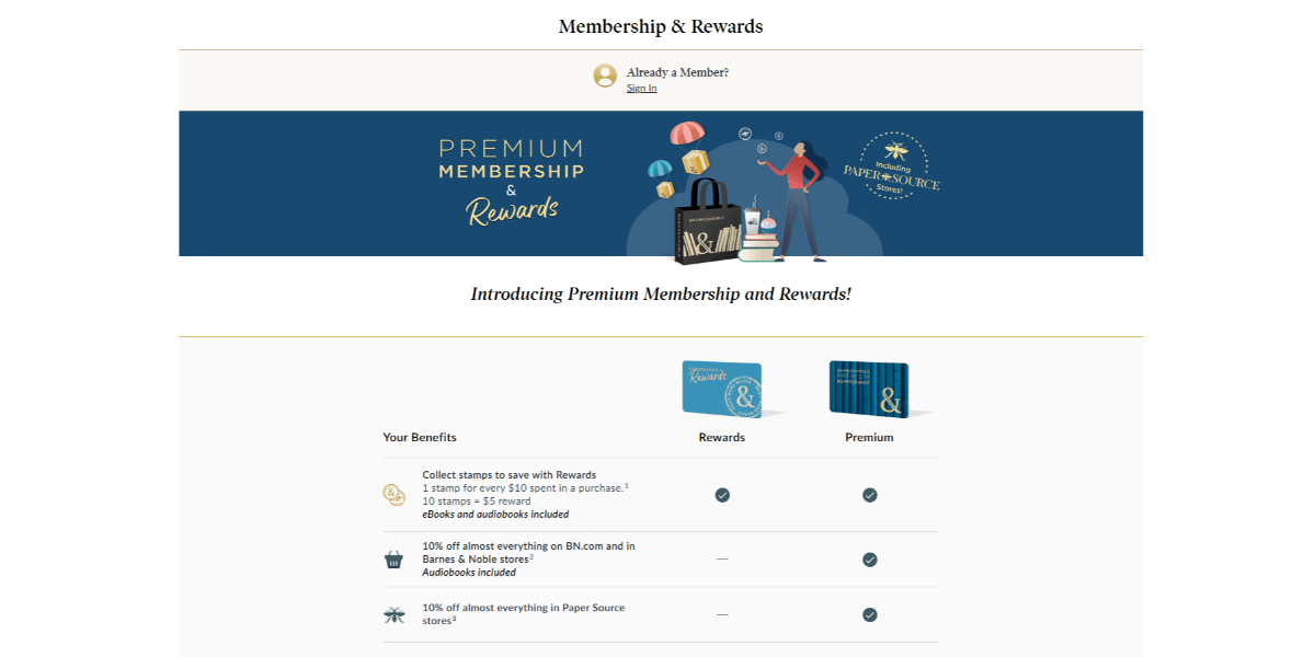
It’s a helpful page that visually compares the differences between being a free Rewards member and a paying Premium member.
Now, when a logged-in Premium member visits that same page, this is what they see:
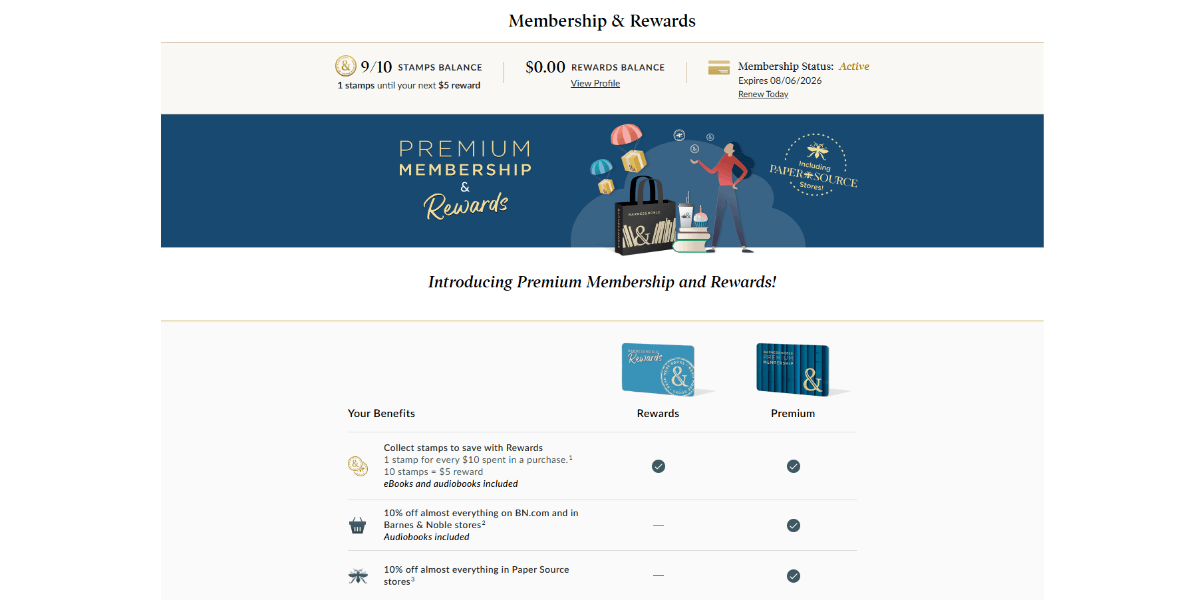
The page is identical to what website visitors see except for a small section at the very top of the page. This section tells the visitor:
- How many stamps they have until their next reward
- The amount of their rewards balance
- The status of their membership
The rest of the page contains the same content as it does for regular website visitors. This seems like a missed opportunity.
Sure, it’s nice to have a reminder of what the benefits are. However, they’ve already been sold on the program. They don’t need to see what the free Rewards program entails nor all the promotional content pushing them to become a member.
This page would be much improved if it provided a checklist of what they’ve used already. Or perhaps gave them a reminder of benefits about to expire. This way, the member could more easily track what they’ve used and what else they can take advantage of in the coming year.
If the team at Barnes & Noble doesn’t want to do that, another option is to redirect logged-in users to their account membership page when they click this link.
As you can see, the extent of the personalization done on a landing page depends on a number of things. Ultimately, you want the personalized content to make your users’ lives easier, their decisions simpler and their patronage of your business a no-brainer. If the personalizations are pointless, confusing or require extra work, then it could backfire.
Wrapping Up
This post describes just some of the ways in which you can use personalization on a website to boost engagement and user retention. The homepage hero section is another good spot for serving up personalized offers and messages. Really, anywhere with high visibility and interaction is a good place to switch up the content based on the user segment, their tracked behavior or purchases or even their demographics.
There’s no need to overdo it either. Start small. While personalization can turn a mundane experience into a memorable one, it should be used sparingly so that it has a greater impact.

Suzanne Scacca
A former project manager and web design agency manager, Suzanne Scacca now writes about the changing landscape of design, development and software.
