Choosing Fonts for Healthcare Marketing and Branding

Whether you need fonts for your healthcare brand’s logo or the website or app you’re building, there are certain best practices to abide by. In this post, we’ll explore four of the most important characteristics to hone in on in your font selection and usage strategies.
In healthcare, trust is everything. And while the care your company provides is ultimately what matters most, that won’t stop potential patients or users from judging you based on your online presence.
One way to instill trust from the get-go is by selecting the right kinds of fonts for both your branding and your website or app. In addition, you need a rock-solid strategy for how you design and use fonts that make your content legible, accessible and professional.
In this post, we’re going to look at four characteristics to pay attention to as you select the best fonts for your healthcare and healthtech brand.
4 Characteristics to Pay Attention to When Selecting Fonts
When choosing typography in general, it needs to be legible and aesthetically pleasing. In healthcare, it gets a bit more complex as there isn’t a ton of room to play around with aesthetics and you also have to consider your target users’ possible visual impairments.
So, here are four factors to consider and ways to experiment with them so you can create a healthcare brand that looks fresh, unique and authentic:
Brand Alignment
Fonts need to be on brand. That’s a given. But what does that mean exactly?
For starters, they need to work together with your other design choices. Poorly chosen fonts can dampen the impact the rest of your design will have on visitors if they don’t fit. For instance, you probably wouldn’t want to use an older, traditional serif font within the branding for a healthtech solution.
Also important is what your font choices convey about your company’s values and mission. If you say you want to provide a great patient experience, but then your fonts are too thin or small to read well, you could be sending the wrong signals to prospective patients.
Let’s look at some examples.
Here’s the homepage hero for NeighborhoodHealth:
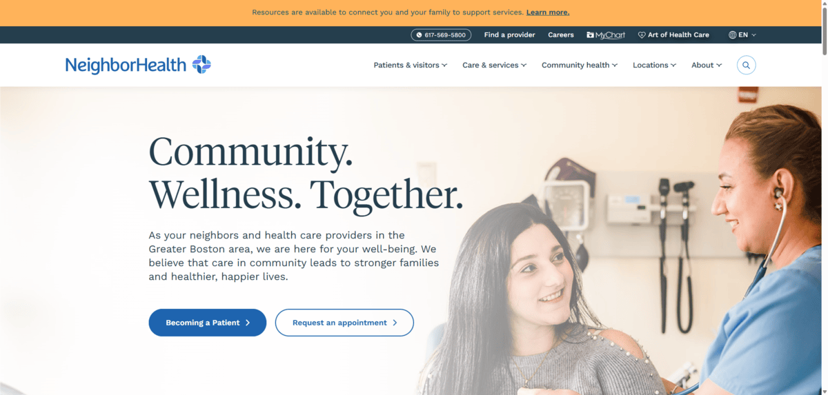
Just from the H1 heading (“Community. Wellness. Together.”), we get a sense for what this brand is going for. To expand upon this, here are the values they espouse:
- Compassion
- Diversity
- Innovation
- Respect
- Teamwork
The heading is a serif called Tiempos Headline. It’s a good choice. It’s a practical-looking font, but it also exudes a sort of warmth to it, which speaks well to the compassionate side of this company.
I think the logo font is worth looking at, too. Not just the font choice, but the kerning (spacing between the letters). The tighter kerning gives the brand a connected feel, which I think works well for one that touts teamwork as a driving value. We see hints of innovation here as well with the uniquely rounded sans serif.
I think Eyeconic is another good example that shows how you can convey different parts of your brand’s personality and values when selecting fonts for the logo vs. for the website.
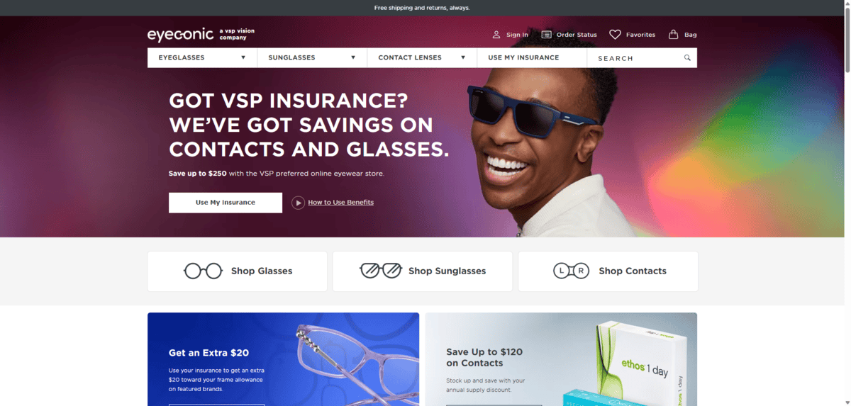
This company values:
- Integrity
- Transparency
- Empathy
- Innovation
- Inclusivity
Their About page also talks a lot about quality of care and level of trust. The website uses a sans serif font family called Gotham SSm. The biggest, boldest lettering on the site is highly readable, which is critical for its vision-impaired patients.
The logo, on the other hand, speaks more to the innovative side of the brand. It also has a fun play on the eye care/health theme by adding a curve to the left side of the “o,” making the almost-connected “co” look like a pair of glasses.
When deciding how to align your fonts with your brand, you may want to put them into buckets as these two do. The website and app fonts can reflect the seriousness and professionalism of your brand and values while the logo shows a bit more about your personality and mission.
Distinction
One of the most important things to do when establishing your healthcare branding is to make it visually distinctive.
It’s not like using a certain font will help a prospective patient make up their mind between two similar establishments. However, if they’re trying to remember which one they liked the most while doing their research, having a memorable look can help with that recall. It’ll also make your brand more recognizable as they engage with it online and perhaps even in person.
Recent research shows that the following 10 Google Fonts are the most used on hospital websites around the world:
- Open Sans (21.4%)
- Roboto (20.1%)
- Montserrat (10.0%)
- Roboto Slab (9.9%)
- Lato (9.1%)
- Poppins (6.3%)
- Raleway (6.2%)
- Source Sans Pro (3.0%)
- Noto Sans (2.6%)
- Oswald (2.5%)
Here’s what they look like side by side in size 30 font:
![Top Hospital Google Fonts Sample of the top 10 Google fonts for hospitals. Open Sans, Roboto, Montserrat, Roboto Slab, Lato, Poppins, Raleway, Source Sans Pro, Noto Sans, and Oswald are each shown here in text that reads: “[font name] Sample: Here’s what this font looks like.”](/images/default-source/blogs/2025/06-25/top-healthcare-fonts.png?sfvrsn=bc2cf2b3_2)
A number of these look quite similar. It also doesn’t help that, with the exception of Roboto Slab, they’re all sans serif fonts.
Some of these fonts do have a distinctive and memorable look to them, though, like Raleway and Oswald. Montserrat is also nice as it looks inviting with its lightweight and spacious lettering.
But you can see how many healthcare brands (in this case, hospitals) mostly play it safe. Over 41% of them use Open Sans or Roboto, which are good fonts for readability. They’re just not the most creative of choices.
What you need to decide is how creative you want to get when choosing fonts for your brand. Is it better to play it safe? If so, is there a way to choose a more traditional font but make it look distinctive?
There are some kinds of healthcare companies that can experiment more, integrating serifs and lesser known fonts into their branding. OB-GYN practitioners are one type of healthcare specialist that are able to do this.
For example, here’s the text found in the New England OB-GYN hero section:

The H1 heading uses a beautiful serif called Mrs Eaves XL. The subheadline below it uses Greycliff CF, an all-caps sans serif. This font pairing gives the brand a modern look, but with a safe and trusting vibe.
Women’s healthcare companies aren’t the only ones who can adopt distinctive or boundary-pushing font styling. Tufts Medicine, for example, uses a serif-sans serif combo as well.
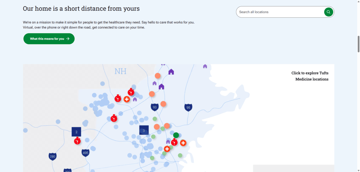
This combination is Lora (serif) and Metropolis (sans serif). You can see what a different vibe is depicted through this font pairing. The serif, in particular, is broad and open, giving the healthcare company a welcoming appeal.
When selecting your own fonts, take some time to play around with different font types and pairings. Then compare them to your nearby (or most relevant) competition. While you want the fonts to feel aligned with your brand identity, you also want them to give your brand a distinguished look.
Hierarchy
When choosing fonts, you need ones that will make it easy to establish a clear visual textual hierarchy.
Specifically, you should focus on the fonts, available weights as well as the unique styling you’re going to apply to the headings on each page, from the H1 at the top all the way down to the lower-level headings. The more complex your pages are with deeper heading levels (H3, H4, H5 and so on), the more important it is to hash this out before settling on a font.
If you’ve ever been on a blog or another lengthy informational page where the content went deep, you may have encountered headings that weren’t easily distinguishable from the body. When that happens, it can give visitors the perception that the content is disorganized, complex and/or difficult to read. Headings aren’t just about communicating what’s to come next, they help pace out content so visitors can consume it in easy-to-digest chunks.
Healthcare webpages tend to have lots of information on them, so headings are important.
For instance, let’s look at this snippet from the Boston Medical Center homepage.
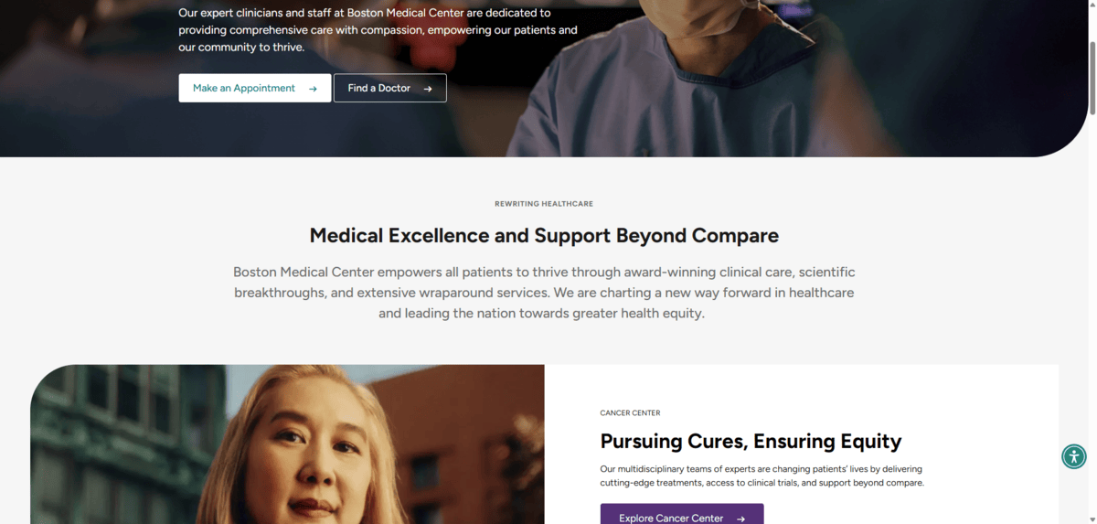
Overall, I think this typographic design has positive and so-so qualities.
For starters, the headings use a sans serif font called Figtree. This is a great font as it’s easy to read and the heavier weight makes it stand out well against the surrounding text.
However, the H2 (“Medical Excellence and Support Beyond Compare”) and H3 (“Pursuing Cures, Ensuring Equity”) appear to be styled identically:
- 36px
- 2.25rem
- 700 weight
On the homepage, I’m not sure if that’s as much of a deal breaker as it is on something like a blog post. H2s and H3s are designed differently so that we can visually indicate to readers that they’re moving from a primary topic to a related secondary one. On blogs, this information is important to share. On the homepage, it might not be since many of these sections have distinct boundaries. That may be why the designer likely chose to override the global H3 styles for this page.
The other questionable choice when it comes to hierarchy is the subheading text above the H2s and H3s. It’s an all-caps, 13-pixel font.
I’m personally not a big fan of using subheadings as they’re often just marketing taglines that convey little value. However, in the case of this site, some of these subheadings matter a great deal, like the one we see for “Cancer Center.” If you keep scrolling down the page, you’ll find that other areas of the hospital are introduced in this manner. My worry is that the text is far too small and light for some people to comfortably read.
What I would recommend when determining if fonts are right for your website or app, is to test if they’re suitable for the hierarchy you have planned.
Instead of designing the big, standout headings first, start with the smallest bits of text. Then, structure the hierarchy up from there. That way, you won’t run into issues with designing smaller subheadings, captions and other supportive text in a way that’s still readable for your visitors. Or, if your higher-level headings end up being too big, then you know you need to find a more compact font to work with.
By establishing a clean, well-thought-out hierarchy, you can set a positive expectation for visitors and prospective patients. Because if your website or app is that well-organized and designed, your business is likely going to be that detail-oriented, too.
Accessibility
Because of the nature of the work in healthcare, there’s a greater likelihood you’re going to have users with some impairments. Visually speaking, here are some of the things to pay attention to as you select and style your typography:
Letter Openness
Take a look at the alphabets of the fonts you’re interested in using. To choose a legible font, avoid fonts that are too narrow or compact.
The easiest way to determine if the lettering is roomy enough is to look at the lowercase letters “c,” “e” and “o.” If there’s ample white space within these letters as well as at their openings, then the font should be fairly legible.
Boston Health Care for the Homeless Program uses a very simple and well-balanced sans serif font called Overpass for its headings. For the body, it uses Lato.
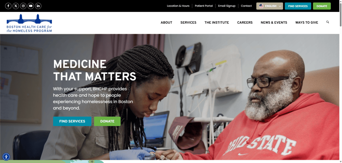
These are great fonts for legibility. Notice the uppercase “C” in “MEDICINE” and the lowercase “o” that appears within the body. Visitors shouldn’t have much trouble reading the text in this hero section.
Letter Distinctiveness
You’re not just looking for letterforms that are difficult to read because they’re too compact or oddly shaped. You also need to look for letterforms that won’t cause issues for people with disabilities like dyslexia.
To cut down on readability issues, your typography should have distinctive letters (and numbers). One of the common tests for this is to compare the uppercase “I,” lowercase “l” and the number “1.”
Let’s look at the footer on the Hers website to see why this matters.
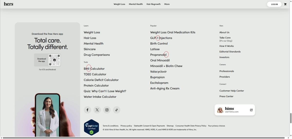
I’ve circled three characters:
- The uppercase “I” in “BMI Calculator”
- The “1” in “GLP-1 Injections”
- The lowercase “l” in “Propanolol”
You can see that Hers only partially passes this test. The “1” is the only distinct character of the three. The lowercase “l” and uppercase “I” may have differing heights and the uppercase “I” appears to be a tad bit thicker. However, the shape of the characters is near-identical, which will make these letters placed near one another harder to distinguish.
You should also look out for lowercase “b,” “d,” “p” and “q.” Though these letters may go in different directions from one another, if their letterforms are identical, it can make it hard for some people to read them. Ideally, you want to see structural differences in each character.
Size, Height & Space
How you design and style your fonts will not only impact the hierarchical layout, but the readability of your content. For this, pay attention to characteristics like font size, weight, kerning, line height and line length.
Let’s look at a homepage that handles this nicely. This is from Vision North.
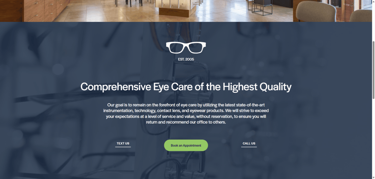
The headline size is 3.6rem. That means it’s 3.6 times the size of the root font size. No matter how small or large the screen gets, this font will always scale this way.
Also notice how much ample space there is within this section. There’s good spacing between the lettering without feeling too roomy. There’s a good amount of space around each bit of text—the headline, paragraph, text links and button. Also, the margins around the text are spacious. This keeps users’ eyes from fatiguing as they read across the screen.
If you’re not sure if you’ve implemented user-friendly styles in your typography, consider doing heatmap testing and session recordings to see if users struggle with certain kinds of text. You may be able to notice patterns of where they get tripped up the most.
Moderated and unmoderated user tests could also be useful in this regard. Or you could always run A/B tests to see if different sizes, spacing and heights impact the readability of your content.
Wrapping Up
Just as you want your physical office to make a great first impression on patients, you want the same for your digital space. Fonts are just one element that can make your healthcare practice or healthtech business look professional, trustworthy and welcoming.
Color choices can also impact your brand perception. If you’re just getting started or are looking to rebrand in the near future, check out this guide on color psychology in healthcare web design.

Suzanne Scacca
A former project manager and web design agency manager, Suzanne Scacca now writes about the changing landscape of design, development and software.
