5 Credit Union Imagery Trends and How to Use Them

Your credit union’s imagery says a lot and can help to distinguish your organization from others in the area. Let’s unpack five effective credit union imagery trends and why they work.
Your credit union’s brand image (i.e., identity) refers to how consumers perceive your organization.
Do they find you trustworthy? Do your core values align with theirs? Do you have something unique to offer within the local market? They should be able to answer all of those questions by interacting with your company online.
There are many ways in which your website and the experiences users have with it help to craft your image. For instance, your imagery (i.e., photos, videos and so on) can tell people things like how modern vs. traditional your company is and who your target demographic is, among other things.
In this post, we’re going to look at some effective credit union imagery trends I’ve found online. Then we’ll wrap up by discussing tips for sourcing and integrating images into your website and digital marketing materials.
5 Credit Union Imagery Trends
Using the same overused and inauthentic stock photos as other companies do (like money falling from the sky or a person holding a debit card in your face) is not the way to go. If you’re looking for inspiration on what works, keep reading.
1. Stock Content with a Message
Based on what I’ve seen, most credit unions don’t have custom photography taken to fill their brand and marketing materials. To be honest, I’m not sure it would even be feasible.
Take a business like a roofing company. They’d have a giant repository of before-and-after photos they could use for their website. But how exactly would you go about capturing a banking service photographically? And would your prospective customers even relate to photos of tellers working behind a desk?
Thankfully, stock photography has come a long way over the last decade. Not only is the quality great, but there’s a good variety of content out there. The trick is to find the right stock imagery to represent your brand.
Let’s look at Grow Financial to start.
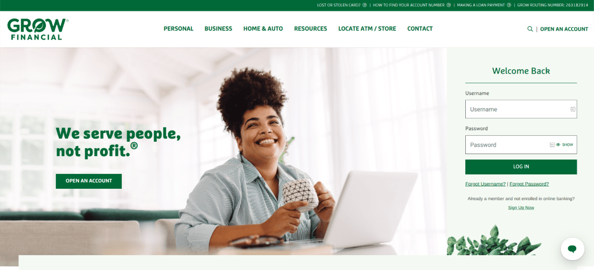
Here we see a young woman smiling in front of her laptop. There are a number of things this photo and some of the others on the homepage convey:
- They serve a diverse range of customers. Age, gender and relationship status don’t matter.
- They serve everyone from military members to creatives.
- This top photo suggests they offer both professional and personal solutions.
- Customers who choose Grow Financial are happy with the financial freedom it affords them.
Now let’s contrast this one with Trailhead Credit Union.
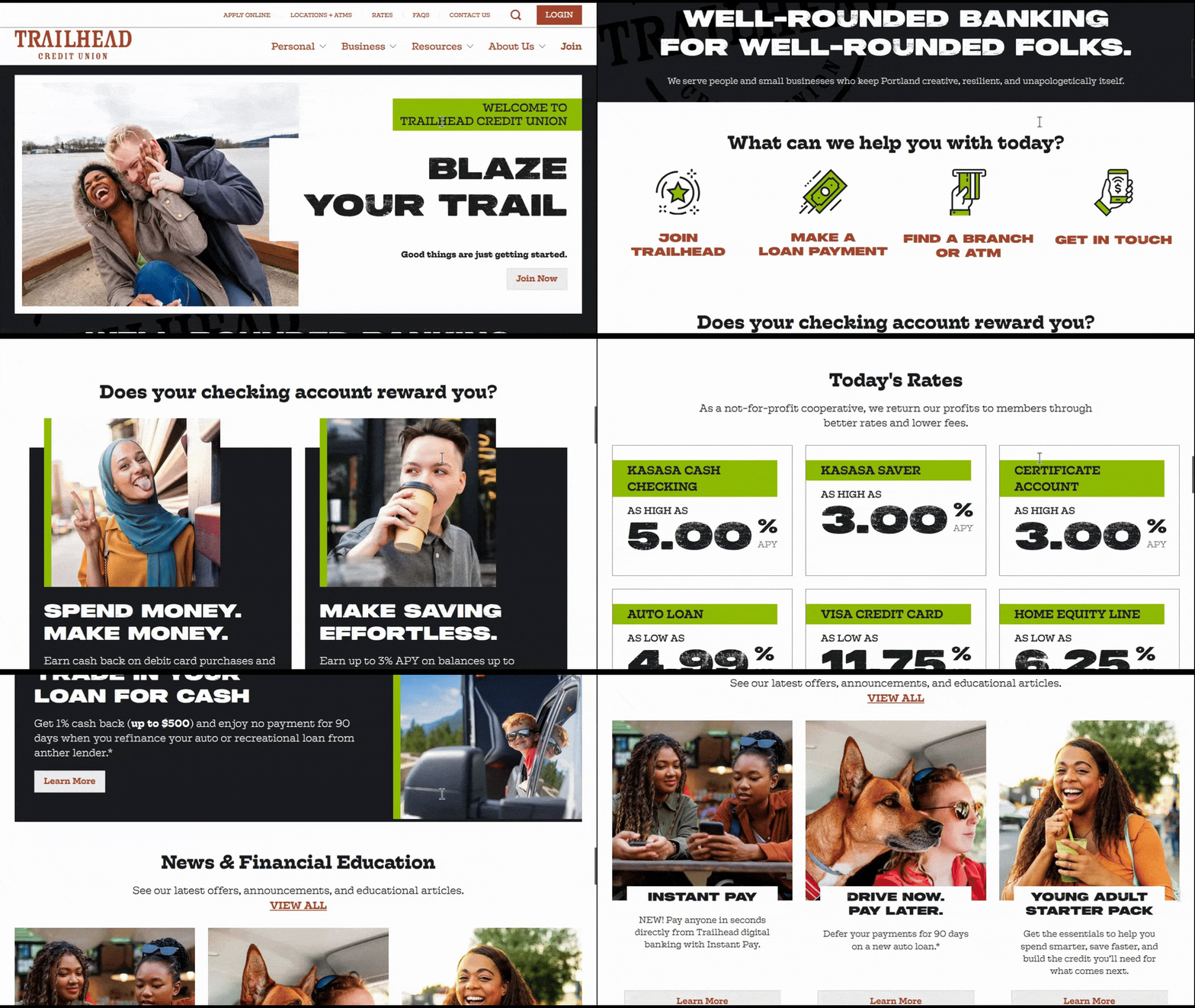
I’m including a video scroll of the homepage so you can see how different these photos (and the web design in general) are from the other website.
While we still get a sense of freedom from the people in the photos, there’s also a casual feel and youthful energy here. My assumption in looking at this website and its graphics is that the credit union is targeting college students, young professionals, as well as young families.
If you’re not sure what signals you want to send out about your brand, your target customers and their financial goals, spend some time doing that before you select your photos.
2. Perfectly Imperfect Photos of Real People
While you may be hard-pressed to find enough photos of real people from your community for your website, that doesn’t mean you can’t integrate them with stock photography. In fact, I think having just one or two such photos can make a huge difference when it comes to building trust with prospects and customers.
Let’s start with MMFCU. The homepage has a couple of photos of real employees.
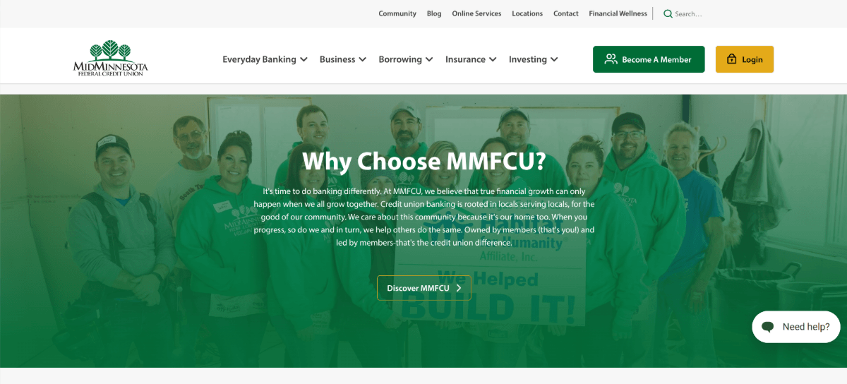
There’s one custom photo in the hero section and another here in the call-to-action section. I wouldn’t say that either photo is professional-grade, but it doesn’t matter.
Customers likely aren’t choosing a credit union based on who has the most polished photos. They want to know there are real people behind the screen and that those people are satisfied with their jobs. Authentic company photos like these give you a chance to introduce customers to your team and to show your company doing something good for the community. In this case, it was building something for Habitat for Humanity.
Next, let’s look at Meridian Credit Union.
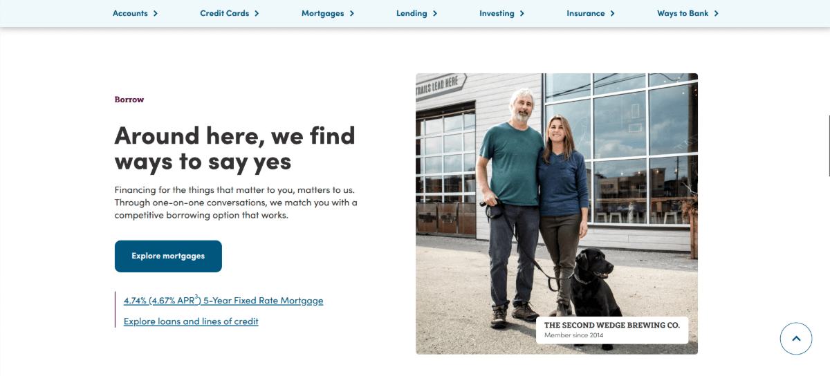
There aren’t any employee photos on the homepage. What they’ve done instead is include real customer photos. In this screenshot, we see a couple with their dog. The caption tells us the name of their business is The Second Wedge Brewing Co. and that they’ve been members since 2014.
This strategy is effective for a couple of reasons. For starters, these real customer photos allowed Meridian’s designers to more or less do away with stock photography. This gives the business a more authentic feel.
Secondly, the photos serve as trust marks. While we don’t have a written or video testimonial from the customer, their faces, business name and length of membership are sufficient.
3. Motion at the Right Moment
There are a number of ways in which you can use motion graphics to get visitors to stop and notice certain areas of your site:
- Sliders
- Carousels
- Videos
- GIFs
- Hover-triggered effects
- Scroll-triggered animations
In my research, I found a lot of credit union sites using sliders and carousels. There’s nothing wrong with that. However, this kind of motion usually requires users to actively set it into motion. And if they’re hurriedly scrolling through your site, they might miss it entirely.
So, let’s have a look at some outliers when it comes to motion.
This is the hero section for Abound Credit Union.
This approach is effective for a number of reasons.
First, there’s the unique factor. This was one of two video backgrounds I saw out of the dozens of sites I looked at.
Second, the stock videos feel very grounded and authentic. There’s the group of friends having a meal outdoors, a mom and child baking in the kitchen and a baseball coach talking to his team. They all depict the same themes of freedom and happiness that we’ve seen in other examples. However, the video format brings them to life.
Lastly, the video can be paused, which is an essential feature for accessibility.
Now let’s have a look at Austic Telco Federal Credit Union.

In this example, the graphics themselves are not moving. However, motion is applied to the typography to reveal the graphics behind it.
There are other animations on this website, like hover and split-screen effects. This one, though, stuck out to me because it’s not one you see often.
I also like the image behind it. One of the things I found when looking at credit union sites is that stock photography doesn’t just depict happy customers. Occasionally you’ll find photos from the general region where they operate. In this case, the background photo shows the Austin city skyline. Credit unions in rural areas usually opt instead for majestic landscapes of mountains, plains or wooded areas.
Since credit unions are community-based (more so than banks), including recognizable regional imagery can help bolster the organization’s ties to the community they serve.
4. Illustrative Design for a Unique Look
If you don’t want to go the route of using stock photos, you could give illustrative design a try. This would give your website a memorable look. What’s more, if you’re concerned about speed, lightweight SVGs could help you achieve faster loading times.
Let’s start by looking at the Lighthouse Credit Union.
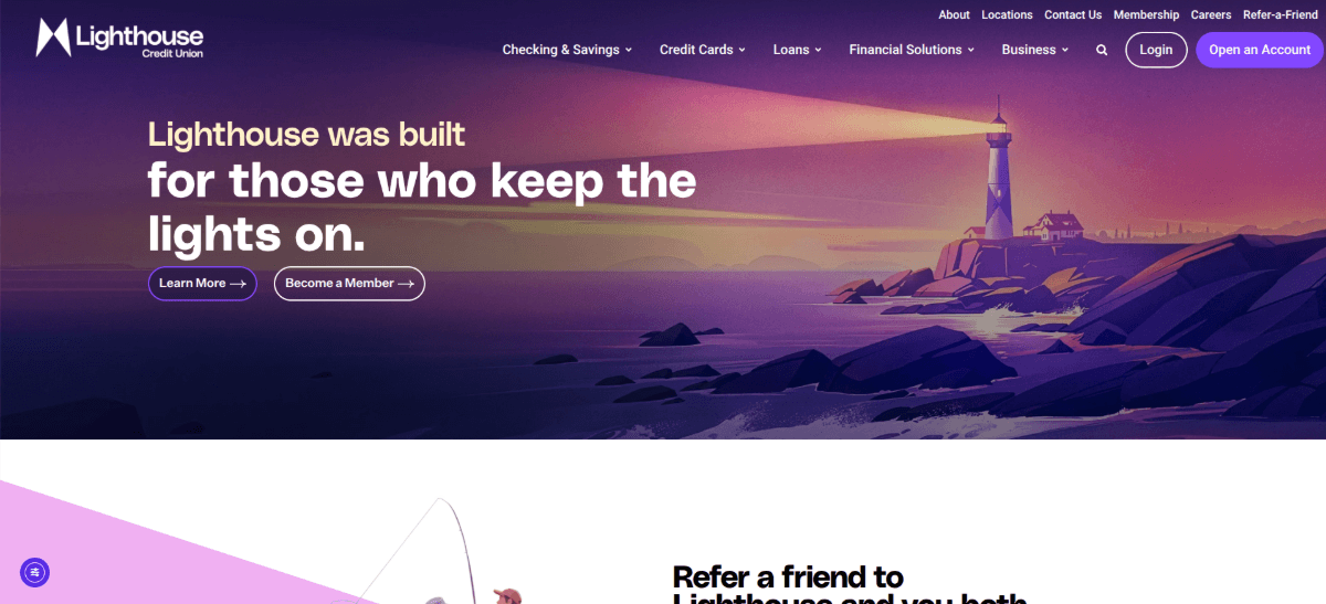
The homepage contains only five illustrations along with some iconography. If you scroll through the page, you’ll see how much more lightweight the page feels—not just in terms of loading speeds, but in terms of content. The illustrations don’t seem to carry as much visual weight as photos do.
Another thing this example demonstrates is how much easier it is to match illustrations to your brand’s color palette. Instead of searching for photos that contain complementary colors or applying the same filter to all of them, custom illustrations allow you to design them that way from the beginning.
Another illustrated example I really like is The Cooperative Bank.
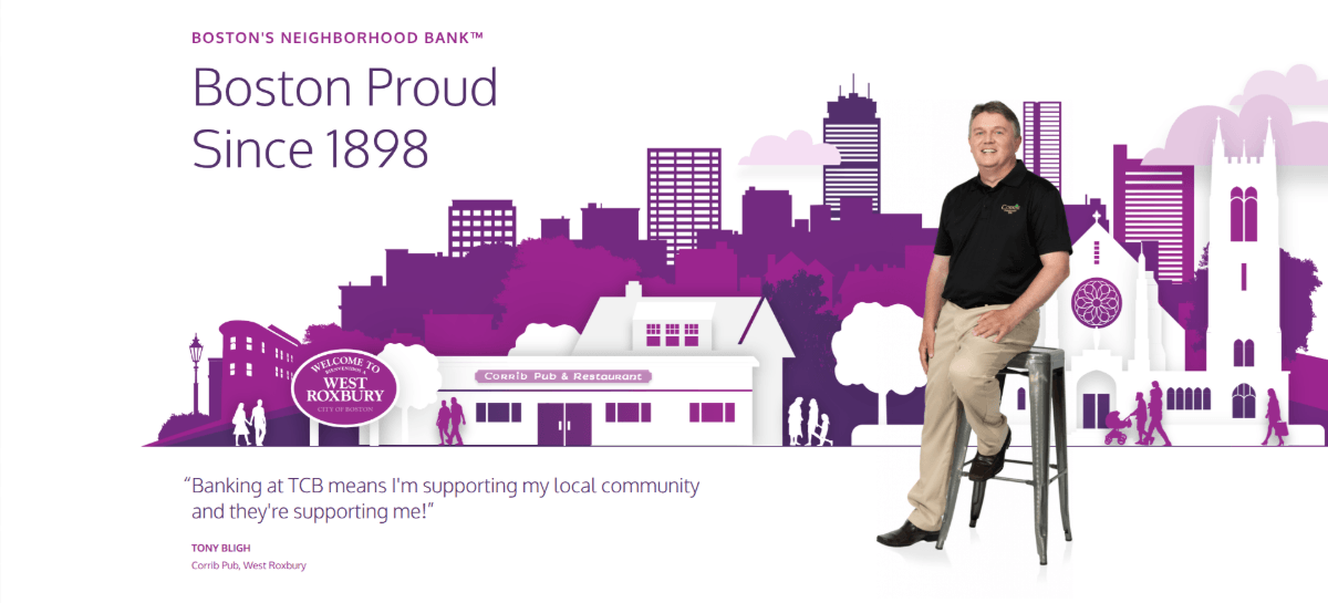
This example is part-illustration, part-photo. Normally, I would advise against mixing formats. However, this one works well because of how it was executed.
For starters, the photo of the man in the foreground is Tony Bligh of the Corrib Pub in West Roxbury (of Boston). Beside him is a testimonial along with his identifying info.
Behind the man is an illustration. If you look closely, you’ll notice that it’s not just there for texture or color.
For starters, there is a drawing of Corrib Pub, which matches what the actual building looks like. Secondly, you can see a number of Boston landmarks, including the Prudential Tower, which is the tallest building in the background.
Not only has The Cooperative Bank managed to create a unique illustration to lead with, it also plays up its local Boston pride.
5. Modern Touches (Rounding, Masks, Shapes & More)
There’s another effective trend I noticed when it comes to credit union imagery. These kinds of websites use stock photography. Unlike the ones we saw earlier, however, they add decorative flourishes that give the page and the brand a more modern and youthful feel.
The first example I want to look at is MECU.
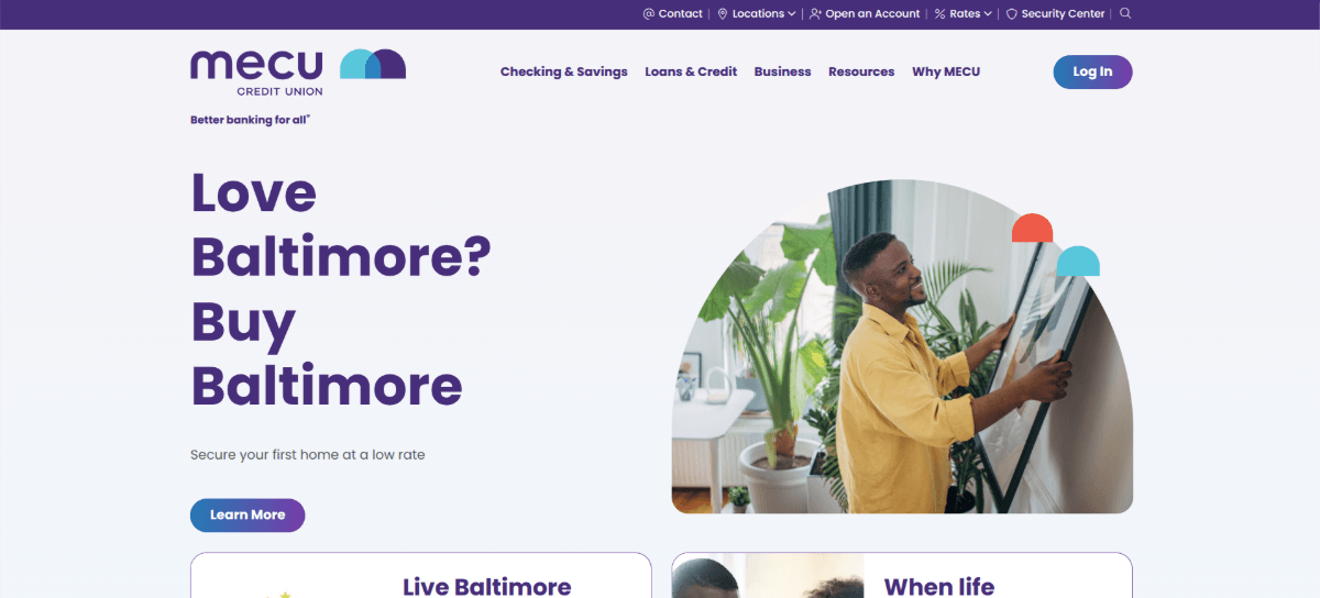
Before you focus on the hero graphic, take a look at the MECU logo. Beside the name are two semicircle shapes—one a light blue, the other a dark blue.
Now look at the hero graphic. It’s placed inside a mask that’s similar to the shapes seen in the logo. In addition, two of those shapes appear along the top-right edge of the graphic in red and blue.
The branded mask, the rounded image edges, and the colorful shapes give this credit union’s website a much different vibe than many of the others we’ve looked at. And this is even with them using stock photography.
Another credit union that’s adopted this modern style is WESTconsin Credit Union.

This website’s imagery hits a lot of the trends we’ve looked at:
- The stock photography depicts a diverse array of customers.
- It showcases customers that look free and happy.
- There are real team and customer photos.
- We see hints of the local setting in the backdrop of some photos.
- There are subtle parallax effects applied to the imagery.
On top of all that, we see the rounded image edges, colorful shapes, and graphics layered with photos. This is a great example of how to give your credit union a modern, youthful, and energetic look.
Tips for Choosing & Using Imagery in Your Credit Union Marketing
Here are some final tips I’ll leave you with for choosing imagery for your credit union website:
- Know your company’s goals.
- Understand who your target audience is—demographics, needs, goals and emotions.
- Pick a style of imagery and maintain consistency throughout the site.
- Choose images that move away from the act of banking and focus instead on the outcomes (i.e., happy customers and employees).
- Save the really creative imagery and effects for the homepage.
- Use motion sparingly and at key junctures on the homepage.
- If you can’t find images with colors that complement your brand, apply a filter.
- Don’t be afraid of using real photos even if they aren’t “pretty.”
- Play up the community aspect. If you don’t have photos of real people, use photos of your local community or geography.
With the right website and marketing imagery, your credit union can make a strong first impression, help visitors relate to your organization and create a memorable experience.
Enjoyed this article?
Add Progress as a preferred source to see more of our content in Google search.
Add Progress as a preferred source on Google
Suzanne Scacca
Freelance Writer & Consultant

