Using Color Psychology for Education Web Design

Let’s look at a study done on color in education design to better understand the significance of color and how to use it in the UI of an educational institution’s website.
You’re about to work on building a website for an institute of learning. While they might already have a logo, you’re wondering which of those colors (as well as others) you can employ in their web design.
Color design isn’t as simple as taking a brand’s or school’s colors and fitting them into areas where they look good. You have to take into consideration what those colors signify as well as the effect they might have on visitors’ emotions and behaviors. In addition, you have to understand how those color meanings change based on the industry and context.
In this post, we’re going to look at an interesting study done on color use and visual identity for universities. Then, we’ll examine what the most popular colors mean, why a designer and brand might want to use them on an education website, and some examples of real schools (of all types) that put them to good use.
What the Data Says About Educational Brands and Color
While combing the web for data on color use in education, I found lots of studies that looked at how color choice in the physical learning environment affected students. For instance, certain visually stimulating and positive colors were used over and over again and were found to improve focus, retention and attitude.
Red, in particular, seems to be the most potent color.
This 2021 study compared how red, purple and green wall colors affected the concentration levels of students. The red wall was the only one that had a stimulating effect on students and, in turn, increased their attention.
The Impact of Colors on Learning report also backs up this idea that red is a powerful color to use when designing a learning environment.
“Mehta and Zhu’s (2009) study indicates that different colors can affect ‘performances on different types of cognitive tasks’ (p. 1045). Specifically, red, associated to danger and failures, can activate a prevention focus to remind people to prevent such negative outcomes, thus enhancing performance on detail-oriented cognitive tasks such as a memory task, proofreading and accuracy related task, and task requiring attention to detail. Red enhances persuasion.”
While it could be beneficial to choose a color like this to draw attention to our websites, what works in the real world doesn’t always apply in the digital sphere.
A 2020 paper entitled Color in Higher Education Branding: A Content Analysis of Visual Identity Guidelines & Website Design gives us a better idea of what works digitally for education. Or, at the very least, what designers in the education niche tend to lean toward when creating the digital color palette for websites.
Here are some of the more notable statistics from the study:
The majority of university brands stick to the minimal color palette rule:
- 46% had 2 colors in the primary color palette
- 27% had 3 colors
- 12% had 1 color
When looking at the percentage of university brands in which certain colors were present, the study’s author found the following colors to be the most popular:
- Yellow (39%)
- Blue (36%)
- White (35%)
- Red (31%)
- Black (28%)

What’s interesting to note, however, is that the most popular color (yellow) never appeared alone. Also, black, white and shades of gray were always paired with other colors.
Of the 12% of schools that had only one primary brand color in their palette, none of them used yellow. Purple and green were the most popular solo colors, while blue, red and orange were also commonly used on their own.
Now, the data above pertains specifically to the primary color palette used to establish the brands’ visual identities (like in the logo). However, the study also looked at colors used on the homepages of these universities.
Here’s what it found in terms of color distribution:

If we take away the neutral colors commonly used to fill backgrounds, white space and to color text, the bar graph follows a similar pattern in terms of color popularity. Yellow (45%) remains the most prominent. Blue (39%) is the second most prominent. And red (34%) the third.
What to Do with Colors in Education Branding and Design
So, why would institutes of higher learning adopt these three colors—yellow, blue and red—over others? According to the study:
“[T]his finding suggests that many universities are associated with personality attributes that fall into the dimensions of competence, excitement and sophistication. More specifically, universities with yellow brand colors may be associated with excitement and youth, blue branding may be associated with competence, intelligence and success, white branding may be associated with sincerity and simplicity, and red branding may be associated with excitement, strength and confidence.”
While that makes sense for universities and colleges, are they the only educational institutions where these traits are idealized and embraced? Not at all.
As I did research for this article, I had no problem finding different types of schools that used the prominent brand and web design colors reported on in the study. That said, I also found schools willing to challenge the norm.
So, whether you’re looking to go a more traditional route or try something a bit more modern and edgy, here’s what the most common colors mean, some good ways to use them and examples of websites that currently put them to use:
Yellow
Yellow commonly signifies or is associated with:
- Youthfulness
- Energy
- Positivity
- Happiness
- Lightness
Not only that, the color is visually and energetically stimulating. That’s why fast-food restaurants like McDonald’s include it in their branding and packaging.
As for educational institutions, they’re probably not using the color yellow to whip up their prospective students, current teachers or alumni into a feeding frenzy. However, some of these schools are likely using it to generate excitement, like Pre-K 4 SA in San Antonio:
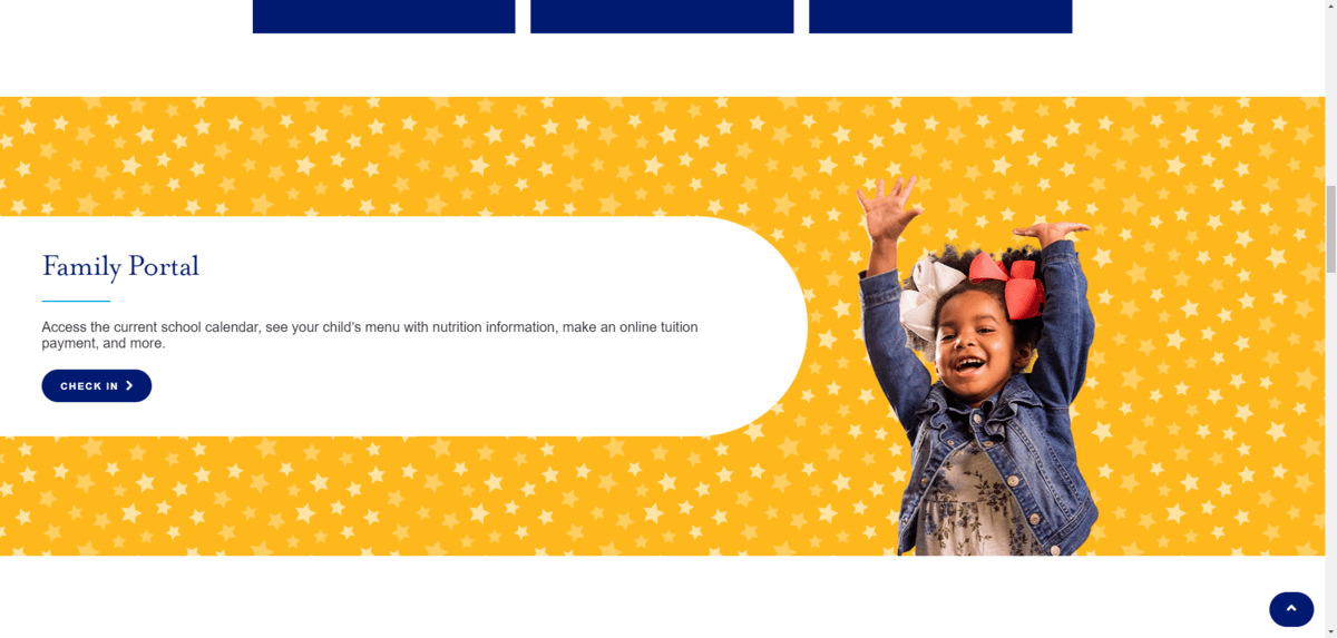
The majority of the website contains the color blue. However, there are bright pops of yellow that appear along the way. This is in line with the study’s findings above where yellow was never observed to be the solo color in branding or web design. Instead, it appears to be an effective way to complement more stabilizing colors in the palette.
In this example, we see how yellow is used to instantly capture the attention of anyone scrolling down the homepage. And paired with this adorable photo of a little girl, it plays up both her excitement as well as her youthful energy.
When we think of yellow, we often imagine this bright version of it. However, other yellowish tones can be useful when creating the look of an educational brand and its website.
For example, Vanderbilt University uses a muted shade of gold:
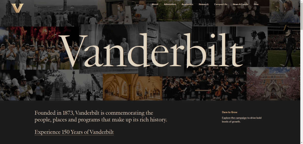
In this case, the yellow coloring of the logo and fonts take on another significance. Namely, the goldish hues suggest great intellect, wealth and success, which is totally inline with the reputation of this school.
Blue
Blue commonly signifies or is associated with:
- Competence
- Intelligence
- Maturity
- Tradition
- Trust
Blue is also known for having a calming effect. For people applying to an institute of higher learning for the first time, this can be an especially useful color to employ in web design.
For example, Hawaii Pacific University uses this beautiful shade of blue for its branding as well as in the background of key parts of the website:

The blue isn’t too bright or light and it looks great beside all the water-inspired imagery. It gives the website a more relaxed appearance, which is a nice juxtaposition against all of the content that prospective students have to digest before applying to the school.
If you’re building a website for a school with more traditional, conservative or religious leanings, blue is a good color to use as well. The key is to use a shade of blue that emphasizes the seriousness of the institution and learning environment. Darker blues, royal blues and even some brighter blues work well.
Here’s how the color blue is used on the Marian High School website:
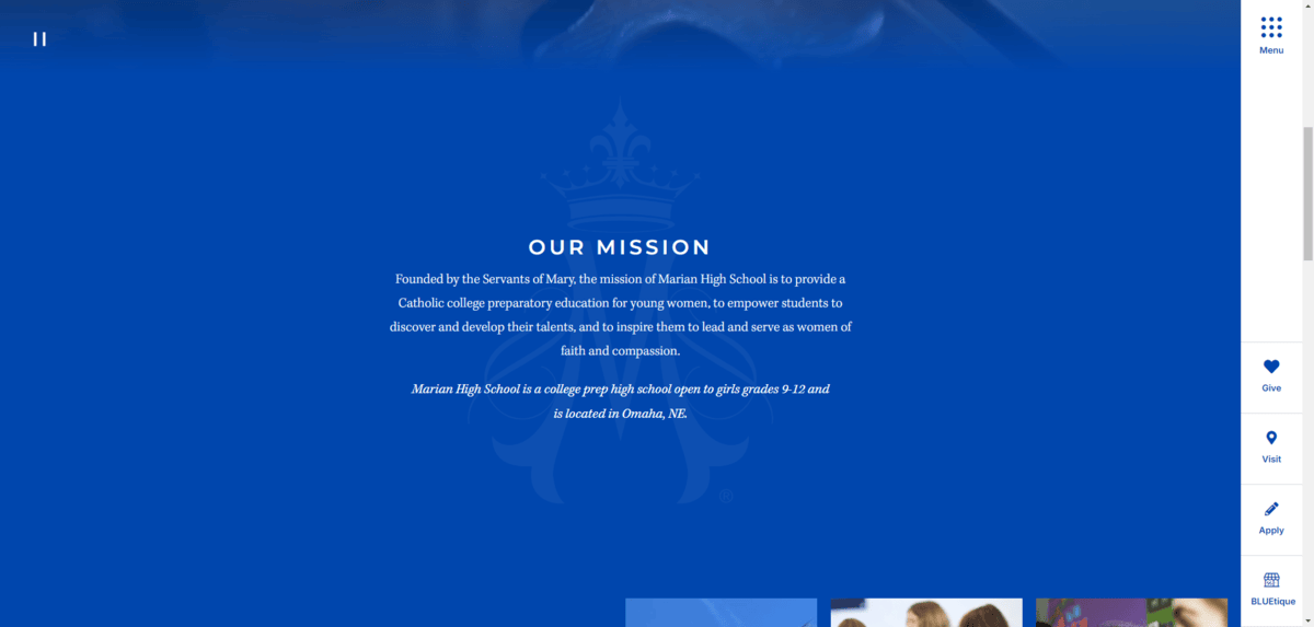
This vibrant shade of blue works beautifully for this Catholic college preparatory school. It’s not used excessively throughout the website. However, when it does appear—usually in the background of key sections like this mission statement—it has a strong impact on the viewer.
Red
Red commonly signifies or is associated with:
- Excitement
- Strength
- Passion
- Bravery
- Power
Like its yellow counterpart in McDonald’s branding, red is also a highly stimulating color.
Now, while most colors have both positive and negative meanings associated with them, red’s negative connotations are a bit more serious. As a result, this can make it a risky color to use in branding if you don’t choose the right hue or use it an appropriate amount.
For example, the Elite Preschool of Concord has a fairly vibrant red as its solo primary color:

This shade of red is used mostly as an accent color throughout the website. In addition to appearing in the background of the circular logo, it’s also used in the following places:
- Navigation links
- Inline links
- Buttons
- Headings
- Separator lines
The color shade is a solid choice. It evokes feelings of passion and excitement, which fits well for a school that will be the introduction to education that most students receive. Excitement and enthusiasm in promoting it is the goal.
There are other red hues you can use that will keep you out of risky territory. For example, you want to avoid ones that resemble blood or evoke a sense of emergency.
Funnily enough, the Transylvania University of Kentucky has adopted a dark crimson red as its primary brand color:
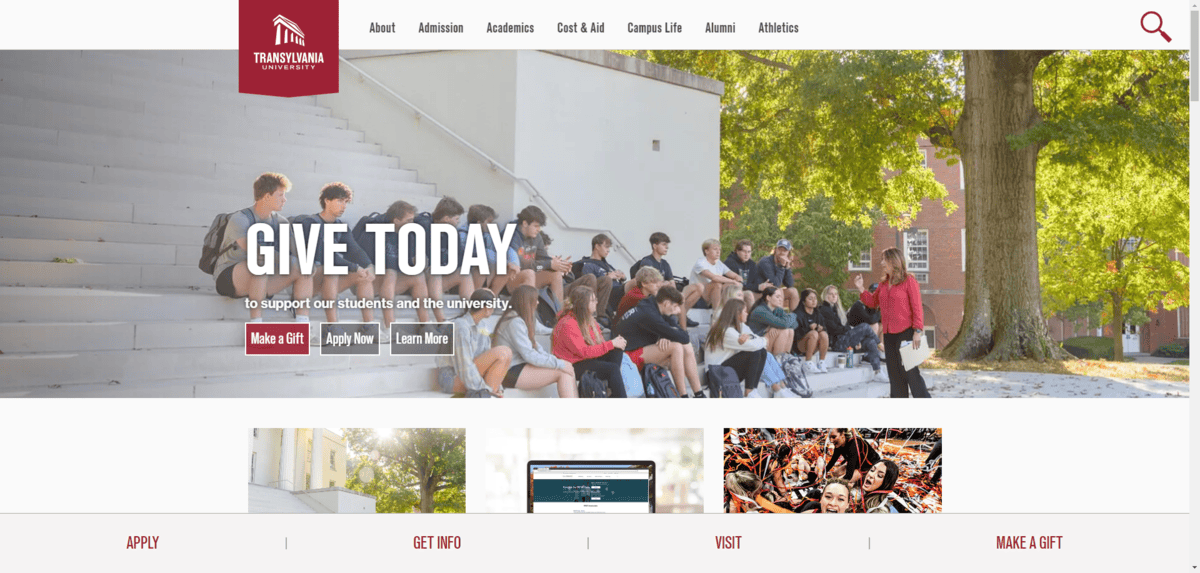
Considering Transylvania’s reputation with Dracula and vampirism, the crimson color is an interesting choice. But the designer has done a great job with it, choosing to use a dark crimson color.
The red is more likely to allude to strength and emotion rather than blood or danger. It’s also helpful that it appears so sparingly throughout the design. Aside from the logo, you really only see red used for small graphics, links and buttons. It does appear in some background sections, but it’s either brightened up a ton or darkened almost to the point of looking black.
Green
Green commonly signifies or is associated with:
- Health
- Harmony
- Freshness
- Growth
- Wealth
What I found interesting when looking for green education websites was how many of them use a green and gold color pairing. For example:
- University of Alaska Anchorage
- Arkansas Tech University
- Cal Poly Humboldt
- Northern Michigan University
- Siena College
- Southeastern Louisiana University
- Wayne State University

If we’re looking at this from the color theory perspective, there could be a couple of reasons why this pairing is so common.
One reason is that both gold and green signify growth and wealth. Subconsciously, these schools want to suggest to prospective students that these will be the outcomes if they get a degree from them.
Another reason this color pairing might be so common is because of how well-balanced it is.
We know that yellow is a color that educational institutions gravitate toward, but that they’re reluctant to use it on its own—to the point where none of the studied universities had used yellow as the only brand color. With green (especially rich greens like the one we see above) being such a healthy and calming color, it’s the perfect complement to yellow’s energy.
The rich and darker green color palettes are typically what we see when green is used in higher education web design. That said, it’s not the only way to use this color.
Let’s look at the example of Little Sunshine’s Playhouse & Preschool:

The website has a natural-looking color palette with browns and greens being the primary colors used. In the screenshot above, you can see exactly why green plays such a dominant role in this website design:
“We create a nurturing environment for each child”
Green is a color that’s often associated with health, nature and nurturing. This preschool is speaking directly to parents through color, assuring them that their children will be in a safe and comfortable atmosphere where they’re well looked after and their growth a top priority.
It’s also a calming color. So, similar to how blue may be used to calm prospective students as they consider their vast array of schooling options, green can be used to do the same with parents who feel anxious about sending their kids to private schools, distant universities and so on.
Orange
Orange commonly signifies or is associated with:
- Courage
- Energy
- Confidence
- Creativity
- Friendliness
Orange isn’t the most popular of colors used in education web design. Nor will you find websites draped in orange the way you would blue or green. However, it does play a similar role as websites containing yellow.
Orange is a great way to bring energy to a website.
Clemson University, for example, uses vibrant pops of orange to break up so much of the purple used in the background of the site.
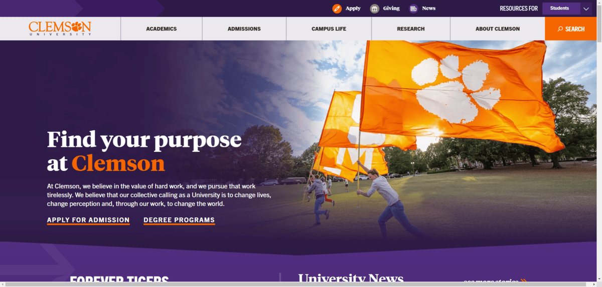
Because of the strong color contrast as well as the general brightness of the orange, it’s an effective way to get visitors to pay attention to important elements on the site.
For starters, the orange reinforces the branding. It’s used for the “Clemson” part of the logo as well as to highlight the word “Clemson” in the hero section’s heading.
Secondly, the orange is used in the most important links on the page. This includes:
- The icon beside the “Apply” button in the top toolbar
- The “Search” button in the header
- Underlining the “Apply for Admission” and “Degree Programs” buttons in the hero section
As you look through other parts of the site, you’ll notice that orange is intentionally used in areas where a university would want there to be tons of engagement.
Another way to use orange is to break up the serious vibe of a school’s web design. The Rochester Institute of Technology is one of those websites:

That’s not to say that other universities or schools aren’t serious. However, technical institutions often appeal to very tech-minded individuals instead of a broad array of learners with interests in the arts, sciences and other fields.
So, black is a great primary color for a school like RIT. It just can’t be the only color used on the website as it’s not an effective way to get people’s attention.
This is where orange comes in handy. It’s also not as bright and youthful as, say, yellow. Something like red might work, but it wouldn’t help the school stray from its serious edge. Which is why I think orange is a good pairing option in this case.
Wrapping Up
We might have pretty clear-cut ideas of what certain colors mean and how they can be used to compel visitors to think or take action. That said, which colors we use does greatly depend on the niche we’re working in.
For example, in a field like healthcare, blues and greens are everywhere. While these colors have powerful significance and calming properties, they’re not as commonly used in the educational space. So, it’s a good idea to familiarize yourself with color theory as it pertains specifically to your niche, find out what’s worked for others and then put those best practices to work for you.

Suzanne Scacca
A former project manager and web design agency manager, Suzanne Scacca now writes about the changing landscape of design, development and software.
