Creating Responsive Sitefinity Navigation

The content you're reading is getting on in years.
This post is on the older side and its content may be out of date.
Be sure to visit our blogs homepage for our latest news, updates and information.
One of the most important elements when designing a website to be mobile friendly is of course, the navigation. A common complication with the navigation menu turns out to be the different intended behaviors. For instance, you might want to have a dropdown menu with one or more sublevels available
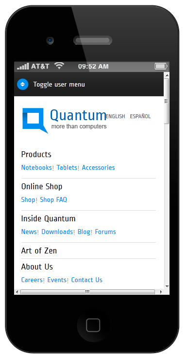
While on a mobile device, the navigation should be easily usable via the touchscreen, so you might want to have something like this:
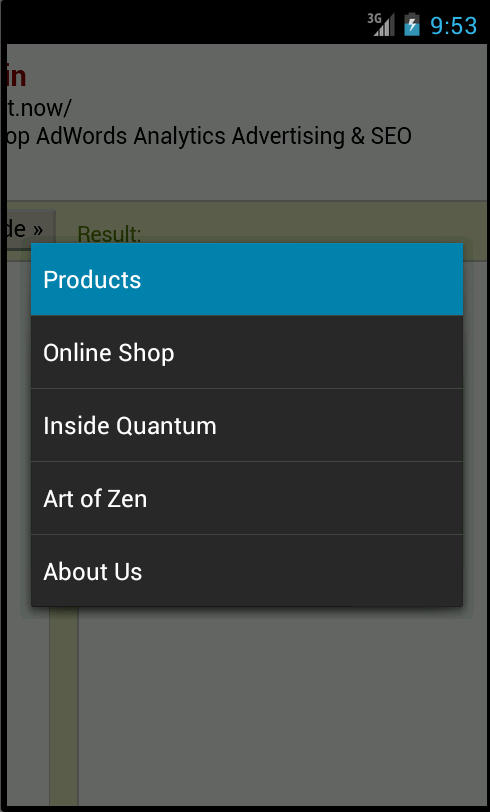
Or even like this:
Is it possible? Definitely! Is there a one-size-fits-all kind of solution? Hardly. There are different cases we need to consider: what’s your original navigation like? Is it a flat, single level tabstrip?
Or is it a dropdown or even a mega menu?

These are all separate scenarios that require a different approach. We’ll revise them all.
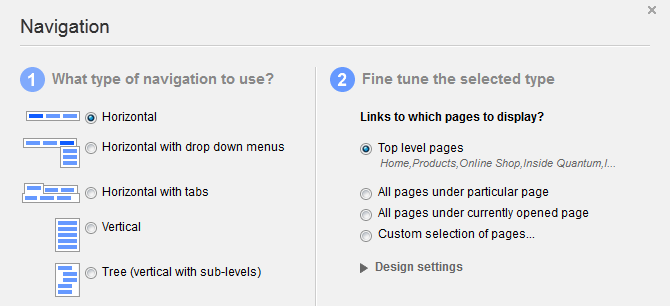
Let’s start with the more simplistic one, like a single level menu. In this example, we’ll address the built-in navigation widget in Sitefinity and using the “horizontal” behavior:
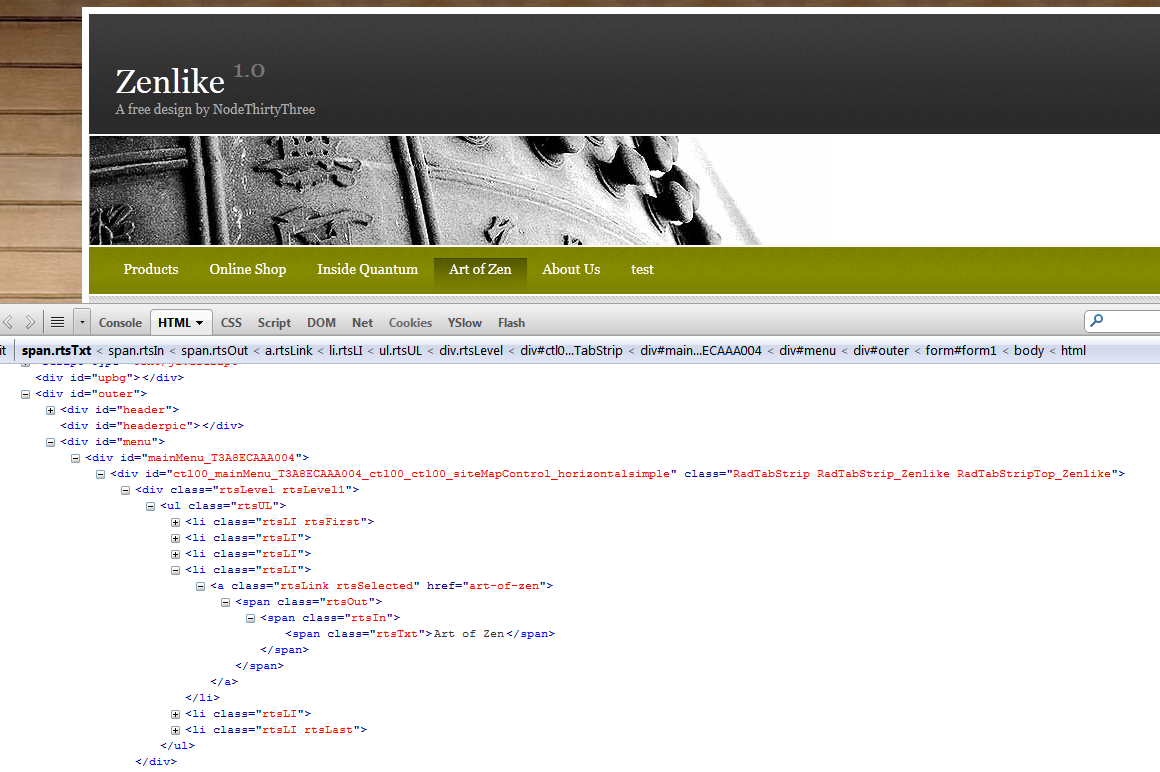
The markup looks something like this:
As you can see, the generated output is a standard unordered list (ul) with each option in the menu being another list item (li). Remember that all CSS skin file selectors that are embedded in the control are fully documented, and you can create your CSS to control the appearance of each element. We have done this to design the menu like we see on the screenshot above.
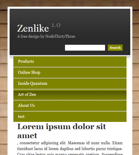
Now, if we need to have different behavior on mobile devices, the easiest and cleanest thing we could do is use a CSS media query, which would specify different CSS styling when the website is viewed on a smaller screen. For example, we could have our menu become something like this:
whenever viewed on a screen, that’s less than 640 px in width. It’s a matter of a few lines of CSS:
@media screen and (max-width: 640px) {
.RadTabStrip_Zenlike li {
width: 100%;
border-top: groove 2px;
border-bottom-color: #767676;
}
.RadTabStrip_Zenlike .rtsLevel .rtsUL li.rtsLI .rtsLink .rtsOut .rtsIn {
padding-left: 10px;
text-align: left;
display: block;
}
}
For these of you, eager to see the full Sitefinity template with the theme’s CSS – the link to it is at the bottom of this page.
Let’s take a look at what happens here: using a media query, we detect whenever the screen size is 640 px. or less in width. If the condition is met, we set the list items in our unordered list to be displayed as a block, so they appear one per row. Also, we force them to fill up 100% of the width of the containing block (the width: 100%; property.) That would set each menu item to be easily accessible by touching anywhere on the row it’s on.
Simple, neat and no duplicate content - just restyling.
Something similar is possible in cases, when you have a dropdown or mega menu - check out the menu on http://www.sitefinity.com/ and see how you can toggle it. It’s again a matter of creating the CSS. There are lots of samples for similar styling across the web.
If togglable menus are not the preferred solution for the mobile version of your page, or if restyling your dropdown/mega menu is too much, there is another approach. Simply have two navigation widgets, of which only one would be visible at a time. How? Easy – simply put each widget into a container and change the “display” settings for them when viewed in large or small screen:
@media screen and (max-width: 640px) {
div.MegaMenu {
display:none;
}
div.MobileMenu {
display:block;
}
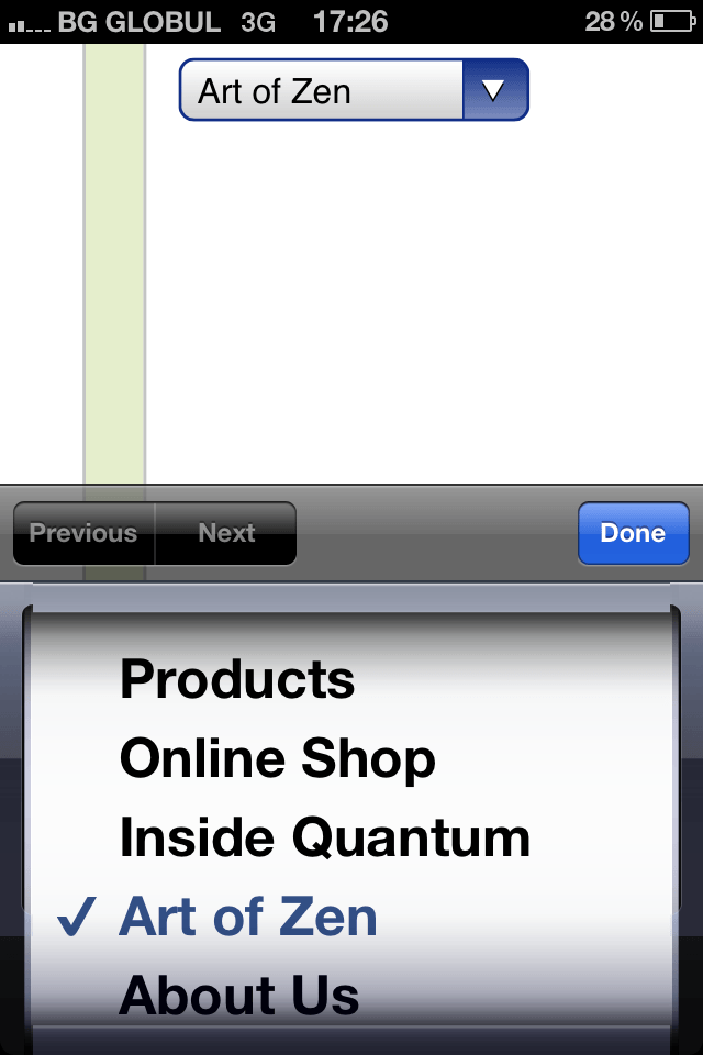
Hottest trends lately, however, suggest using native interface representation, that’s typical for mobile devices. “Select” dropdown lists are a great example – if we can convert a menu to a <select> dropdown list, we will have a native user interface on iOS and Android, that will represent our information in an even more user-friendly and sleek way.
Here’s How:
First, we start off by adding our <select> dropdown list to our template. Again, using the hide/display option using display:none; settings and media queries, we toggle the visibility of our main menu and the select dropdown.
But wait, does that mean that we have to manually manage that dropdown and populate it with options every time we add or remove pages? Not necessarily – with a simple Javascript we can dynamically generate the <select> list from our original navigation. Chris Coyier from CSS Tricks has a neat sample for this.
One thing that I still haven’t found a definitive answer for is this: do the hidden navigation menus and their anchors affect SEO somehow? I’ve consulted with SEO experts and the answer I’ve received so far is the same – no one can tell for sure, as search engine algorithms are kept in secret. Common belief is that user experience is more important.
What do you think?


