Customize autogenerated fields
You can customize the automatically generated fields by using the following predefined attributes:
DefaultValue
The DefaultValue attribute determines the predefined value that is displayed when the widget editor opens initially. The user can overwrite it afterwards.
To apply this attribute, use the following code sample:
DisplayName
If you add this attribute to a property of the widget, the property title is displayed according to the specified value.
To apply this attribute, use the following code sample:
Description
This attribute serves as instructional text for the field. It provides instructional text to clarify the usage of the field.
The description looks in the following way:
To apply this attribute, use the following code sample:
DescriptionExtended
This attribute inherits the Description attribute and adds two additional properties to provide additional UI elements for enhancing the field visualization – InlineDescription and InstructionalNotes.
The attribute looks in the following way:

To apply this attribute, use the following code sample:
Placeholder
This attribute specifies a placeholder text in the input field. You can use it to visualize a predefined text in the input field that will be overwritten by the user. It is valid for fields of type string only.
The attribute looks in the following way:

To add this attribute, use the following code:
Mirror
This attribute sets a field that mirrors its value from another field. For example, the page title for search engines is mirrored from the page title and it can be later overwritten. It is valid for fields of type string only.
The attribute looks in the following way:

To add this attribute, use the following code:
Browsable
If you add this attribute to a property of the widget, the property is not displayed in the property editor, and it will not be persisted in the database. This property becomes hidden.
To add the attribute, use the following code:
TableView
This attribute is valid for complex objects. It controls whether to render the complex object inline as a table or as a section. You can also use it with lists of complex or primitive properties to modify the way the table looks like. For more information >> Lists.
By using this attribute, you can:
- Control whether the table rows can be reordered by drag-and-drop
- Control whether a single or multiple table rows can be selected by default
- Control whether many rows can be added at once either from selecting a predefined list or by entering values manually.
- Control the number of columns that are displayed when rendering lists of complex or primitive properties. The rest of the columns will be accessible through a separate page using the More details button
Complex object as a table view
The attribute makes a complex object look in the following way:

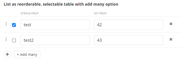
Reorderable table view with selectable rows and Add many options
You can use the table view with lists of complex or primitive properties to make table rows selectable and reorderable.
The table looks in the following way:

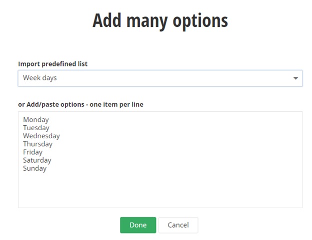
Add many option
You can add Add many button. It is used to add a longer list at bulk. You can also use a set of predefined list that you can find useful, such as Timezones or Countries.
The option looks in the following way:

To add the table view attribute, use the following code:
NOTE: In the above sample:
ColumnCount is the number of columns that are displayed in the table, the rest are collapsed and can be viewed by clicking More details.ContentSection(<number>) is the order in which the properties are displayed in the table. For example, ContentSection(1) displays the property in the first column.
You can provide predefined lists with values in a JSON file. You place the file in one of the following:
- In the root folder -
wwwroot/js/{widget_name}/{file_name}.json
- As embedded resource –
Scripts/{widget_name}/{file_name}.json
The file must have the following structure:
DataType
This attribute controls the visualization of the field.
You can use it in the following ways:
HTML editor
Use the DataType attribute to display a string field type as an HTML editor.
The HTML field looks in the following way:

Color picker
Use the DataType attribute to display a string field type as a color picker. You can combine the DataType and the DefaultValue attribute.
The color picker looks in the following way:

To configure the values of the color picker, use this sample on Sitefinity GitHub repository.
Text area
Use the DataType attribute to display a string field type as a text area.
The text area field looks in the following way:

Checkbox
To display a Boolean field type as a checkbox, use the following code:
The checkbox looks in the following way:

Radio button
Use this attribute to display a single option selector as a radio button. You use this attribute with the enum type.
The radio button looks in the following way:

Chip selector with enum values
Use this attribute to display a single option selector values as a chip selector. You use this attribute with the enum type.
The chip selector with values looks in the following way:

Chip selector with int values
Use this attribute to display a single option selector integer values as a chip selector. You use this attribute with the int type.
The chip selector with numbers looks in the following way:

Dropdown
Use the attribute to display a single option selector as dropdown. You can either do this using an enum type or by utilizing the ChoiceAttribute.
The dropdown field looks in the following way:

Password
Use the attribute to display a string field type as a password field.
The password field looks in the following way:

External data choice
You can populate a dropdown box or a list of choices dynamically from a custom data source, such as an external API. You can do this for single selection fields, such as dropdown box, or for multiple selection fields, such as checkbox.
You achieve this by creating an extensibility point in the ASP.NET Core Renderer.
For more information, see All properties widget sample » Extensibility on Sitefinity GitHub Repository.
Dynamic choice fields look in the following way:

Range
Use the attribute to display a build in component for setting a range.
The range field looks in the following way:

File types
Use the attribute to display a build in component for selecting allowed file types.
The field looks in the following way:
Attributes
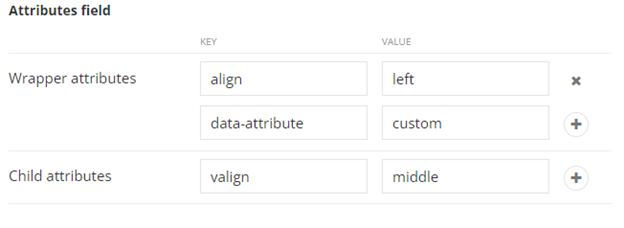
Use the attribute to display a build in component for creating and modeling attributes. The attributes are plain key-value pairs. This way, you can use the component for multiple purposes that can take advantage of such data structure.
The field looks in the following way:

To apply the DataType attribute, use the following code sample: