Types of charts
IMPORTANT: Sitefinity CMS Analytics module is unavailable after July 1, 2024, because it depends on the discontinued Google Universal Analytics. We recommend using Sitefinity Insight and the Script manager (available in Sitefinity CMS 14.3 and later) to integrate another analytics solution.
Analytics uses different types of charts to represent data. Single data series are represented by area charts and multiple series are represented by stacked area charts. You can also change the view of the charts. Pie charts are used to depict data from tables.
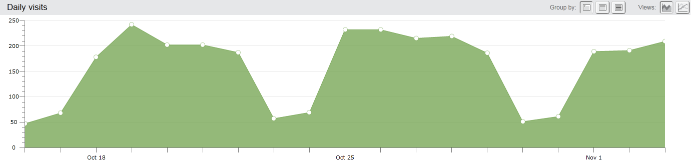
One dimensional area chart
Analytics uses the area chart to represent a single time series. The screenshot bellow displays the Visits of your website grouped on a daily basis:
 enlarge screenshot
NOTE: When you hover over a point in an area chart, the system displays the value of the indicator for the day, week, or month which you have hovered over.
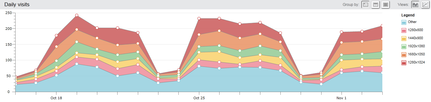
Multidimensional stacked area chart
Analytics uses stacked area charts to represent graphically the proportion between different time series. At each point from the time interval, you are able to see both the cumulative value (the upper most point in the chart for that day) as well as the proportion with which each time series contribute.
The stacked area chart displays the five series that have the biggest total sum for the time interval you have selected. All other series are summed together and represented as Other. Note that Other is always displayed at the bottom of a stacked area chart.
The following screenshot displays a stacked area chart, plotting the number of visits of users that use a particular screen resolution. The five most commonly used resolutions are plotted, while all the other data is summed and represented by others. Note that for each day, the sum of all time series (the upper most point) add up to the total number of visitors (represented in the previous screenshot):
 enlarge screenshot
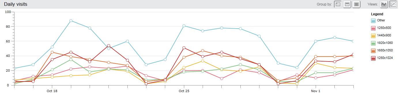
Multidimensional line chart
The line chart is not a cumulative (stacked) chart. Each timer series is represented by its own line. The line chart is better if you want to spot a time trend, but, unlike the stacked area chart, seeing the proportion of the series is not that straight forward.
To switch between area chart and line chart, use the Views: button group in the toolbar:
- To display data in area charts, click
 (Area Graph).
- To display data in line charts, click
 (Line Graph).
The following screenshot represents the same data for screen resolutions as above, but in a line chart:
 enlarge screenshot
NOTE: When you hover over a time series in a stack area chart or a line chart, the system displays the name of the series and its value for the day, week, or month which you have hovered over.
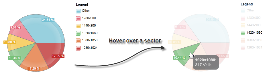
Pie chart
The pie chart is used to graphically depict data from tables. It is used to represent only the proportion between the series. The pie chart does not depict data in time, it uses total sums of all series for the chosen time interval.
The following screenshot represents the screen resolutions in a pie chart:
 enlarge screenshot
NOTE: When you hover over a sector in the chart, the system displays as quick info text the name of the series and its total count for the selected time interval.
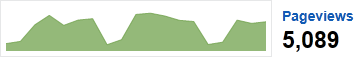
Overview chart
Analytics uses overview charts for indicators, displayed in main reports. The overview charts are always small area charts, which display no details. One of the indictors is displayed in the main chart and you can see the overview chart next to the other indicators. When you click an overview chart, it is displayed in the main chart.
The following screenshot displays the overview chart of the Pageviews indicator: