Use the Section widget
Overview
After, using the Section widget, you have divided the ASP.NET Core page into the desired layout elements – rows and columns, you can style each element.
Styling includes defining margins and paddings and applying background color or image.
You can style each Section widget and its columns individually.
Procedure
To do this, perform the following:
- Hover over the Section widget that you want to divide into columns.
- In the upper-right corner of the widget, click its SECTION label.
A menu with options appears.
- Click icon
 .
.
The styling page appears. It has the Section style and the Column style sections.
NOTE: If the Section widget does not have any columns, it is treated as having one column that you can style separately of the section.
Style the Section
For each Section, you can configure the following:
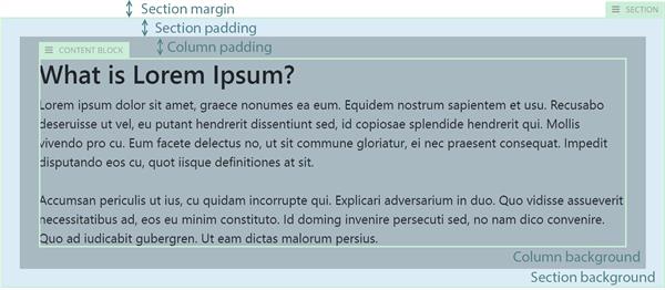
- The section margins – choose from the predefined values of none, small, medium, or large.
- The section paddings– choose from the predefined values of none, small, medium, or large.
- The background color of the section.
Choose one of the following:
- Use a Color for the background.
In Value, select one of the predefined colors.
- Use an Image for the background.
Click  (Select) and choose between the following:
- Upload an image from your computer
To upload an image, drag and drop it in the window or click Upload image from your computer, browse your computer to find the image you want to upload and click Open.
- Select an image from library
The system displays recently used images.
You can select one of the recent images or perform the following:
- Select the content provider where the image is located
- Click the library where the image is located.
- Select the image and click Use selected.
- Choose how to place the image on the background by selecting between Fill, Center, or Cover.
- Select a Video for the background.
Click  (Select) and choose between the following:
- Upload a video from your computer
To upload a video, drag and drop it in the window or click Upload video from your computer, browse your computer to find the video you want to upload and click Open.
- Select a video from library
The system displays recently used videos.
You can select one of the recent videos or perform the following:
- Select the content provider where the video is located.
- Click the library where the video is located.
- Select the video and click Use selected.
Style the columns of the Section
For each column, you can configure the following:
- The column paddings– choose from the predefined values of none, small, medium, or large.
- The background color of the column – choose between none or one of the predefined colors.
When finished, click Save.
Example
The following screenshot illustrates the different styling options:
Advanced settings
When you are styling a Section widget, in addition to the basic predefined settings, you can also apply a custom CSS class to each element separately.
To do this, perform the following:
- Open the Section widget for styling.
- In the upper-right corner of the page, click
 (Advanced settings).
- You can enter individual CSS class for the Section and for each of its columns.
- Click Save.
Sample
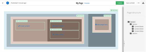
To achieve a margin between two columns, you place two Section widgets inside the columns and configure their margins.
The following screenshot demonstrates how to nest widgets. All margins and paddings are configured to medium. The margins of the two nested sections are used as spacing between the two columns of the first Section widget.
