DevReach site: Overview of pages and page templates
Pages
The DevReach project has the following basic pages:
Templates
The DevReach site uses two templates.
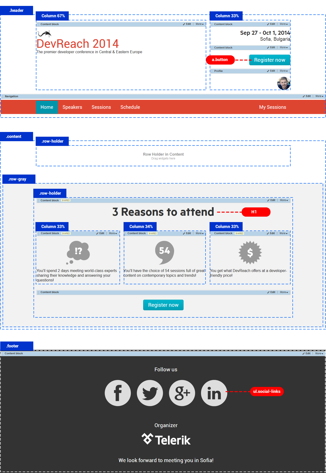
The first template is based on the 1 Column, Header, Footer template and is used by the Home page.
The following screenshot displays the template and its placeholders:

Each placeholder contains the 100% layout element and the elements are assigned classes .header, .footer and .row-holder, respectively.
Class .row-holder arranges the content in the center of the screen, using the following CSS:
.row-holder
{
width:940px;
margin:0 auto;
}
There are two colored rows, which you achieve by applying the following classes to the 100% layout element:
.row-gray{
background:gray;
}
.row-blue{
background:blue;
}
You use layout element 33% + 34% + 33% to arrange content in three columns.
EXAMPLE: To display Three reasons to attend section arranged in three columns in gray row, perform the following:
- Use 100% layout element and set its class to .row-gray
- Inside it drop another 100% layout element and set its class to .row-holder
- Inside row-holder, drop Content block widget for title and 33% + 34% + 33% layout element.
- In the columns, drop Content block widgets for each reason to attend.
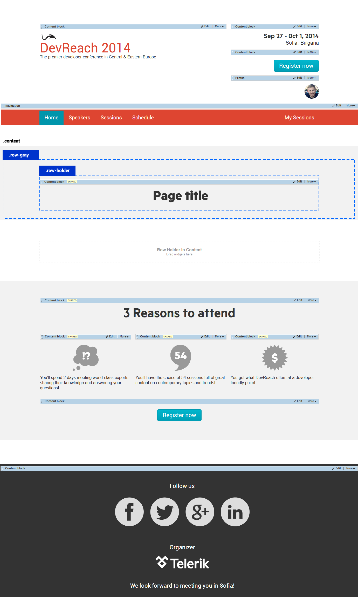
The second template is based on the first one. It has added a placeholder for displaying the page title. Inside the placeholder is a Content block widget that is made editable in pages. This way each page can have a different title. For more information, see Template widgets editable in pages.
The following screenshot displays the second template:

Widgets
Content on the site is displayed by following widgets:
- Content block for Logo, Event date, Footer, 3 Reasons to attend, Venue, page titles.
- Image widget for image header on Home page
- Dynamic content widgets for Speakers and Sessions.
- Profile widget for user’s thumbnail next to the navigation. Visible for logged users.
Responsive design
Create responsive rule for smartphones – transform three columns to three rows.
For more information, see Overview: Responsive design.