Autogenerated widget editors for .NET Core
Overview
Sitefinity CMS provides enhanced user experience for working with custom ASP.NET Core widgets. By default, Sitefinity CMS detects the types of the public properties that you define in the code of the widget and automatically generates the widget editor with the respective fields.
The widget editors support the following:
- Editing the properties through more user-friendly, type-specific field editors
- Grouping properties in section and views
- Validating the user input
- Conditionally displaying fields, depending on custom requirements
Autogenerated field type
Out-of-the-box, you get enhanced field editors for the following property types:
Boolean
Displayed as Yes/No optionEnum
Displayed as dropdown selector with all available options for the enumeratorInt, double
Displayed as number fieldDateTime
Displayed with date-time picker- Complex objects
A complex object is a property that consists of simpler properties. Sitefinity CMS automatically generates editors for the them, depending on their types, and displays them in a row. If the properties, constructing the complex object, are four or less, they are displayed in one row.
The following screenshot demonstrates the automatically generated editor for the Margin property that consists of TOP, RIGHT, BOTTOM, and LEFT margin properties:

Dictionary
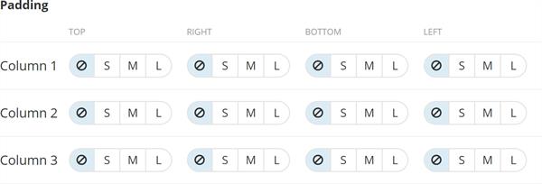
A dictionary is a collection of complex objects. Sitefinity CMS automatically generates editors for the properties in the dictionary. The properties of the complex object are displayed in columns. Each dictionary entry is displayed on a separate row in the table.
The following screenshot demonstrates the autogenerated property editor of a dictionary of complex objects:

The attribute that determines how many rows to create for the entries in the dictionary is the following:
[LengthDependsOn(nameof(ColumnsCount), "Column", "Column ")]
In this example, the number of rows that the column paddings dictionary has is determined by the number of columns that a Section widget has (ColumnsCount). Each Section widget column is a complex object, containing four other properties of type Enum – these are the top, right, bottom, and left paddings that can be one the predefined values – none, small, medium, or large.
List
Similar to the Dictionary, the number of list entries that Sitefinity CMS generates depends on the LengthDependsOn attribute. This attribute specifies the property whose value is used to determine the number of list entries. It uses the titles from the attribute to label the rows.
- Other types
All other types are displayed using a text field where you can type your values.
Customize autogenerated fields
You can customize the automatically generated fields by using the following predefined attributes:
DefaultValue
This is a predefined value that is displayed when the widget editor opens initially. Afterword’s, the user can overwrite it.
ConfigurationDefaultValue
This attribute has the same purpose as the Default Value Attribute. However, its predefined value can be configured in the appconfig.json file in the following way:
[ConfigurationDefaultValue("Widgets:Styling:DefaultPadding")]
Description
This attribute serves as instructional text for the field.
Placeholder
This attribute specifies a placeholder text in the input field.
LengthDependsOn
This attribute specifies the property whose value is used to determine the number of list entries. It uses the titles from the attribute to label the rows. Using the LengthDependsOn attribute, you can also edit the label of the rows and add extra records to the collection, beside the autogenarted ones.
EXAMPLE: The following code sample, demonstrates how to use the attributes to customize autogenerated fields:
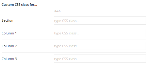
The code above generates the following fields in the widget editor:

Validations
You can easily enable validation for the field values by using the attributes provided in
Sitefinity CMS supports the following attributes:
EmailAddressAttribute
Validates an email address.
MaxLengthAttribute
Specifies the maximum length of array or string data that is allowed.
MinLengthAttribute
Specifies the minimum length of array or string data that is allowed.
RangeAttribute
Specifies the numeric range limits for the value of a data field.
RegularExpressionAttribute
Specifies that a data field value in ASP.NET Dynamic Data must match the specified regular expression.
RequiredAttribute
Specifies that a data field value is required.
StringLengthAttribute
Specifies the minimum and maximum length of characters that are allowed in a data field.
UrlAttribute
Provides URL validation.
These validation attributes are provided in Microsoft's .NET System.ComponentModel.DataAnnotations Namespace.
Sections and views
You can specify where the properties are displayed. Sitefinity CMS support the following levels of differentiation:
- By views
You can specify whether the properties are displayed in the main view (basic) or in the advanced view. If you do not specify anything, the property appears in the basic view. This way, you can place in the advanced view properties that requires more technical knowledge or are rarely used.
- By section
You can use this attribute to group the properties in sections inside the view and provide expand and collapse capability.
The following code sample, moves the first property to the advanced section and puts the second property in a particular section:
Conditional fields
You can hide or display fields depending on the value of a related property.
You do this by using the ConditionalVisibilityAttribute in the following way:
This sample adds a rule that displays field MyProperty, only if the Title property is equals to My custom title.
The ConditionalVisibilityAttribute takes a parameter that is defined in the following JSON:
View all property values
In case you want to view all property values persisted in a widget, regardless of the view or the section where they are displayed, you can use the clipboard functionality.
When you press CTRL+ALT+C, all the widget’s properties and their values are copied to the clipboard. Then, you can paste them in a text editor of your choice.
You can also paste values in the widget editor by pressing CTRL+ALT+V. Values are validated, in the same way, as if they are entered directly in the field editors.
EXAMPLE: If you have two properties - CustomerName and CustomerAge, you can enter their values in the widget editor, by pasting the following:
{"CustomerName":"MyName","CustomerAge":"5"}
NOTE: This feature is available for Chrome browser only.