Label layout elements
You can apply custom labels to your layout elements. This way you can create a more explicit layout that is easier to understand. For example, you can label your header and footer or you can label an element to state which widget must be applied to it.
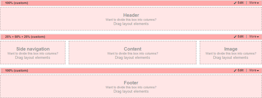
The following screenshot displays a layout where each layout element has a custom label applied to it:

To label a layout element, perform the following:
- Click the Edit button of the element.
- In the right pane, click Classes & Labels.
- In the Labels section, you can label each column from the layout element.
- Click Done.
Label a custom layout widget
To apply a label to a custom layout widget, in the template, add a new attribute data-placeholder-label to the sf_ColsOut <div>.
EXAMPLE:
<div runat="server" class="sf_cols">
<div runat="server" class="sf_colsOut sf_2cols_1_25" data-placeholder-label="Left Sidebar">
<div runat="server" class="sf_colsIn sf_2cols_1in_25">
</div>
</div>
<div runat="server" class="sf_colsOut sf_2cols_2_75" data-placeholder-label="Content">
<div runat="server" class="sf_colsIn sf_2cols_2in_75">
</div>
</div>
</div>
Set a label when using a master page
When using a master page with multiple asp:contentplaceholder, you can add a label in one of the following ways: