World Wide Web Day: A Look Back on the Evolution of Web Design

In celebration of World Wide Web Day, let’s look back on the evolution of web design and how static websites have transformed into completely dynamic digital experiences.
I knew from the moment I built my first HTML table that I wanted a career working with websites. I took my first HTML class in seventh grade in the late 1990s in the only shared computer lab in our school. I picked up HTML quickly and felt empowered by it, because not many others were doing it and I understood it.
The World Wide Web was invented in 1989 and became public domain in 1993. By the time I was in college in the early 2000s, there were full-time jobs that wouldn’t have existed without the World Wide Web—and I was planning on getting one. I was learning about website development, website user experience, online marketing and website design and I still didn’t even have a laptop.
Think back to some of those early websites: you could see the grids of the tables used to create the page layout. There was no need for responsive website design or even the ability to apply much design at all. Websites used language like “Welcome” and “Home Page” in the copy because you needed to tell people what to do and where they were on your website. Think of the big red “Click Here” buttons. Wow, how user design has improved over the last 20 years!
I can recall working at companies where their corporate website was static HTML files and there was no content management software (CMS). I was hired because I could edit raw HTML files. The first CMS I ever used was a home-grown CMS that was developed by the web agency I was working for; it was rudimentary but it got the job done. It allowed nontechnical people to edit their own websites. This was a fun time. Then I started learning Drupal, WordPress, Sitecore, Sitefinity and so many others.
Each platform had something unique about it and an audience that it catered to. As an end-user, it was hard shifting the mind set from a static page to the possibility of dynamic and re-usable pieces of content across a website. Then, we introduced mobile and separate mobile websites, and then a fully responsive website and mobile-first design and content. A seamless and easy-to-use web experience is so important, but it was so hard to achieve at that time.
Evolving From Static Webpages to Meaningful Experiences
Let’s take a quick look at how our own Progress homepage evolved over the years, from basic user design to a more intuitive user experience.
Using the Internet Wayback Machine, the first instance of the Progress.com homepage was in February of 1997. The homepage seemed to act as a catalog of everything we offered.
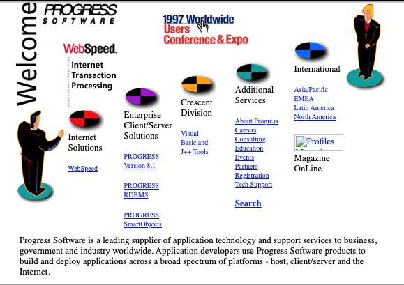
The older the web got, the more the digital experience of a website began to evolve. By December 2001, the Progress homepage began to transform, almost as if it were a digital newspaper with its column-like form. It not only was used to showcase our products, but also our business and various companies, while displaying news, announcements, and events.
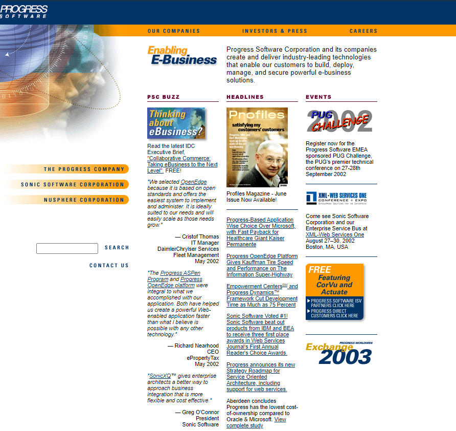
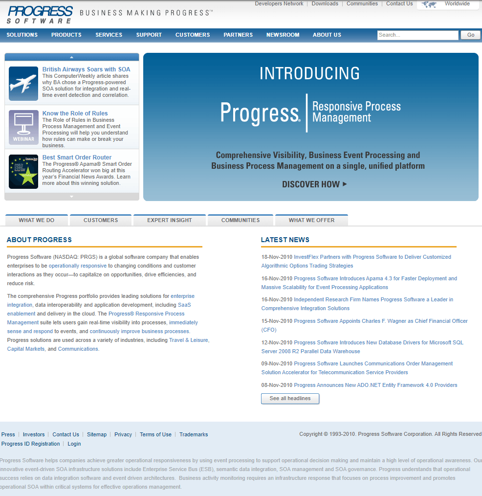
Fast forward almost 10 years later and our digital presence continued to evolve, building out our navigation. The homepage now included more options, enabling visitors to easily move throughout the breadth of content that made up the Progress website. Websites had grown into hundreds and thousands of pages, showcasing everything a company had to offer, from products and services, to support and partner portals.
At this point, digital presence overall had grown so much that companies were thinking about their presence online globally, localizing pages to extend their reach to consumers. They even had to think about how their products were sold, as e-commerce began to make its mark. Business had truly transformed and make its impact online. It was clear digital was here to stay.
From Content Management to a Powerful Digital Experience Platform
Today, it is no longer just about managing your content, but rather managing your digital experience. Right now, we’re running an A/B test on our homepage which we believe will improve our user experience, enabling them to further engage with our content. At the same time, we are personalizing content for our visitors in certain geographies.
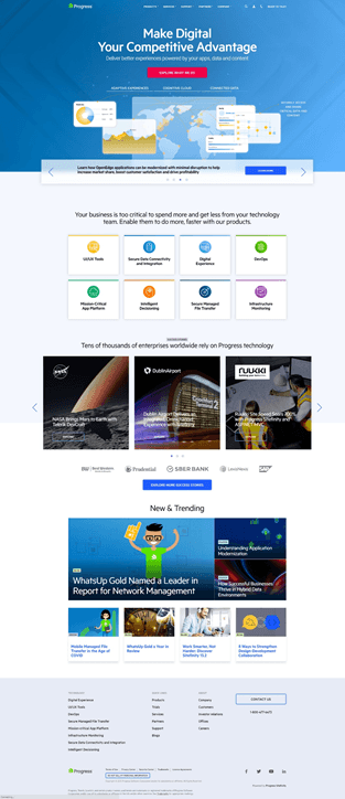
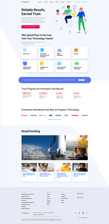
This could not have been possible without business applications such as Sitefinity. Sitefinity started out as a content management system, aimed at making the management and publishing of website content easy. Over the years it has evolved to enable its users to manage digital experiences, not just content.
From content management and content analytics, to A/B testing and personalization, we are truly lucky to have our own DXP to continue to evolve not only our homepage, but our entire website and the experiences it delivers. I can only imagine the new advancements in digital to come to further drive the evolution of the World Wide Web.
Could you imagine what the world would be like today without the World Wide Web as we know it? We owe so much to Tim Berners-Lee’s invention of the World Wide Web and the power of knowledge share we have today because of it.
World Wide Web Day is celebrated on August 1 of every year. It is always important that we look back and appreciate where we came from so that we can continue to push boundaries and improve in the future. My goal is to take little steps every day in my career and life to make the web a better place.
See how Sitefinity’s DXP can evolve your website to today’s web standards.
Let’s see what will be in store next for the World Wide Web!

Kate Pendarvis
Kate is responsible for leading Progress’ web presence and digital marketing activities. Kate has worked in the digital marketing space for over 10 years with expertise in web operations, web design, web development, search engine optimization, paid search, A/B testing, personalization, and more. Kate previously led the Digital Marketing team at Acquia, and graduated from the New England Institute of Art with a BS in Interactive Media Design.
Next:
Comments
Topics
Sitefinity Training and Certification Now Available.
Let our experts teach you how to use Sitefinity's best-in-class features to deliver compelling digital experiences.
Learn MoreMore From Progress
Latest Stories
in Your Inbox
Subscribe to get all the news, info and tutorials you need to build better business apps and sites

